Team Behind the Design
Logo Design Analysis
Logo work for emerging wellness brands relies on how symbolism, type, and color shape emotional trust while staying clear and direct.
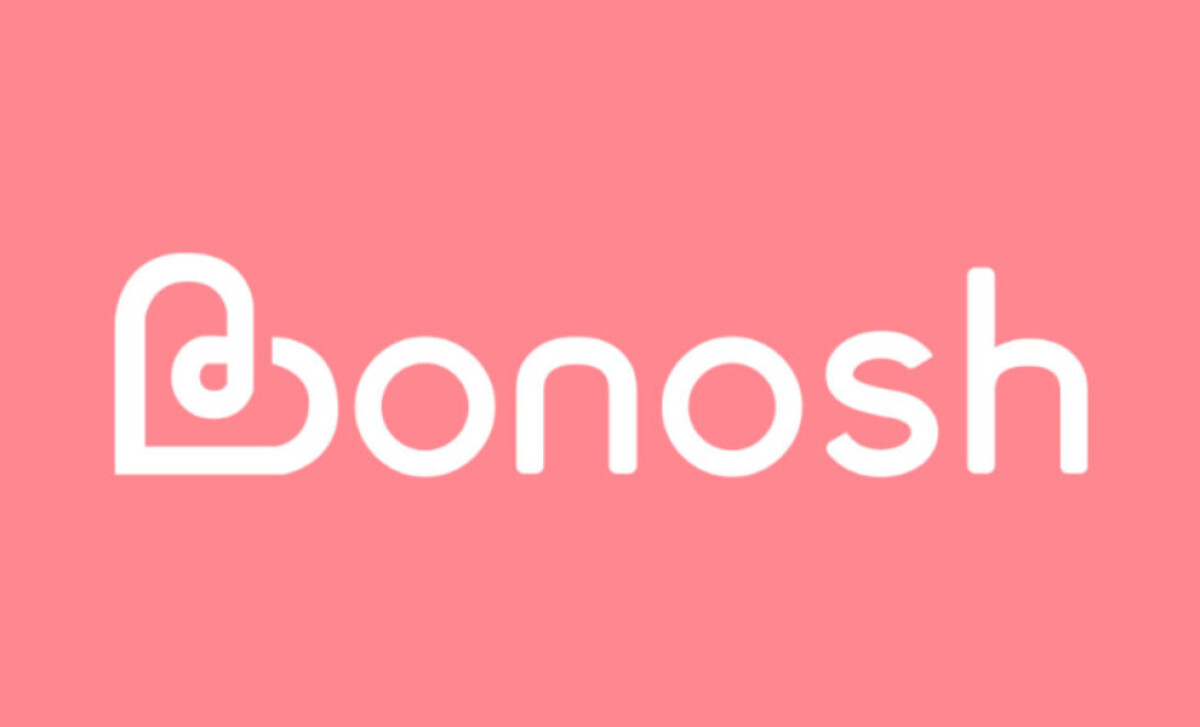
Bonosh Health’s mark reaches that balance through a gentle, unified construction built around simplicity and a warm sense of energy.
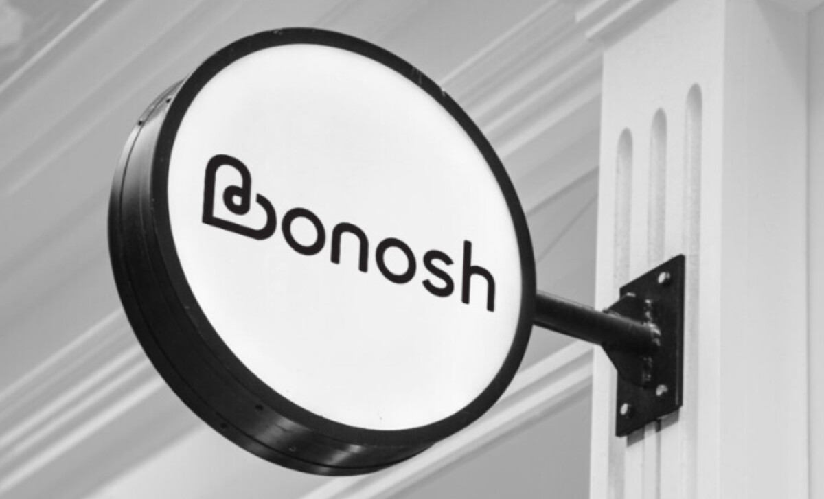
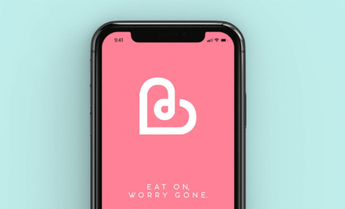
- Concept: The heart-shaped logomark that cleverly integrates a lowercase “b” gives the brand an immediate emotional anchor. I like how the continuous stroke creates both forms without breaking rhythm, which adds meaning without visual clutter.
- Typography: The rounded sans-serif wordmark carries a humanistic tone that aligns naturally with the logomark’s looped geometry. I appreciate how the wide bowls and gentle terminals create a calm, flowing rhythm, making the brand feel friendly without veering into overly playful territory.
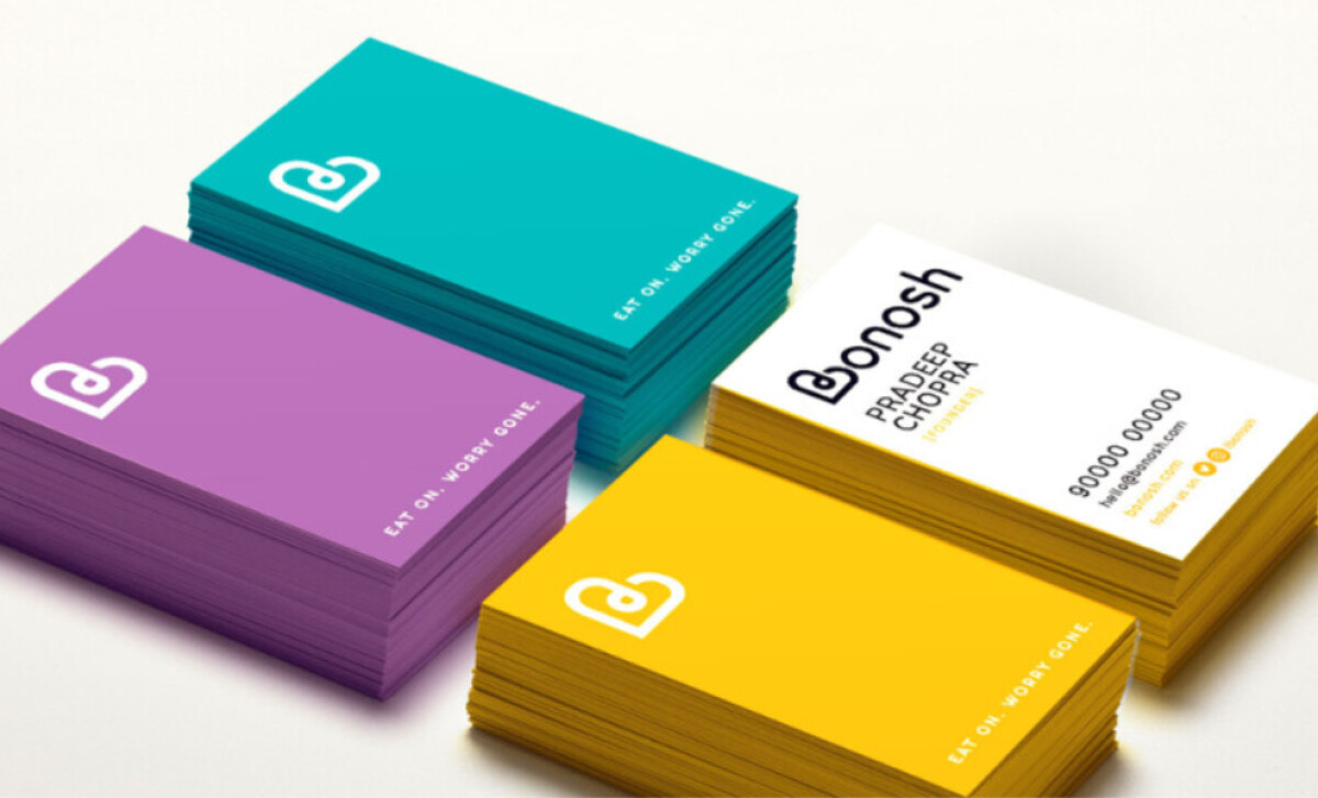
- Scalability: The logomark’s simple looping structure and balanced negative space allow it to scale down remarkably well. I find that its smooth stroke and clear silhouette hold their integrity even at smaller sizes, whether on a mobile screen or on compact printed pieces like business cards.
- Applications: A consistent stroke logic helps the logo adapt effortlessly across monochrome, reverse, and full-color uses. I like how this minimalism allows the identity to move seamlessly across digital touchpoints and physical ones like storefront signage and stationery, without ever losing visual harmony.
What Brands & Agencies Can Learn from Bonosh Health
Here are a few key lessons from Bonosh Health’s logo design:
1. Use Symbolism to Build Emotional Connection
A logomark that blends meaning with form can strengthen brand recall instantly. When symbols communicate a core emotion they become long-term brand assets.
2. Let Softness Signal Approachability
Rounded geometry and smooth stroke transitions help make health and wellness brands feel more accessible. This approach is especially effective for startups seeking to avoid clinical or intimidating visual cues.
3. Design With Versatility in Mind
A unified stroke logic and clean silhouette ensure a logo performs well across packaging, apps, merchandise, and signage. Building for flexibility early on saves brands from future redesigns caused by scaling or legibility issues.
About DesignRush Featured Designs
At DesignRush, we evaluate hundreds of projects each month. Featured selections stand out for clarity, craftsmanship, conceptual depth, and execution across digital and brand experiences.
The strongest examples move on to our Monthly Design Awards, highlighting best-in-class creative work.
Check out more standout work across categories:
- Best Logo Designs
- Best Website Designs
- Best App Designs
- Best Print Designs
- Best Packaging Designs
- Best Video Designs
For a full list of design agencies and related services, see our Agency Directory.