Standout Features:
- Powerful and solid wordmark
- Neat and strong typography
- Symbolic and flexible use
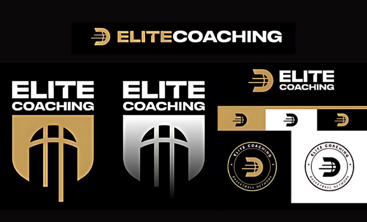
In the high-competition world of sports training, clarity and strength win. JJ Creative Group brings these principles front and center in their design for Elite Coaching’s visual identity.
The wordmark does all the heavy lifting. It uses angular, assertive letterforms that evoke movement and discipline, key values in athletic performance. The spacing is tight but calculated, reflecting both energy and precision.
The logo features two dominant symbols: a shield icon shaped from basketball court elements, and a forward-leaning “E” monogram built with motion lines that convey speed and acceleration. Together, they anchor the brand in athletic authority while evoking progress — a visual cue that Elite Coaching is about going further, faster.
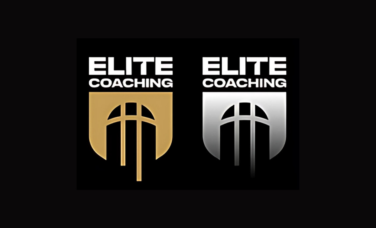
Typographically, “ELITE” uses thick, geometric letterforms while “COACHING” sits neatly underneath in a condensed, supportive format. This duality of strength and support mirrors the role of a coach — directive yet enabling.
Where the identity truly shines is its application versatility. Rendered in black and white, gold, silver, and on black backgrounds, the logo flexes across merch, apparel, and digital with polished cohesion. The gradient shield variants add a premium dimension, signaling exclusivity and excellence, vital in competitive sports training.