Team Behind the Design
Logo Design Analysis
A logo can reveal a brand’s story long before any words are read. It should convey purpose, emotion, and identity in a single glance while staying functional across every format.
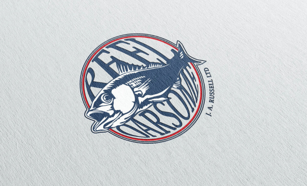
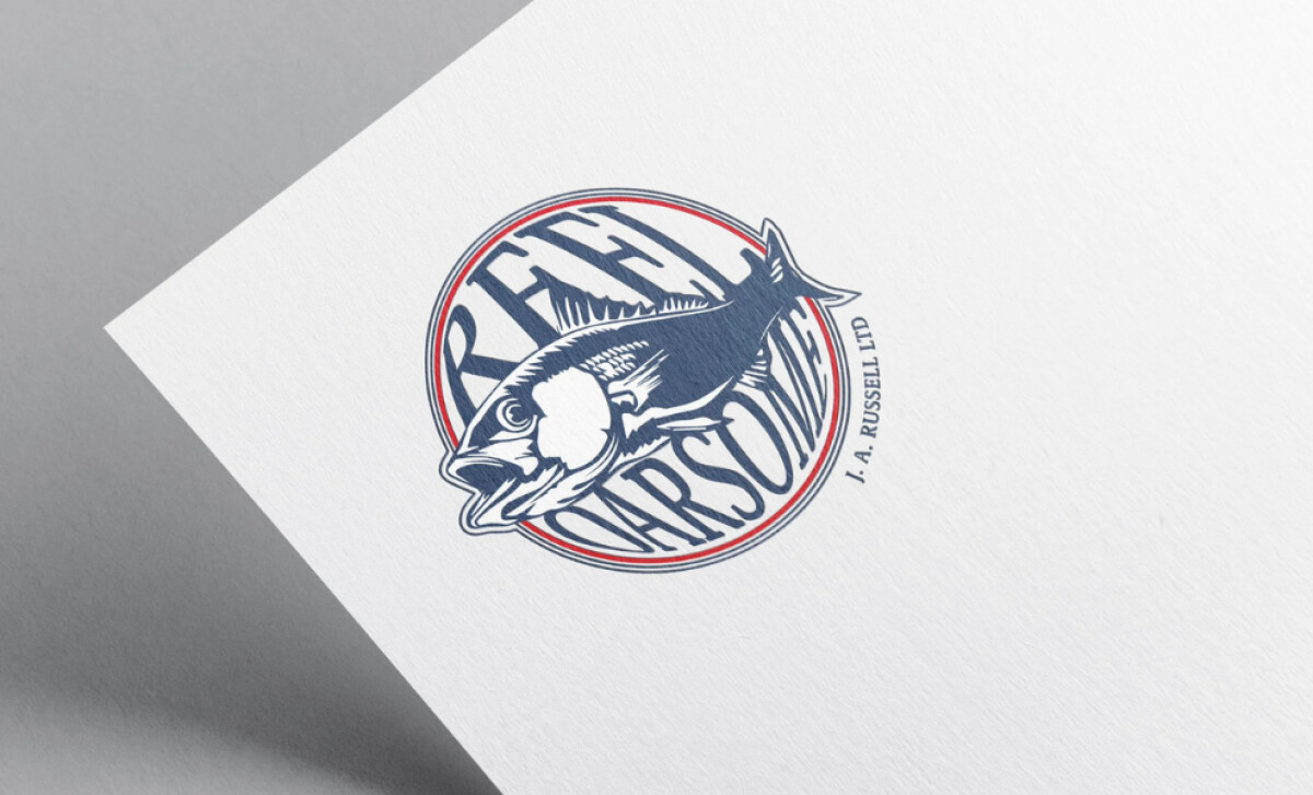
The Reel Oarsome design does this with a confident mix of hand-drawn illustration and expressive typography that instantly connects to the fishing world.
- Concept: The illustrated fish creates an immediate link to the event’s identity, while the circular frame reinforces unity and continuity, symbolizing community within the sport.
- Typography: The curved, bold lettering adds motion and weight, matching the energy of the illustration without overpowering it.
- Scalability: Despite its detail, the design maintains legibility and impact at smaller sizes, ensuring it works across apparel, banners, and digital platforms.
- Applications: The textured print treatment gives the logo a tactile quality that enhances its presence on physical materials, from posters to event merchandise.
What Brands & Agencies Can Learn from Reel Oarsome
Kate Evans’ design for Reel Oarsome shows how illustration and typography can come together to express both tradition and excitement. The logo feels alive, drawing people in with its sense of craft and motion.
1. Let Craft Tell the Story
The hand-drawn fish illustration gives the mark its personality. It communicates authenticity and passion, reminding us that even in a digital world, craftsmanship still creates the strongest emotional connection.
2. Balance Energy with Control
The circular frame and curved type provide structure to the energetic illustration. This balance keeps the logo readable and professional while preserving its sense of movement and enthusiasm.
3. Design for Every Surface
From print to merchandise, the logo holds its strength. The textured finish and scalable layout make it adaptable without losing its handmade feel. That adaptability ensures the identity works wherever the event lives.
About DesignRush Featured Designs
At DesignRush, we review hundreds of agency projects each month to uncover standout work in branding, digital, and visual design. The featured designs represent some of the most compelling executions, standing out for clarity, creativity, and technical precision.
Top-performing projects often advance to our Monthly Design Awards, gaining wider industry recognition.
See more creative projects across categories:
- Best Logo Designs
- Best Website Designs
- Best App Designs
- Best Print Designs
- Best Packaging Designs
- Best Video Designs
For a full list of design agencies and related services, visit our Agency Directory.