Standout Features:
- Geometric dragonfly symbol
- Custom monospaced-type inspired wordmark
- Strategic color contrast
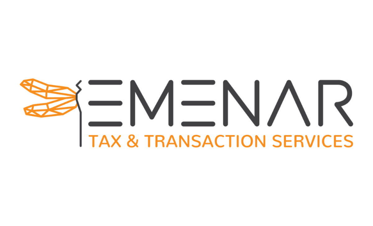
EMENAR, specializing in complex financial transactions like M&A and restructuring, unveiled a logo by Fine Line Design. The identity needed to articulate sophistication and strategic prowess. It achieves this through a distinctive typeface and an insect emblem, symbolizing the firm's agile and precise operational style.
The brand emblem is a geometric dragonfly, created with angular orange linework. It uniquely interacts with the first "E" of the company name, its wings extending to replace part of the letter. This symbol is chosen for its association with agility and adaptability—essential attributes for a financial advisory firm.
The word "EMENAR" is typeset in a unique, rounded monospaced style. Characters have straight geometric stems and horizontal bars; the "A" is a simple triangle. This design choice suggests systems and precision, elevating brand perception by subtly alluding to code, architecture, and analytical tools
A limited yet effective color scheme defines the logo: soft charcoal gray for the "EMENAR" wordmark, and a vibrant orange for both the dragonfly emblem and the "TAX & TRANSACTION SERVICES" tagline. This contrast aids legibility, and the use of orange is significant as color psychology studies often associate it with creativity and enthusiasm.
This professional service logo demonstrates that even in traditionally conservative sectors like tax and transaction advisory, a modern and distinctive visual identity can be achieved. EMENAR’s mark, with its unique emblem and contemporary type, signals a forward-thinking approach, crucial for attracting clients who value innovation alongside expertise.