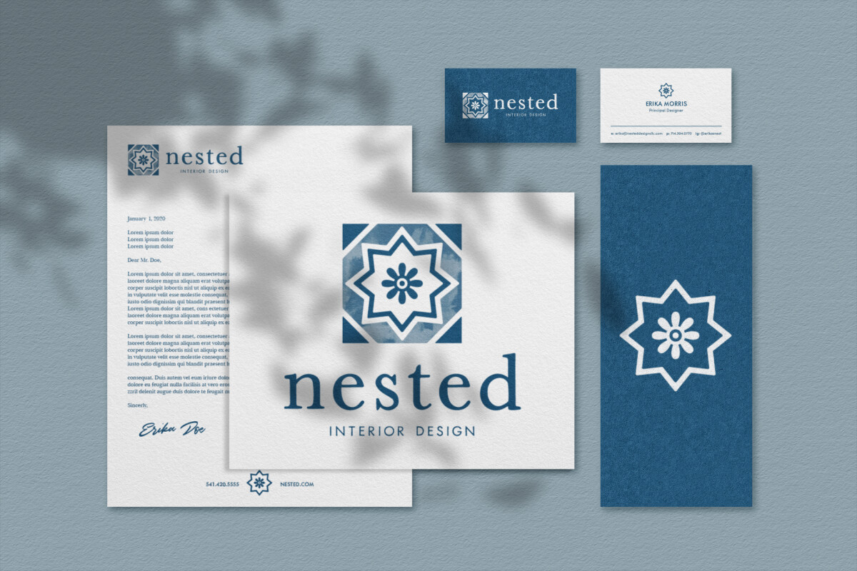
Standout Features:
- Geometric floral icon
- Elegant serif wordmark
- Unified brand applications
Bruised Goods delivered a logo and identity suite for Nested Interior Design that balances cultural roots with modern luxury. Their solution is rooted in symmetry and craft, echoing the principles of interior design through brand visuals.
The centerpiece of the logo is a geometric floral symbol, likely inspired by Middle Eastern or Mediterranean tile motifs. Its eight-pointed form and central bloom reflect themes of harmony and completeness, evoking the deliberate elegance often found in well-composed interiors.

Complementing the icon is a refined serif wordmark. The use of lowercase in “nested” softens the tone, while the subtle letterforms project professionalism and poise. The contrast between delicate strokes and bold structure mirrors the relationship between style and stability in interior environments.
The visual identity extends seamlessly across touchpoints — from stationery to signage. The identity proves flexible enough to thrive in both tactile materials and digital spaces, making the brand feel both premium and personable.
Nested Interior Design’s brand presence is a quiet triumph of detail and cohesion. Bruised Goods has crafted an identity system that honors symmetry, balance, and warmth — the very traits clients seek in architecture or interior design logos.