Team Behind the Design
Logo Design Analysis
I always look at financial branding for how it builds confidence at a glance.
Gemex achieves that with:
- structure
- precision, and
- calm visual control.
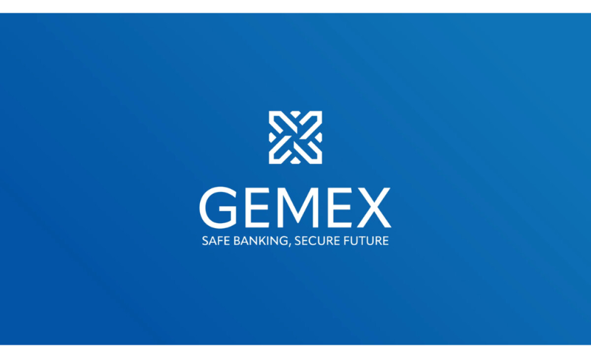
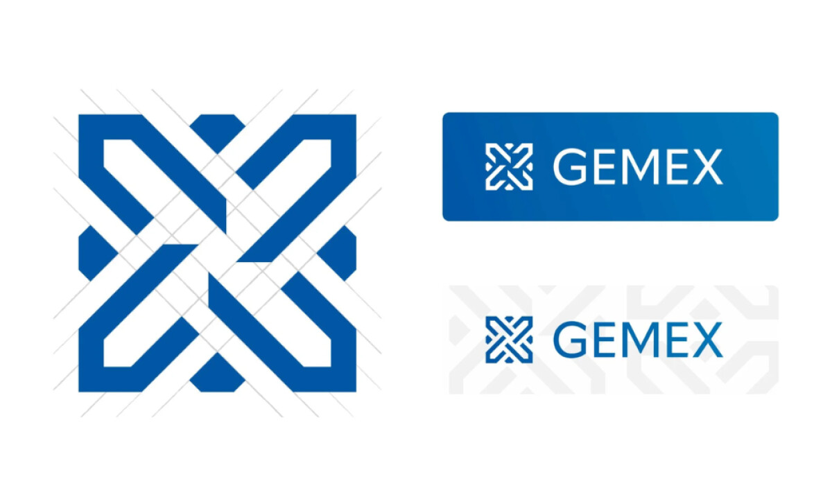
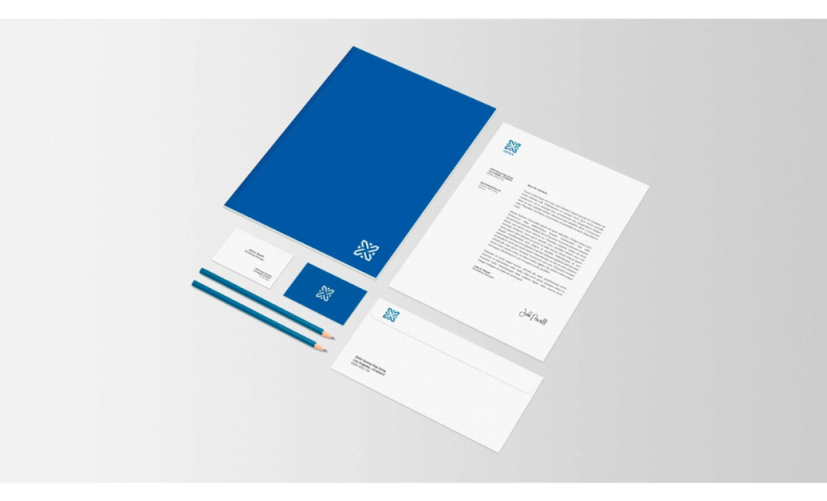
- Symbol and Form: The abstract mark forms an interlocking pattern that suggests unity and protection. It feels engineered and deliberate, hinting at both security and innovation.
- Color and Tone: The blue gradient reinforces stability and reliability while adding depth. It’s professional without feeling cold, balancing trust with modern appeal.
- Typography: The sans-serif typeface complements the geometric mark with clarity and proportion. The spacing feels open and confident, supporting the logo’s sense of assurance.
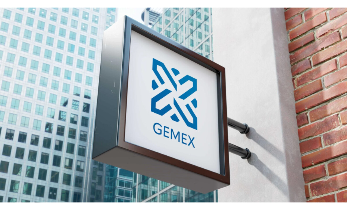
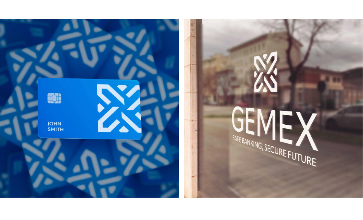
- Application and System: Across signage, stationery, and digital assets, the design scales effortlessly. The logo maintains its presence whether embossed on a card or displayed on glass, proving its versatility and balance.
What Brands & Agencies Can Learn from Gemex
Gemex demonstrates how financial branding can feel both secure and progressive. Welsford Design’s work shows that structure and emotion can coexist when handled with restraint and precision.
1. Build Trust Through Simplicity
A clear, geometric mark communicates stability faster than complex symbolism. When every line serves a purpose, the design earns credibility through clarity.
2. Use Color to Signal Confidence
Blue remains timeless in finance for a reason. Gradients and tonal shifts can modernize the palette without losing the trust and authority the color conveys.
3. Design for Scalability and Longevity
A logo that adapts seamlessly across print and digital platforms reinforces consistency. When a mark feels as strong on a business card as it does on a building facade, it stands the test of time.
About DesignRush Featured Designs
At DesignRush, we review hundreds of agency projects each month. The featured designs stand out for creativity, relevance, and execution.
Many go on to be recognized as winners of our Monthly Design Awards.
Discover more examples here:
- Best Logo Designs
- Best Website Designs
- Best App Designs
- Best Print Designs
- Best Packaging Designs
- Best Video Designs
For a full list of design agencies and related services, see our Agency Directory.


