Standout Features:
- Modern and dynamic typography
- Strong, impactful color choice
- Versatile logo design for multiple applications
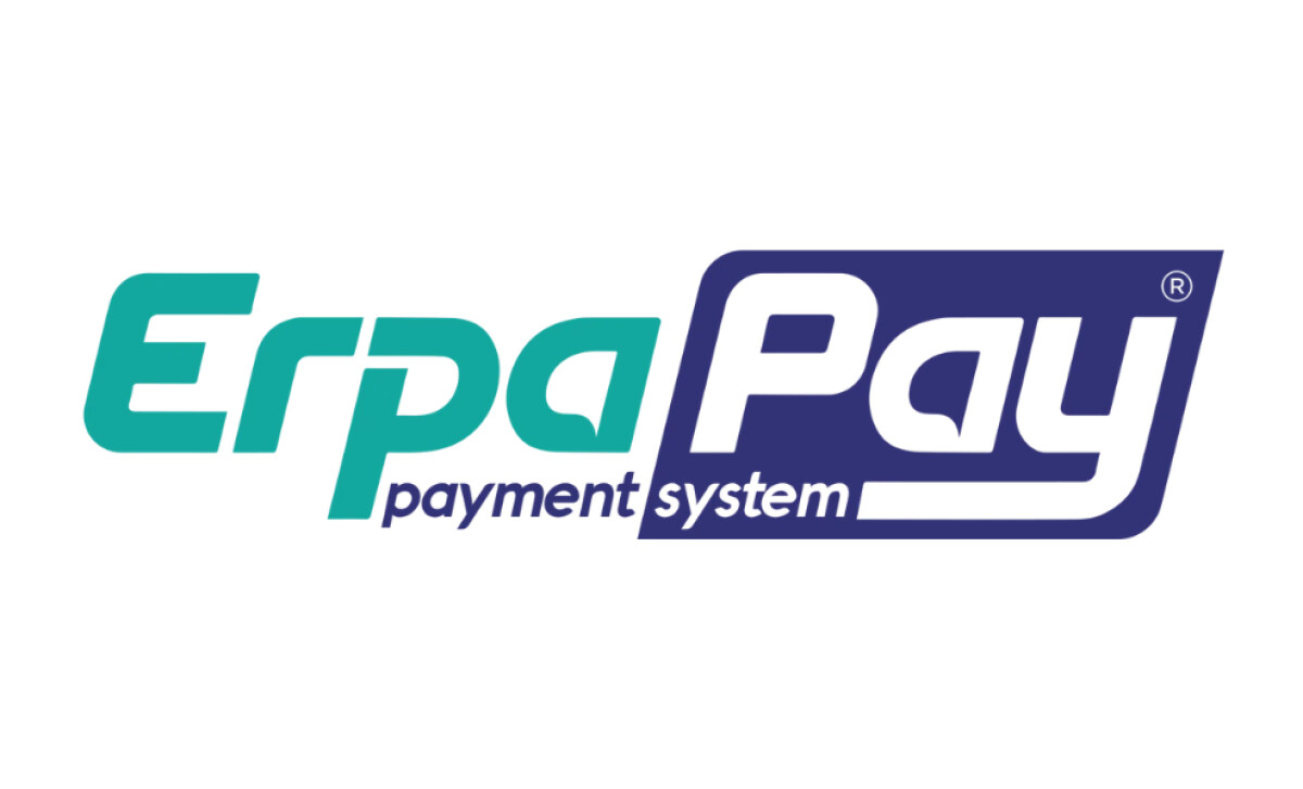
The ErpaPay logo, designed by OOT Kreatif Reklam Ajansi, combines sleek typography and impactful design to create a modern visual identity for a payment system brand. The logo balances simplicity with energy, reflecting both the reliability and dynamism expected from a financial service provider.
The typography in the ErpaPay logo is bold and clean, with smooth curves that lend it a dynamic and forward-thinking look. The unique design of the “P” and the letter spacing makes the logo stand out, embodying the modernity of digital payments in a recognizable and professional way.
The green and purple color scheme exudes trustworthiness and professionalism while also conveying a sense of innovation. Green, often associated with financial growth, works seamlessly with purple, which adds a premium, sophisticated feel to the brand identity.
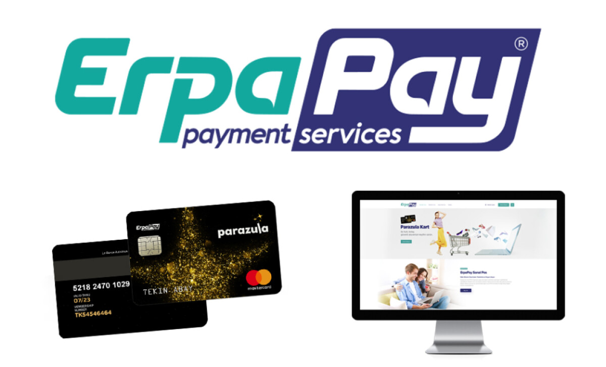
The ErpaPay logo is designed to be easily adaptable across digital and physical media. Whether displayed on credit cards, mobile applications, or websites, the logo remains clear, legible, and effective, making it ideal for a range of brand applications.
The ErpaPay logo perfectly encapsulates the blend of modern finance and accessibility. It’s a clever mix of simplicity, professionalism, and innovation that resonates with the target audience. In a sea of financial logos, this one’s clean and bold design ensures ErpaPay stands out.

