Standout Features:
- Well-rounded design, literally
- Minimal color set
- Evocative
Much of the First Page Strategy's logo design can be explained with the agency's very candid business approach:
"We are strategic marketers with in-house experience at tech companies like yours — and we’re built to understand your product, move fast, be flexible, and get sh*t done".
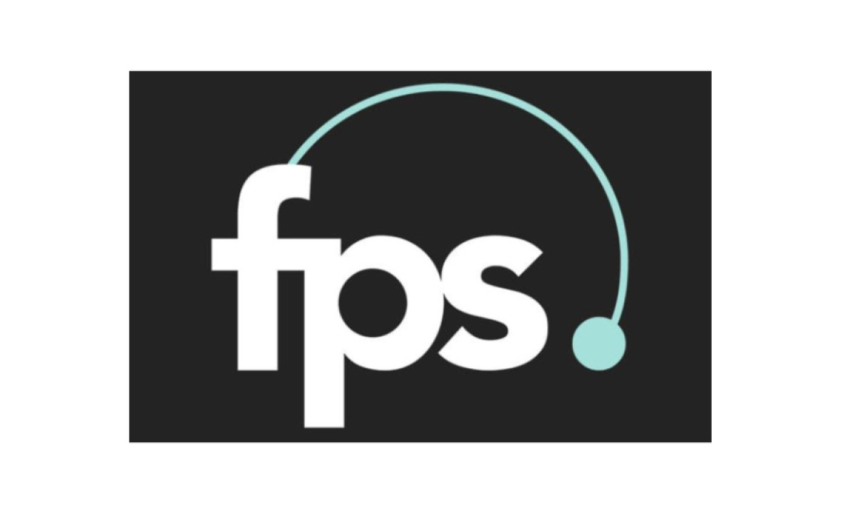
FPS logo is similarly no-nonsense, straight-to-the-point, clean, and minimal, however, it doesn't mean that it's one note. For example, the teal semicircle (a leftover motif from the older design) clearly communicates the creativity, flexibility, and ultimately, the brand's well-rounded expertise.
Get a chance to become the next Design Award winner.
SUBMIT YOUR DESIGN


