- Agency: Slidesignus
- Client: FLOYS
- Category: Logo Design — Health & Wellness
- Location: Malang, Indonesia
- Project Brief: Create a health and wellness logo design for FLOYS that communicates balance, calmness, and mindful movement through minimal typography, neutral colors, and a refined visual identity adaptable across print, digital, and studio environments.
Health and wellness brands win people over when the logo feels as calm as the class itself. Slidesignus built FLOYS, a concept yoga and pilates studio, around a soft circular mark and a gentle wordmark.
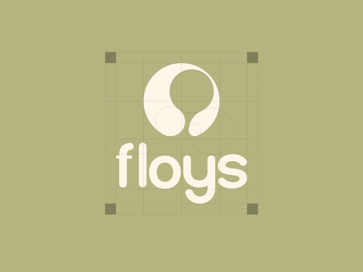
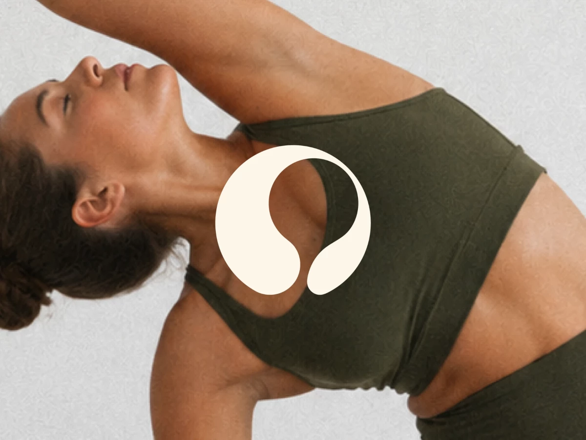
The symbol curls inward from a full circle, leaving an open space that tapers into two rounded ends. It reads like a body bending into a stretch or a breath moving in and out, which suits a studio built on balance.
A construction grid shows the mark is drawn entirely from overlapping circles, so no hard corner breaks the flow. Below it, the lowercase "floys" wordmark uses rounded strokes and soft terminals that echo the symbol.
Cream on muted sage and olive keeps the palette quiet and natural. The logo also works on a leafy mailer box and a dark blade sign outside the studio, so you'd recognize the brand at any size.