Team Behind the Design
Logo Design Analysis
A strong logo system for a writing focused brand needs to feel intentional, timeless, and expressive without unnecessary noise.
With Get Wordy, I noticed how the design leans into soft elegance while still feeling structured and professional.
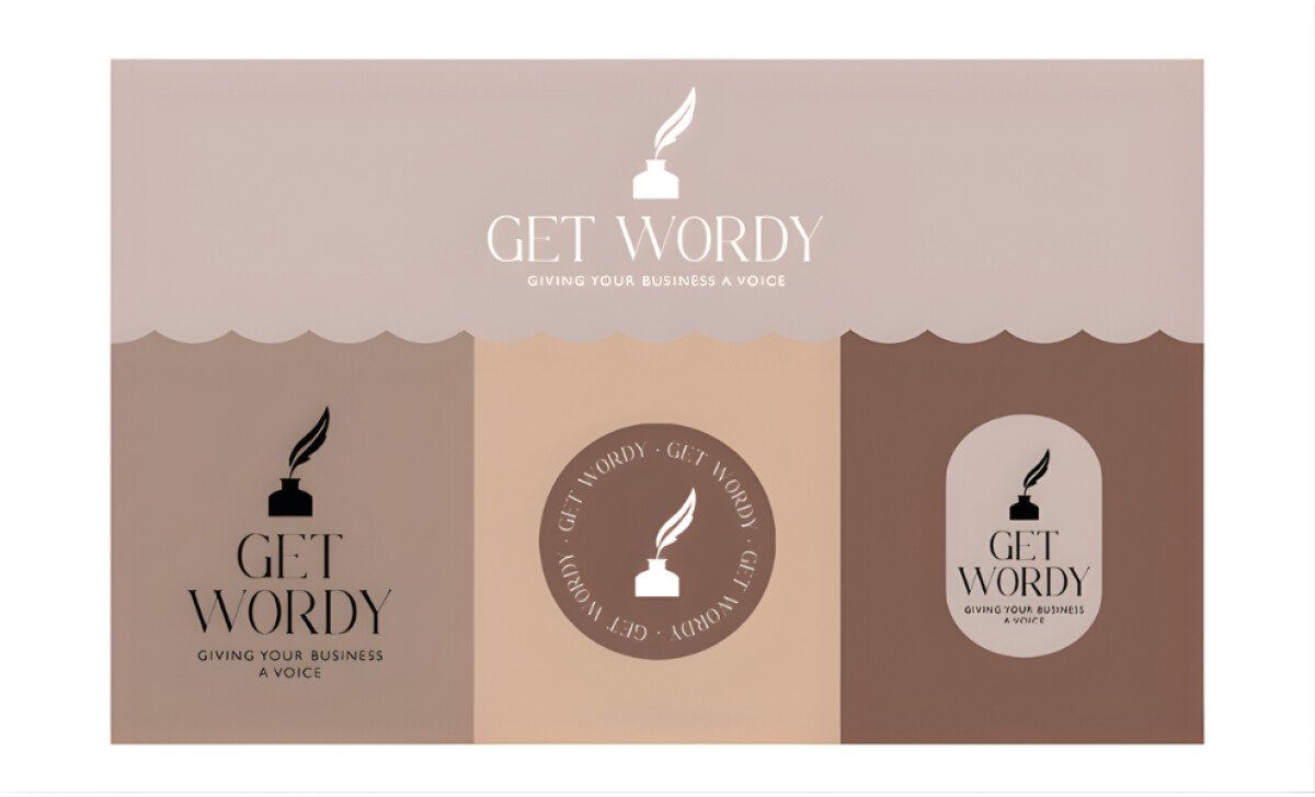
- Concept and Symbolism: I like how the ink bottle and quill instantly communicate the heart of the brand. The symbol feels classic, but the clean lines make it feel modern enough for digital and print. It captures the spirit of writing in a way that feels both direct and poetic.
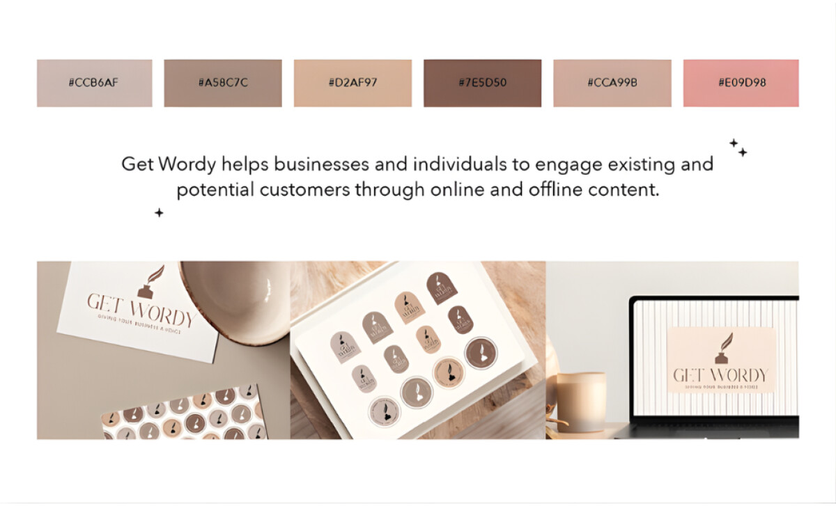
- Color System: The muted creams, caramels, and coffee tones give the brand a calming warmth. As I moved through the palette, I noticed how each neutral shade supports a sense of comfort and sophistication. The colors feel carefully chosen to embody quiet luxury rather than loud expression.
- Typography and Personality: The editorial style typography brings a gentle sense of refinement. I appreciate how the serif letterforms add character without overpowering the symbol. It gives the logo a literary tone that aligns well with a brand built on storytelling and communication.
- Versatility and Usability: The variety of lockups makes the system flexible across packaging, social media, stationery, and digital platforms. As I reviewed the set, I could see how each variation maintains visual consistency, making implementation smooth and cohesive for real world use.
What Brands & Agencies Can Learn from Get Wordy
Design Crumbs Studio’s work for Get Wordy shows how a writing-focused brand can express personality through subtle choices rather than loud gestures. The identity feels calm, thoughtful, and quietly confident.
1. Let Symbolism Speak First
The ink bottle and quill create immediate recognition. This kind of clear, story-centered symbol helps audiences understand the brand’s essence long before they read a single word.
2. Use Neutrals to Convey Warmth and Sophistication
The palette of creams, caramels, and soft browns builds a comforting atmosphere. These tones carry a sense of literary warmth while still feeling polished enough for professional use.
3. Pair Editorial Typography with Modern Restraint
The serif letterforms add elegance, but the overall system stays clean and adaptable. This balance makes the brand feel both expressive and dependable across print, digital, and social formats.
About DesignRush Featured Designs
At DesignRush, we review hundreds of agency projects each month. The featured designs stand out for creativity, relevance, and execution.
Many go on to be recognized as winners of our Monthly Design Awards.
Discover more examples here:
- Best Logo Designs
- Best Website Designs
- Best App Designs
- Best Print Designs
- Best Packaging Designs
- Best Video Designs
For a full list of design agencies and related services, see our Agency Directory.