Standout Features:
- Diagonal symbol combining a checkmark
- Modular color system for multi-platform adaptability
- Bold sans-serif wordmark with custom letterweighting
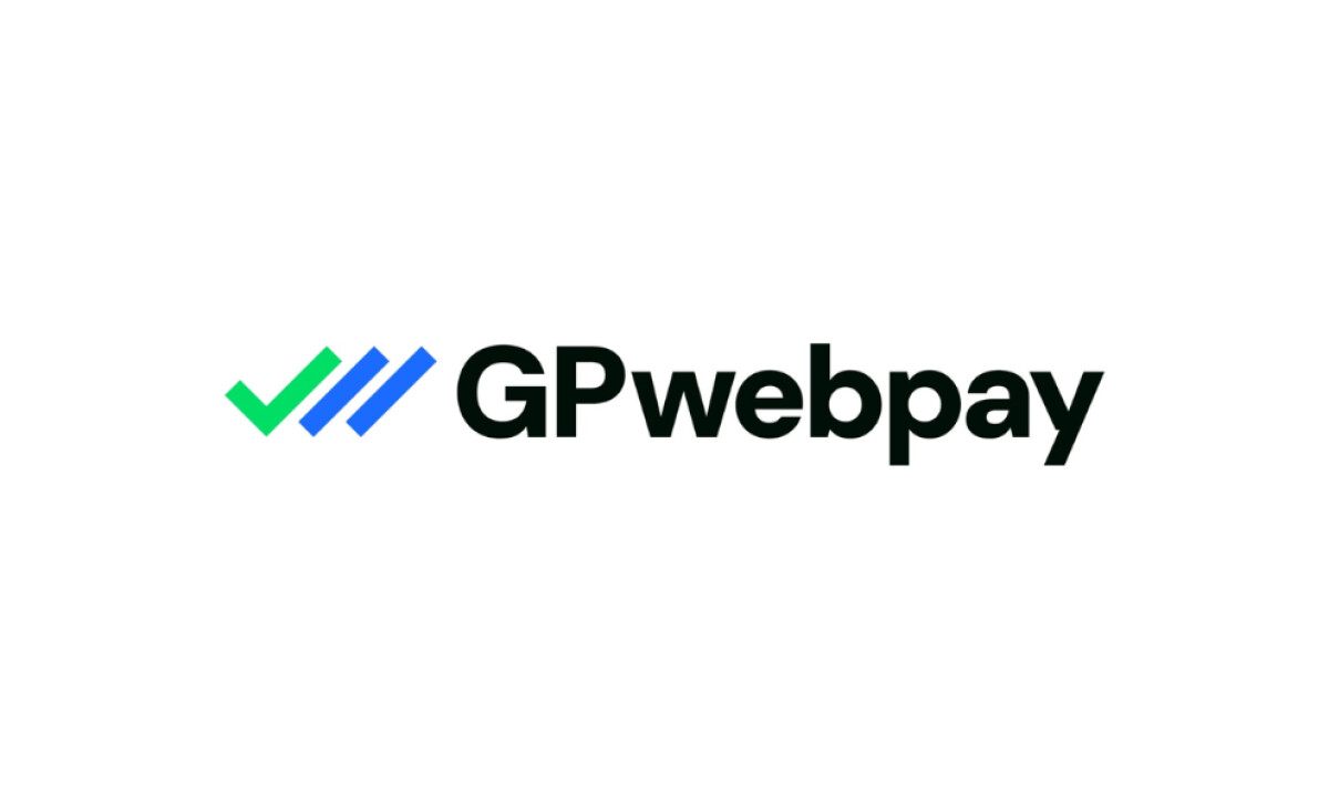
GP webpay, the leading payment gateway in the Czech Republic, offers a modern and secure system for online card transactions. Loudmark uses abstract symbolism and clean typography to design a trustworthy and bold logo for the fintech space.
The logo incorporates a distinctive diagonal symbol: a green checkmark shape leading into two parallel blue lines. These three bold strokes are angled to the right, suggesting forward momentum. The checkmark clearly nods to transaction confirmation, while the blue lines imply speed and connectivity in payment processing.
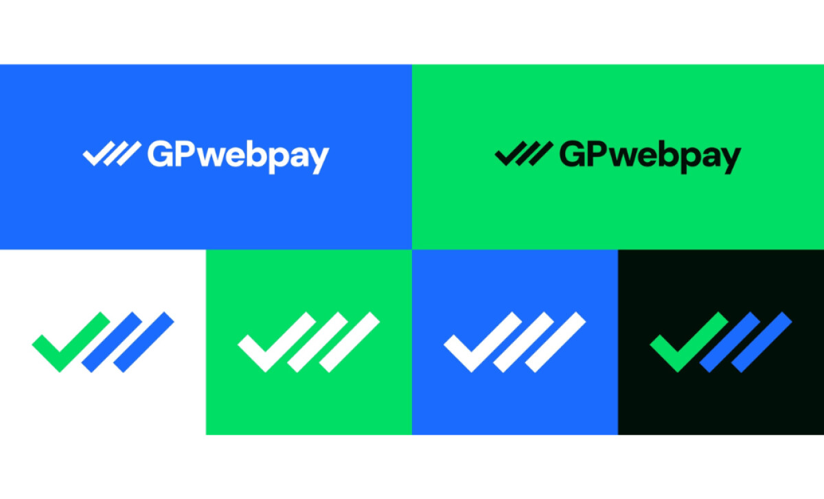
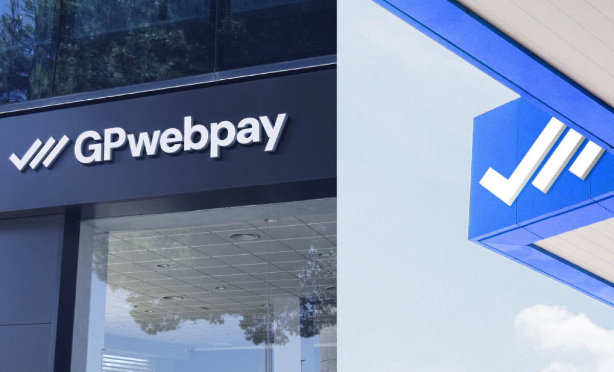
The logo’s color variations — white, black, green, and electric blue — are designed for multi-platform adaptability. This flexibility reinforces brand cohesion and usability in diverse environments, with the bold colors being both memorable and energizing for the payment gateway brand.
Not to mention, this color selection is highly symbolic in the fintech space, as brighter green is often utilized in financial applications, and blue is a well-known color for building a trustworthy image (Adobe).
A bold geometric sans-serif in solid black defines the logotype. The lowercase "webpay" and uppercase "GP" features rounded forms. This custom letterweight and styling ensures the brand name is modern, grounded, and easily legible across various platforms.
A key insight from the GP webpay logo is the strategic power of a simple yet symbolic brandmark. With its intuitive checkmark/arrow icon and versatile color applications, the agency created a memorable, platform-ready mark built for versatility and professionalism.


