Standout Features:
- Refreshing wave shape
- Two-toned color scheme
- Striking bold typography
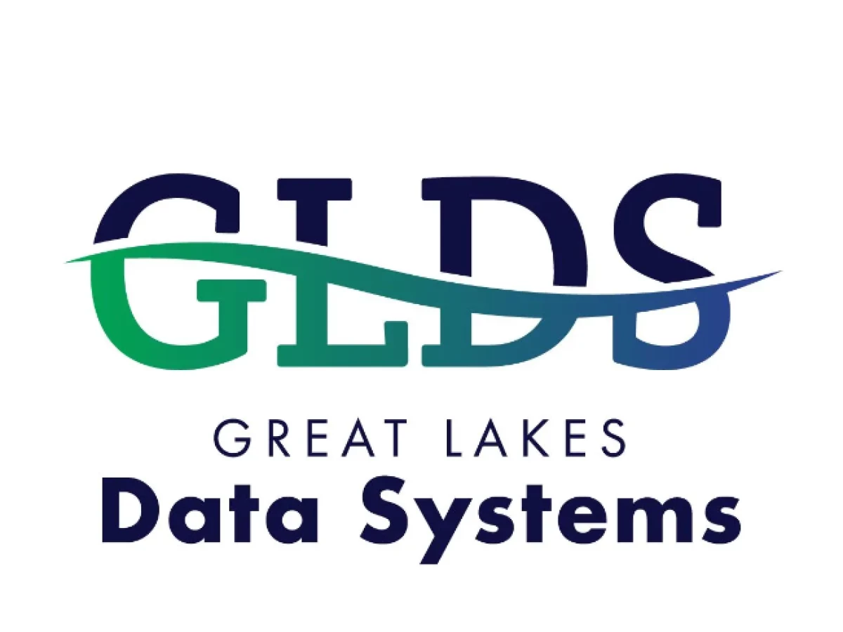
Behind Your Design illustrates innovation and natural connectivity in the logo they crafted for Great Lakes Data Systems. The wave-like shape symbolizes the seamless data flow, reflecting the company's proficiency in managing complex data systems.
Set in bold, uppercase letters, the "GLDS" acronym stands out with clarity and strength. It underscores the company's solid foundation in the tech industry. This choice of typography conveys reliability and authority – essential qualities for a leader in data systems.
The greens and blues not only pay homage to the Great Lakes. They also link the brand's technological solutions to the natural world's fluidity and interconnectedness. This color scheme elegantly bridges the gap between the digital and the natural!