Standout Features:
- Custom logotype with playful letterforms
- High-contrast orange brand color
- Scalable assets for digital platforms
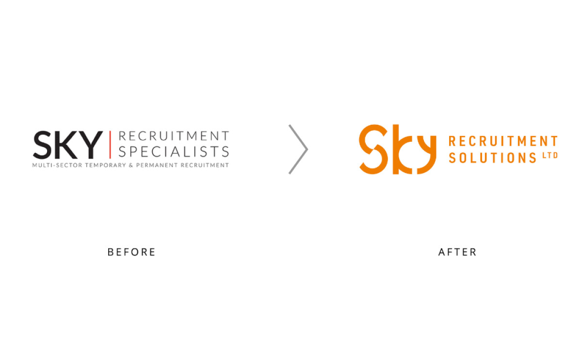
The bold move Sky Recruitment Solutions took with their new identity, courtesy of Branding Optimist, was to trade corporate formality for standout personality. This Derby-based recruitment company ditched a conventional typographic logo in favor of a confident, contemporary mark that better reflects its community focus and ambitious standards.
The redesigned logotype replaces the previous generic type with customized, curved letterforms. The "S", "k", and "y" feature consistent stroke thickness and subtle stylization that creates a slashed yet fluid, interconnected look. This typographic approach gives the brand an approachable, energetic presence.
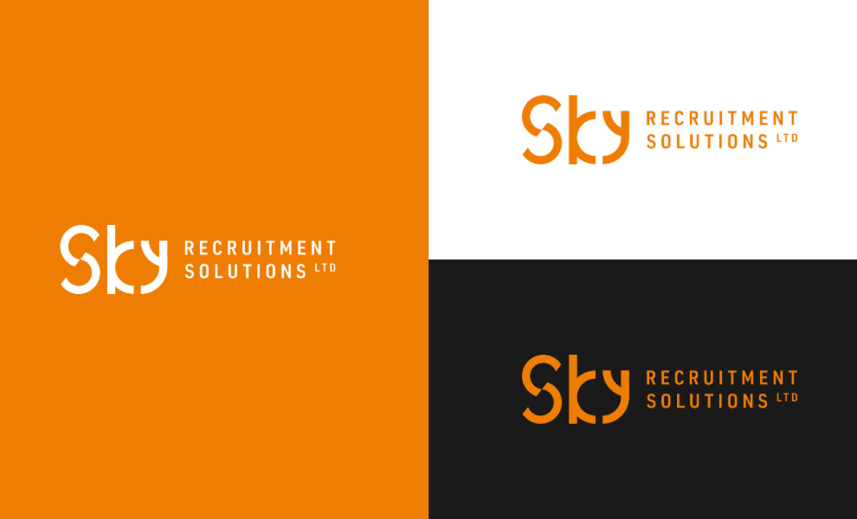
Color takes center stage in the rebrand. The vivid, confident orange completely transforms the tone of the identity. Orange radiates energy, optimism, and action — qualities aligning with Sky Recruitment’s mission to put people first and support the Derby community. Compared to the previous grayscale, this new scheme immediately draws attention.
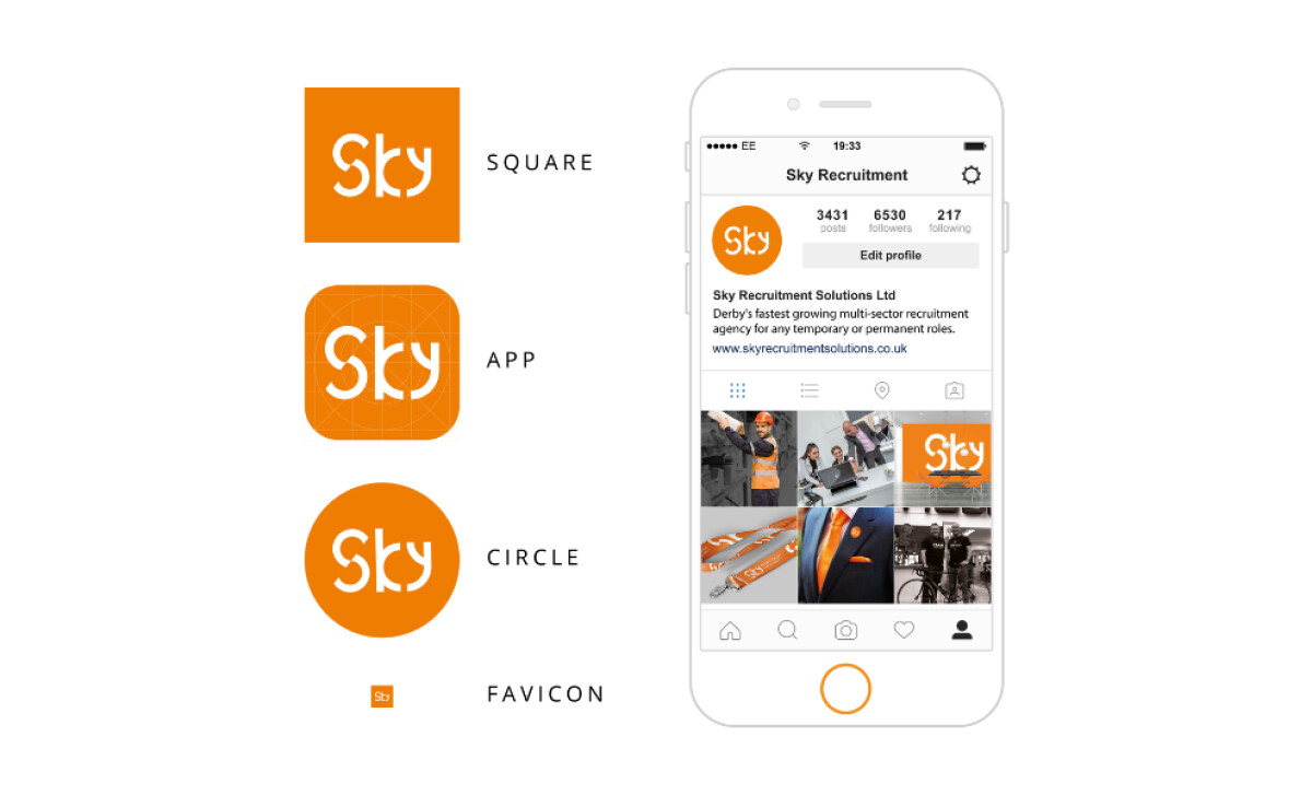
The logo system includes responsive formats optimized for square, circle, app icon, and favicon usage — demonstrating a clear focus on digital scalability and social visibility. Whether viewed in a browser tab or on a mobile screen, the logo remains legible and iconic, ensuring strong brand cohesion.
The rebranding of Sky Recruitment Solutions’ professional services website reflects a confident leap forward — swapping formality for a digitally-optimized, community-first identity. From its playful typography to bold color and digital adaptability, the new logo amplifies the company's regional pride and modern ethos.