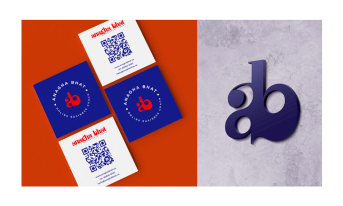
Standout features:
- A unique use of abstract icons
- Calm and collected feel
- Harmony of visual elements
This is an excellent example of an abstract logo working well without confusing its target audience. Many avoid such logo design styles because they fear getting lost in a sea of quirky-looking ones.
When done right, an abstract logo will work perfectly and make your brand more recognizable to the general public.
This logo design by BONB has employed various abstract icon elements, each showing relevance to the company.
They also used blue and black, which are great because blue means peace while black signifies stability. This simple color story lets people know they are a stable company, able to give their clients peace of mind.
Get a chance to become the next Design Award winner.
SUBMIT YOUR DESIGN