Standout Features:
- Mellow vibe
- Feminine energy
- Personal empowerment symbolism
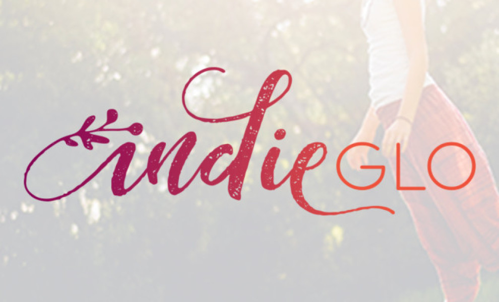
IndieGlo is a brand that encompasses health coaching, yoga lessons, and cooking. Let Her Fly had a difficult job of presenting all of these within a single brand design. The idea was to give IndieGlo an unconventional, fresh look and downplay the brand’s uniqueness.
The logo design consists of a single-word logotype written in two styles. The “Indie” is written in cursive purple gradient, and the “glo” is written in a simple orange sans serif. This color palette gives off a mellow vibe with strong feminine energy. It seems nurturing but powerful and serious.
The color choice was based on beet and green. Together, these colors symbolize strength, warmth, action, balance, and restoration. So, the gradient helps indicate the personal growth and stability that the brand stands behind. The orange part depicts the energy the change requires and the exotic, unknown part of the journey to change.