- Agency: Chance
- Client: Kalon Sports
- Category: Logo Design — Sports & Leisure Logo
- Location: Córdoba, Argentina
- Project Brief: Design a logo that reflects Kalon Sports’ commitment to expert-curated athletic products through a timeless identity focused on trust, performance, and credibility.
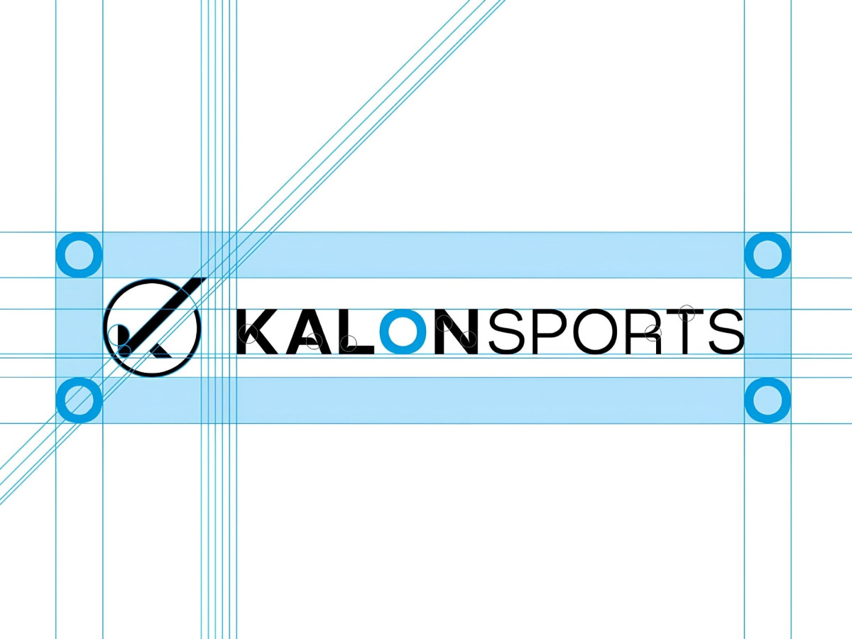
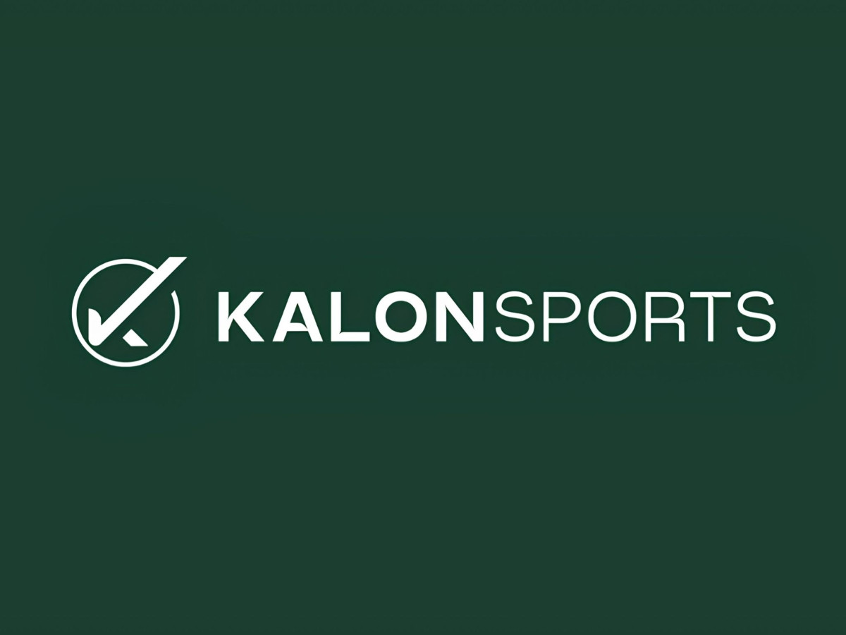
The best sports and leisure logos skip the mascot and the motion lines and just tell you the brand is legitimate. Kalon Sports does that by fusing a stylized K with a checkmark, so the symbol reads as approval before it reads as a letter.
The construction holds up under scrutiny. The grid shows tight, deliberate spacing between the mark and the wordmark, with the diagonal stroke of the K doubling as the check's upward sweep, a detail that only works because the geometry was built with real precision.
The color system stays disciplined across applications. A deep forest green anchors the tote bag and social profile, giving the brand a grounded, technical feel closer to outdoor gear than a typical sports logo heavy on red and black.
The wordmark pairs a bold KALON with a lighter SPORTS, letting the brand name lead while the descriptor stays quiet. For an identity meant to signal expert judgment over hype, a mark this restrained earns the trust it's built to project.