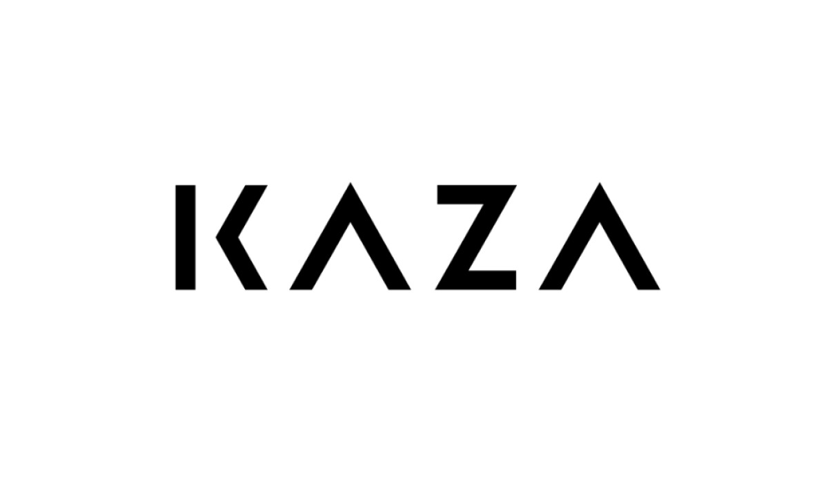
Standout Features:
- Clever negative space "A" design
- Bold, simple, and geometric typography
- Minimalist monochrome color palette
Whether it's making your home beautiful or designing a functional office, Kaza Interior covers it all, including architecture. Designmind developed their logo to mirror their elegant and simple design approach. The use of negative space is a key feature, highlighting their expertise in creating visually pleasing and smart spaces for you.
This logo’s most creative feature is how it uses negative space. The letter "As" in "KAZA" lack a crossbar and the letter “K” is halved by space. It’s a simple but very effective trick to make the letters interesting yet still legible. You get a sense of Kaza Interior’s clever and sophisticated approach to making spaces both beautiful and functional.
Supporting the negative space element is the logo's bold and simple typography. The letters of "KAZA" are crafted in a clean, geometric sans-serif style. This not only makes the logo highly readable for you but also gives it a solid, modern appearance that speaks to Kaza's design expertise.
The monochrome colors — mostly black and white — are a deliberate choice for the Kaza Interior logo. This keeps the design feeling uncluttered and modern. It ensures that the negative space feature and the bold typography are what you notice first. This also makes the logo very adaptable for different uses.
Essentially, the Kaza Interior logo by Designmind is both visually engaging and full of meaning. The use of negative space to form the "A," combined with bold, clean text and a simple color scheme, creates a lasting impression. It clearly tells you that Kaza brings a modern, thoughtful, and elegant approach to design.