Standout Features:
- Futuristic logo aesthetic
- Neon + dark theme
- Wide font style
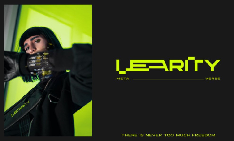
More than a cryptocurrency coin or token, LEARITY is a metaverse. It’s a virtual space, a crypto world where everything and everyone is connected and can interact with each other.
With that value proposition, Rocketman Studio created a logo infused with futuristic themes – the perfect aesthetic for an innovative and revolutionary brand!
The logotype is written in a cyborg-inspired typeface reminiscent of those texts and visuals you’d typically see in science fiction illustrations.
The intertwined letters also add an extra layer of edginess and grit that shows the brand’s strong visual identity. Despite the overlapping characters, the brand name is still quite legible, thanks to the wide font style.
The logo comes in bright green, and under a dark theme, it pops! Integrating this neon and glow-in-the-dark visual element into the logo elevates the whole aesthetic and is very much in line with the brand’s futuristic visuals.