Standout Features:
- Custom interlocking letterform
- Bold geometric sans-serif typeface
- Flexible and adaptable color system
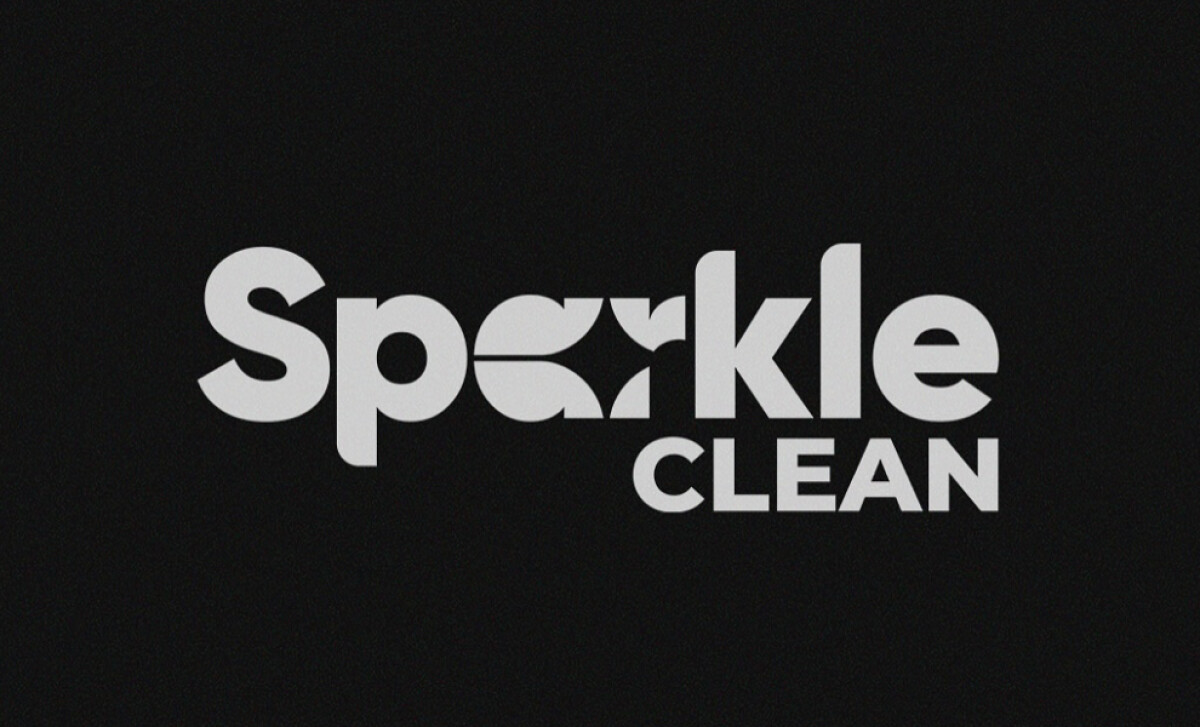
We are looking at a logo that has an icon embedded right inside the wordmark. This inventive approach makes the brand stand out.
It immediately communicates that Sparkle Clean is a company that values creativity and a polished final result.
This smart typographic trick does multiple things at once. Firstly, the curved negative space mimics a sparkle.
It also introduces the idea of reflection and polish, and this unique typographic element is a powerful tool, as research confirms that unique typography contributes significantly to brand recognition.
The geometric structure of the font aligns with ideas of precision and reliability. These are important concepts for a cleaning company to communicate.
Plus, the uniform stroke weight makes the lettermark logo design feel orderly and professional, which helps to build customer trust.
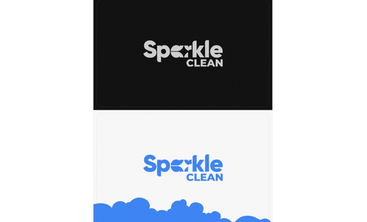
The fact that the logo works so well as a simple one-color mark is a testament to its strong design.
But, it's also adaptable when filled with other colors, such as its blue version. Its simplicity is what ensures the brand is always clear and identifiable in any environment.
Cayweb's logo successfully balances a distinctive look with a disciplined design. The key lesson here is that a small, clever detail — like a custom ligature — can make a brand memorable. It’sa great example of smart, conceptual branding.
Making your brand memorable doesn't always require a big, complex design; sometimes a single, smart detail is all you need.
That's why brands turn to expert partners, and our team has ranked the best agencies worldwide to make finding them simple.
Visit our Agency Directory for the Top Logo Design Companies, as well as:
Our design experts also recognize the most innovative design projects across the globe. Visit our Awards section to see the best & latest in logo design.


