- Agency: Luminous Design
- Client: KOITA
- Category: Logo Design — Bakery
- Location: Agia Paraskevi, Greece
- Project Brief: Create a logo and visual identity for KOITA that brings its artisanal bakery and contemporary dining bar together through a slanted wordmark, expressive lettering, playful graphics, and a flexible system across physical and digital touchpoints.
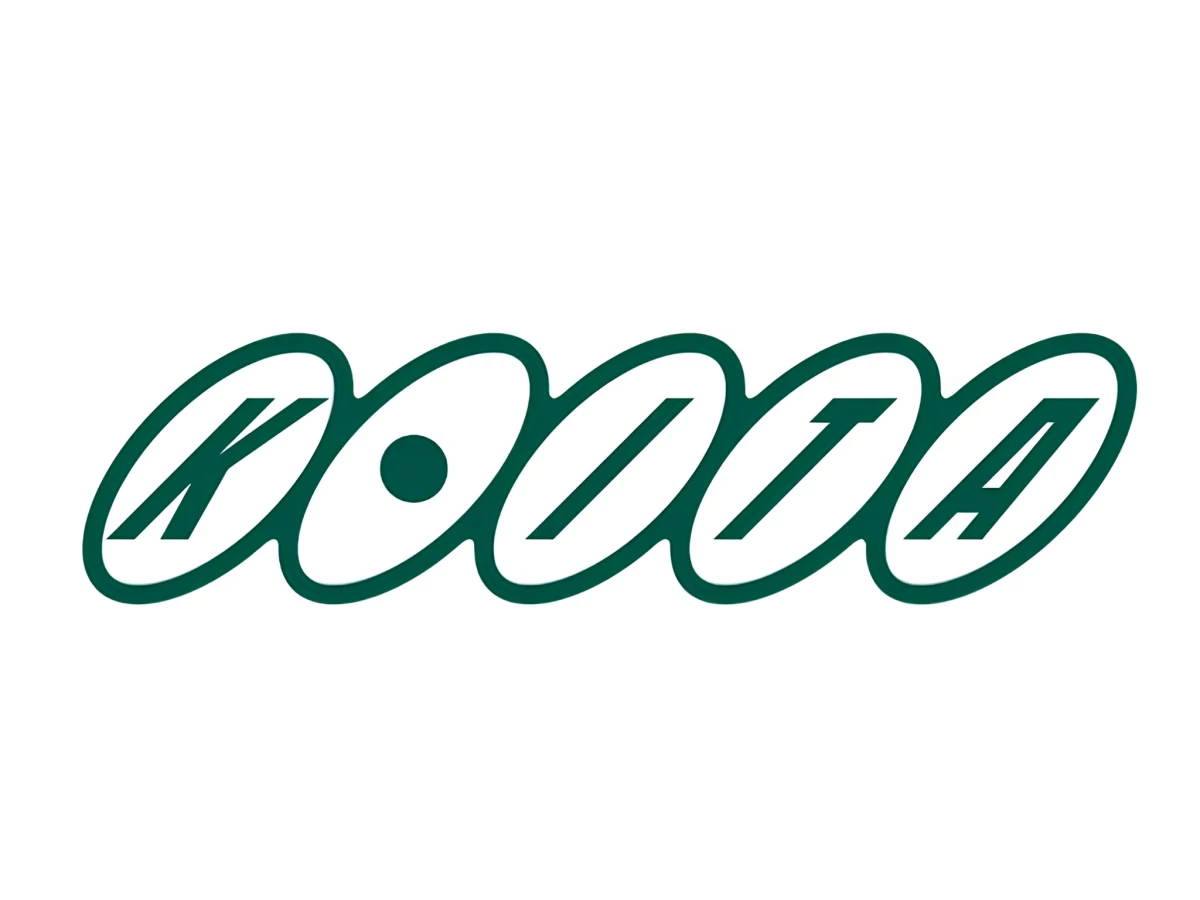
A bakery logo can set the mood for a whole day when the venue serves matcha at breakfast and cocktails after dark. KOITA, a Greek microbakery and dining bar named after the word for “look,” got a wordmark from Luminous Design that seems to watch you back.
Five slanted ovals link into a single chain, each holding one italic capital in deep bottle green. The O swaps its letterform for a solid dot, so it reads as a pupil peering out from the row.
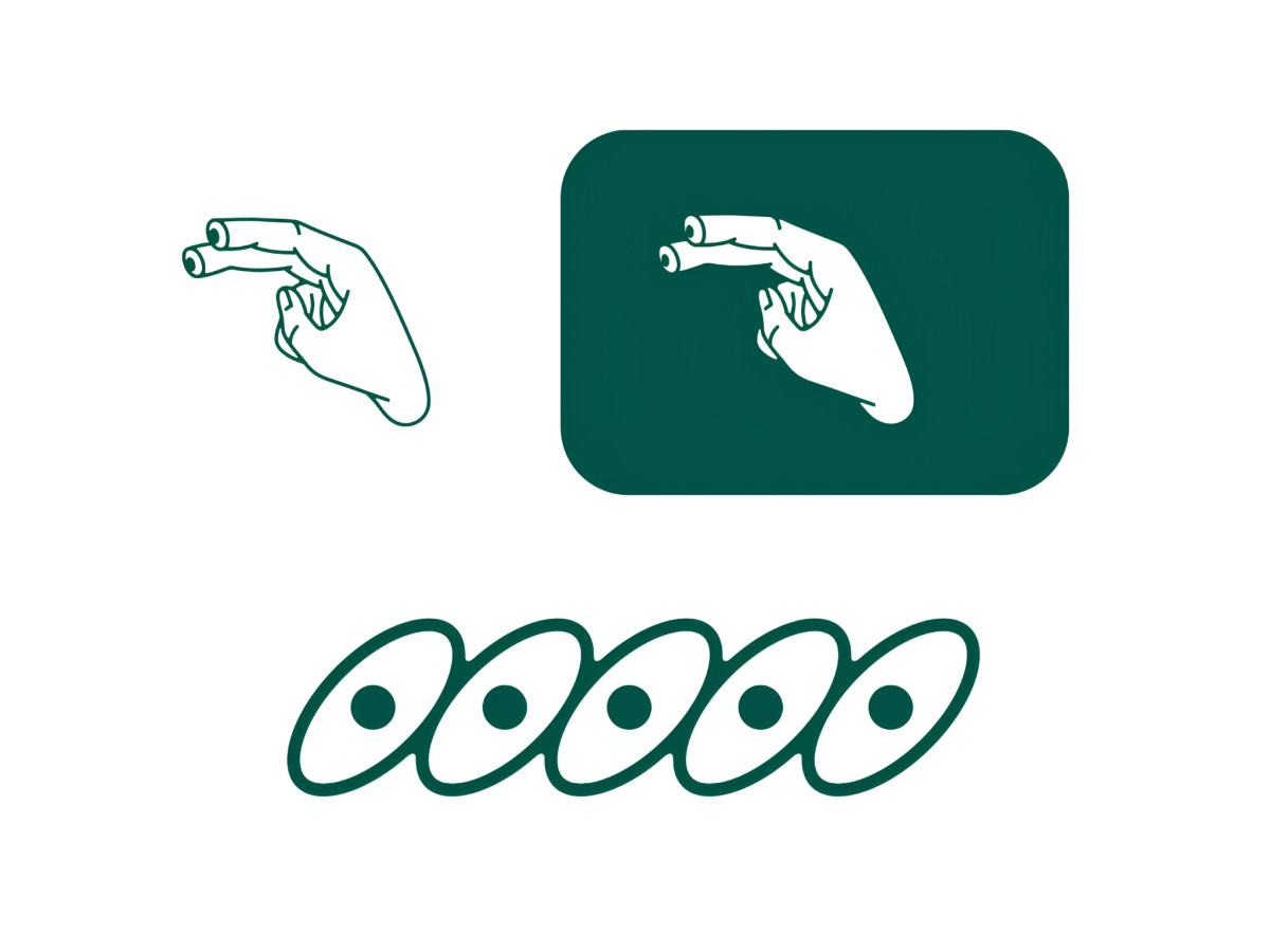
Strip the letters out and the ovals turn into a line of five open eyes, a pattern that works as a border or a stamp. An illustrated hand adds a cheeky gag, with tiny eyes drawn on its two outstretched fingertips.
On takeaway cups, the green-and-white palette flips from one surface to the next. Green cups carry the sideways wordmark or the pointing hand in white, while white cups get a single pair of green eyes near the rim.