Standout Features:
- Simple and streamlined wordmark
- A futuristic typeface with lowercase letters
- Neutral colors
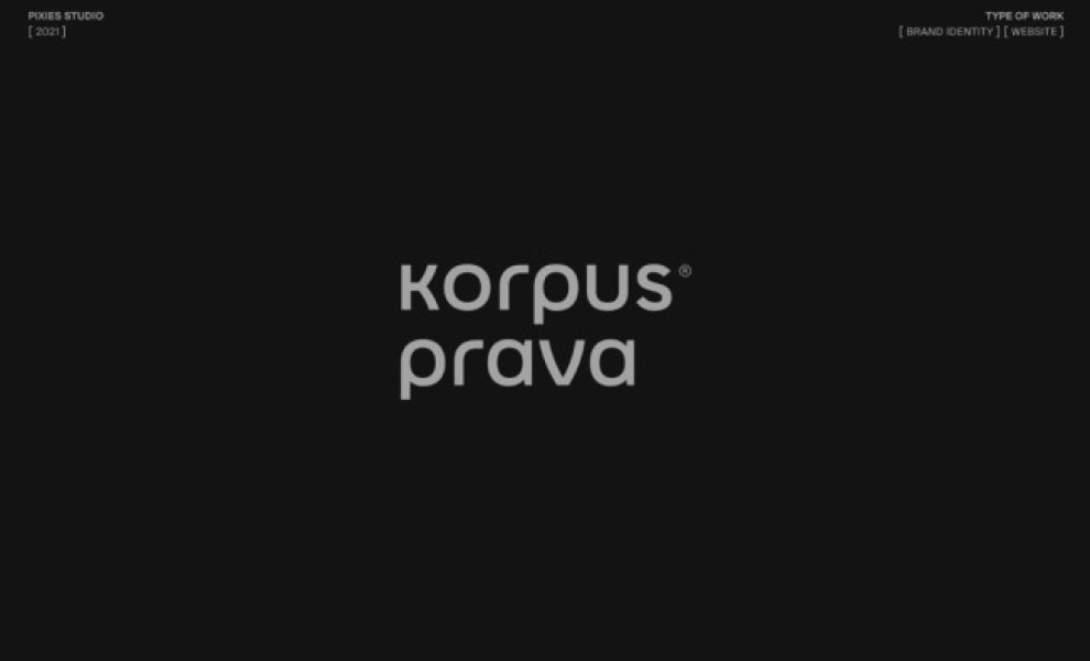
If you’re into modernizing traditional images like the Lady Justice and Roman warriors, you’ll definitely get inspired by this branding design for Korpus Prava by Pixies Studio.
These ancient images have been reworked as flat icons representing the law firm’s services – a style choice just as smart and contemporary as the logo!
It features a simple layout of the brand name, written in a futuristic sans-serif font that looks clean, sharp, and streamlined. The designers used lowercase letters for the wordmark, a great design trick to elevate and modernize your brand.
Neutral colors like black, white, and gray dominate the brand theme, adding an extra touch of sophistication and a cutting-edge look to the overall visual language.
Even without showcasing a lot of visuals and a spectrum of colors, Korpus Prava’s logo still manages to wow the crowd!


-preview.jpg)