Insurance company Munich RE's logo design embodies stability, trust, and professionalism through a sleek cubic diamond emblem, a commanding monochromatic color scheme, and clean, modern typography. Together, these elements create a powerful visual identity that speaks to the company's expertise and dependability in the global insurance industry.
Key Insights for Brands:
- Adding geometric shapes to your logo conveys precision and order
- Monochromatic colors contribute to your logo's longevity and adaptability across various platforms
- Using clean, straightforward typography communicates your brand's professionalism
Munich RE Reflects Stability and Trust With Sleek and Timeless Logo Design
Munich RE, one of the leading reinsurers, boasts a logo that combines simplicity and symbolism to convey a commitment to trust, stability, and partnership. Crafted in 1973 by well-known designer Anton Stankowski, the logo design showcases a cubic diamond intersected by horizontal lines and a clean sans-serif font. All these design elements are rendered in a commanding navy blue color.
Its minimalist design, crafted with geometric accuracy, typographic boldness, and monochromatic unambiguity, is a solid foundation for the Munich RE identity. It is timeless and highly recognizable — synonymous with professionalism and dependability.
The Logo Features a Cubic-Shaped Diamond Emblem That Embodies Precision and Expertise
-desktop.jpg)
The cubic-shaped diamond at the core of the Munich RE logo symbolizes meaningful values such as interconnectedness, assurance, and differentiation. Geometric shapes, utilized in some of the best logo designs, to exude precision and order, mirror the company's dedication to expertise and stability within the insurance industry.
The lines within the diamond mirror the exchanges and relationships Munich RE has fostered over the years. Their sharp edges evoke authority and sophistication while reinforcing the brand's enduring legacy, a common trait among abstract logo designs.
The Munich RE Logo Instills Security and Professionalism With a Monochromatic Color Story

The Munich RE logo uses a color palette designed to instill confidence. The deep blue shade, coded as #00538A, is associated with respectability and security – qualities essential to the insurance industry. This shade also reinforces the logo's firmness, assuring clients that their assets are safe in dependable hands.
Often seen in impressive works of top-notch logo designers, using one hue emphasizes simplicity and a clean aesthetic that exudes authority. It also adds a timeless quality to the logo, ensuring its longevity and adaptability across various platforms.
Munich RE Combines Clarity and Personality Through Straightforward Typography
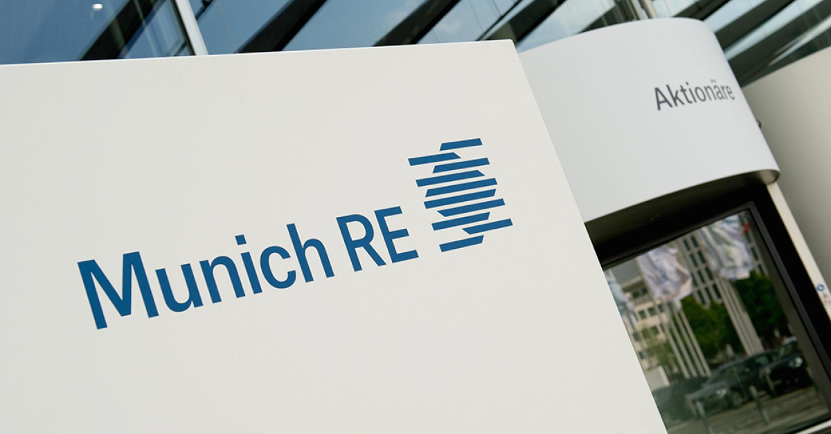
The sans-serif typeface Tablet Gothic Narrow Semi Bold significantly enhances clarity and presence. Primarily designed for publication titling, this typeface balances readability and distinct personality. Its modern, straightforward structure exudes professionalism, while its clean lines allow the logo to stand out without overwhelming the eyes.
Combined, the cubic diamond, monochromatic color palette, and sleek typography work harmoniously. These elements create a memorable brand identity that personifies MunichRE's reliability and industry expertise.