Team Behind the Design
Logo Design Analysis
In legal and insurance logo design, I pay close attention to concept clarity, typography, scalability, and how the mark behaves in real use.
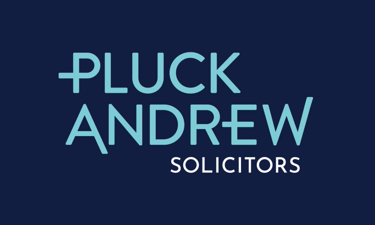
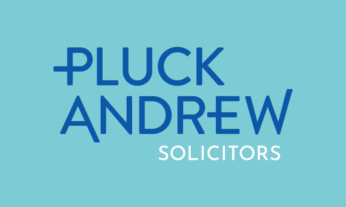
AS Partners’ redesign for Pluck Andrew Solicitors brings a contemporary edge to a long-established practice, using distinct type choices and a steady, warm palette to signal trust without losing the firm’s heritage.
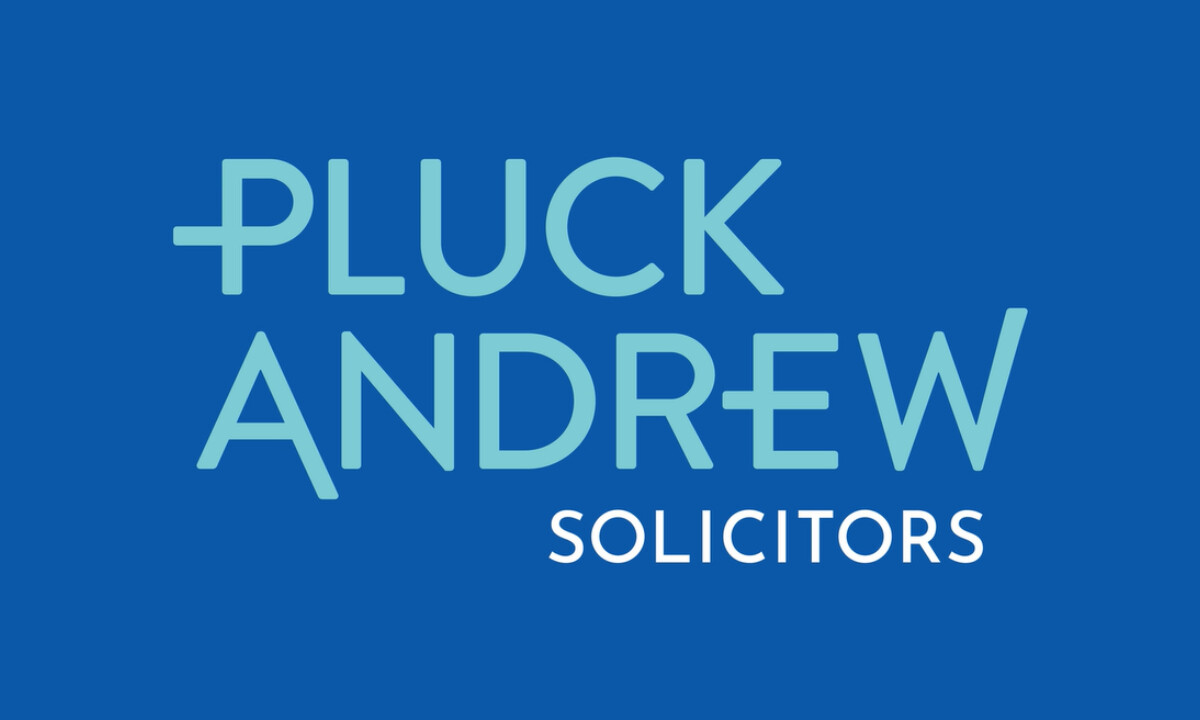
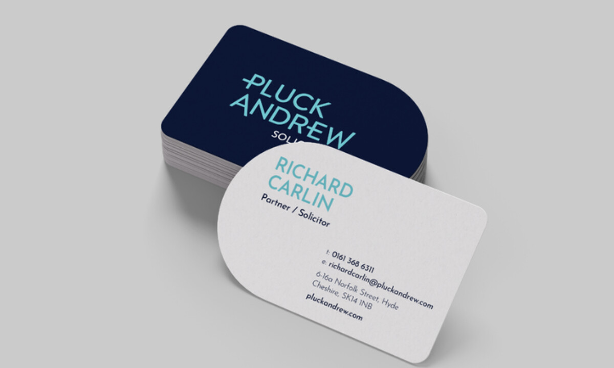
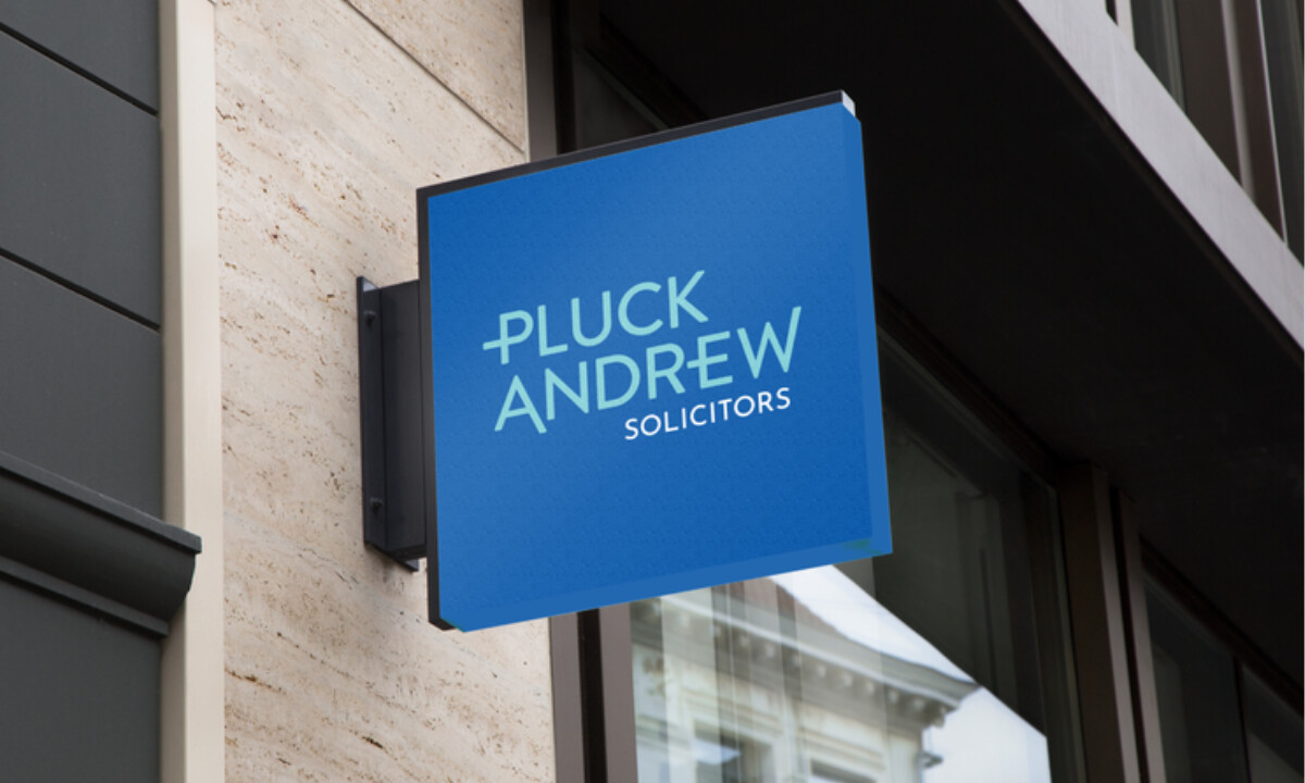
- Concept & Symbol: The custom “P” at the start of the wordmark works as the clearest focal point, and I appreciate how its horizontal bar reaches left to form a gentle hook. It gives the logo its own signature shape without falling back on literal legal symbols, which keeps the identity fresh.
- Typography & Tone: The geometric sans-serif type gives the name a steady, modern feel. I like how the lighter “SOLICITORS” line eases the hierarchy and keeps the tone open rather than stiff. It reads cleanly at a glance, which matters a lot in legal and insurance logo design.
- Color & Mood: The mix of deep navy, aqua, and mid-blue creates a calm blend of tradition and approachability. Navy brings weight, and aqua adds a softer lift. I like how these three shades settle into a balanced rhythm that keeps the identity steady and easy to read.
- Applications & Touchpoints: The rounded business cards caught my eye first, since they soften the firm’s presence without drifting into anything too playful. I also like how the mark holds its voice across signage, stationery, and digital use. The geometry keeps everything steady.
What Brands & Agencies Can Learn from Pluck Andrew Solicitors
Here are a few key lessons from Pluck Andrew Solicitors’ logo redesign:
1. Prioritize Typographic Personality
Small adjustments to letterforms can create a signature look without extra symbols. This helps a brand stay minimal while building recognition.
2. Use Color to Balance Trust and Warmth
A tiered blue palette supports professionalism but still feels friendly. Smart tonal choices often help brands in formal sectors modernize effectively.
3. Build Consistency Across Touchpoints
Applying the identity cleanly across print, digital, and environmental uses strengthens recognition and supports long-term brand cohesion.
About DesignRush Featured Designs
At DesignRush, we spotlight agency projects that push creative boundaries. The designs we feature reflect expert execution and highlight the trends shaping branding today.
Some of these standout projects later earn recognition in the Monthly Design Awards.
Check out more standout work across categories:
- Best Logo Designs
- Best Website Designs
- Best App Designs
- Best Print Designs
- Best Packaging Designs
- Best Video Designs
For a full list of design agencies and related services, see our Agency Directory.