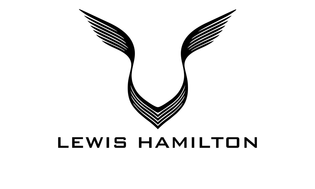
Stare at Lewis Hamilton's personal logo long enough and it refuses to settle. From one angle it reads as a pair of wings lifting off a central spine. From another it reads as the face of an animal, narrow at the snout and flared at the brow. Both stick. No one has walked either one back.
That gap is the interesting part. This is not two takes on the same picture. One reading is a bird. The other is a big cat. The metaphors point in opposite directions, and the people attaching them work from the same set of lines.
Most personal logos in sport are vanity marks: a monogram or a number. Hamilton's is rarer. It carries two incompatible explanations at once, both live, and the design stays abstract enough to hold them both.
Two Stories Behind One Mark
The panther story comes from the people who built it. Damon Gorrie, founder of the studio Safari Sundays, says his team created the mark for Hamilton in 2012 and based it on the panther, Hamilton's favorite animal.
Gorrie reads the cat's stealth and agility as a stand-in for Hamilton's driving and his style off the track, and describes the core mark as a panther coming out of the dark just before it strikes. By that account the upper forms are not wings at all. They sit above a face, and the lower V forms a muzzle.
The wings story is the one the public reached for on its own. Logo references such as 1000logos file Hamilton's mark next to the winged emblems of British marques such as Aston Martin and the Rolls-Royce Spirit of Ecstasy, reading it as a stylized V of raised wings that stands for speed and freedom.
That interpretation has spread far enough that design accounts now treat the panther origin as a reveal, a "you have been seeing it wrong" correction to the wings most people assumed.
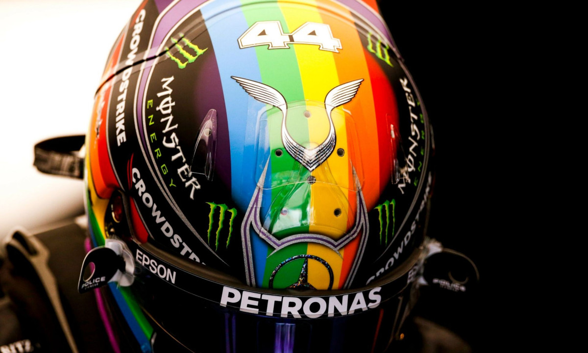
Both stories attach to the exact same lines. The number 44, Hamilton's racing number, travels with the mark across helmets, merchandise and memorabilia.
What the Shape Is Actually Doing
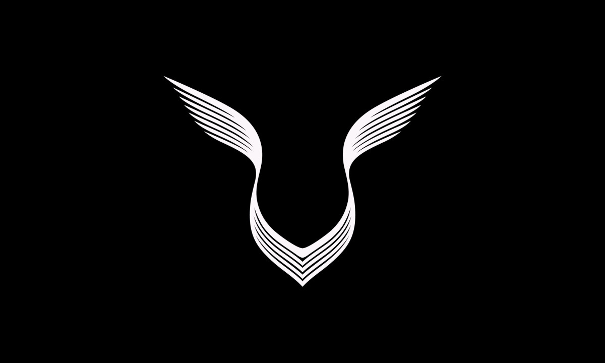
Look at the construction rather than the caption. The mark stacks strokes that taper as they travel outward, heavy where they meet at the center and thinning to fine points at the tips. The two upper forms sweep up and apart. The lower forms fold into a V and close at a single point. Negative space does as much work as the black ink.
That structure lets both stories hold. The upward sweep of the top strokes reads as flight, which feeds the wings interpretation. The same strokes, pulled into a central column with a defined low point, resolve into a brow and a muzzle, which feeds the panther interpretation. The line work looks feathered enough to suggest plumage and smooth enough to suggest fur.
The shape works because it stays vague. There's no eye, no beak, no claw, no feather drawn clearly enough to lock it to one thing. That vagueness is what makes it work.
The question worth asking is whether that marks a weakness or the entire point.
Ambiguity As the Strategy
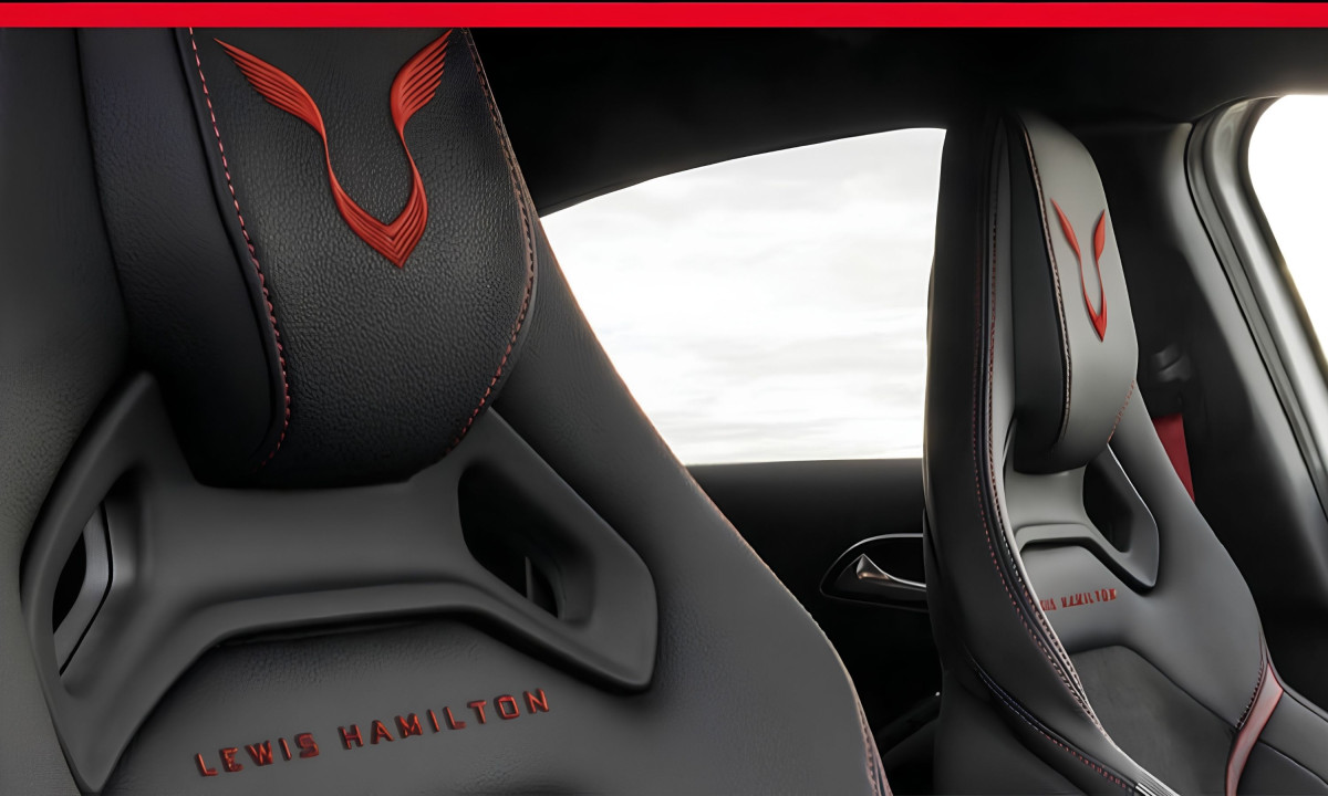
A personal logo carries a name, not a product. It has to ride on a helmet, a racing boot, a headrest and a phone case without breaking, and it has to mean roughly the same thing in each place.
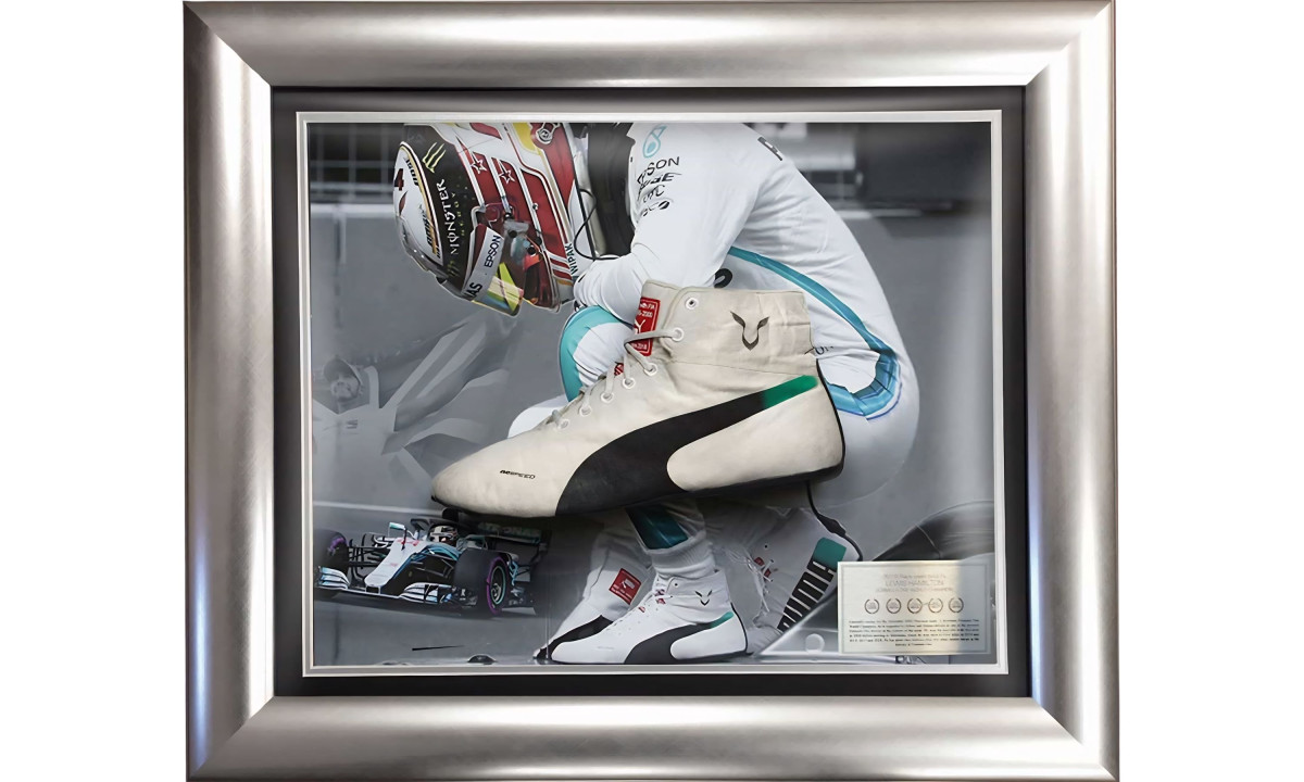
A mark tied to one literal creature would drag that creature's associations everywhere it went. An abstract mark drags very little. That's why Hamilton's logo works the same whether it's on a Pride-themed helmet, a scuffed racing boot, or a road car headrest: it doesn't commit to a scene, so the viewer fills in the meaning.
That flexibility is easy to mistake for emptiness. It is closer to range. The same lines absorb a stealth story and a flight story equally well, and no one has to redraw them to do it.
The Portability Test: Mercedes to Ferrari
This is where the mark faces its real test.
For more than a decade the logo lived inside a Mercedes-AMG Petronas world: silver and black, with teal accents, a brand register that reads as engineered and exact. Against that backdrop both the stealth-panther reading and the aerospace-wings reading made sense.
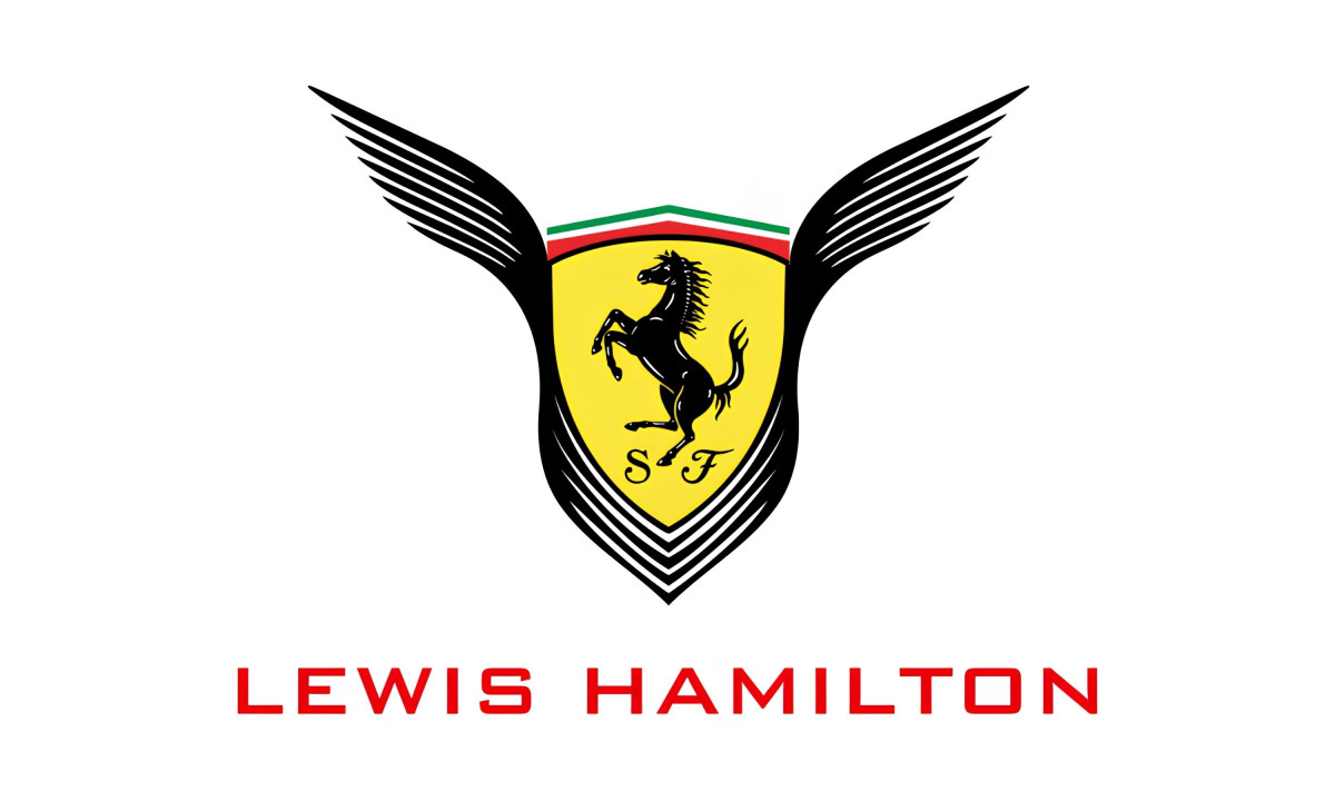
In 2025 Hamilton left Mercedes for Ferrari in one of the biggest driver moves in F1 history. The personal mark did not change. Its surroundings changed completely. Ferrari's identity runs on red and drama, on being seen, an Italian emotional register rather than a German engineering one.
So the open question is whether an abstract wings-or-panther mark reads the same against Ferrari red as it did against Mercedes silver. The stealth idea in particular sits strangely inside a brand that trades on being seen. A panther in the shadows is a hard sell next to a scarlet car built to pull every eye in the grandstand.
This is also where the abstraction pays off. Because the logo never tied itself to teal, to German restraint or to a literal animal, it carries no context-specific baggage into Maranello. It takes Ferrari red as readily as it sat in Mercedes silver. The quality that made it hard to pin down is the same quality that lets it travel.
The Early Verdict
Most personal logos in sport never face this test, because most athletes do not switch to a rival of this size at this level of visibility. Hamilton's first Ferrari season went rough by his standards, with no podiums across the year.
Then he won the Barcelona-Catalunya Grand Prix on June 14, his first victory in Ferrari red, beating George Russell and Lando Norris and ending Mercedes' winning streak this season. The same mark sat on the car through the slump and through the breakthrough, unchanged either way.
That says more about the strength of an ambiguous design than either origin story ever could. A logo that can read as wings in silver and a panther in red, and hold its meaning through a winless year and a landmark win alike, outlasts the question of which one it really is.

Our team ranks agencies worldwide to help you find a qualified partner. Visit our Agency Directory for the Top Logo Design Companies as well as: