Brazil wears five stars on its badge, the most of any football nation. But they did not appear until 1971, the season after its third World Cup win. Not in 1914, when the badge was born. Not in 1930, its first World Cup. Not even 1950, the year Brazil hosted and lost the final at the Maracanã. For 57 years, the badge made no reference to winning anything, which raises the question: what was it doing for those 57 years?
Changing, mostly. The Confederação Brasileira de Futebol badge has gone through more than 20 documented versions since 1914, more than almost any national football identity.
And yet it remains one of the most recognizable marks in the sport, not despite the revisions but because of what survives them. Here's a look at the Brazil football team's logo history and evolution.
1914–1916: The FBS Shield
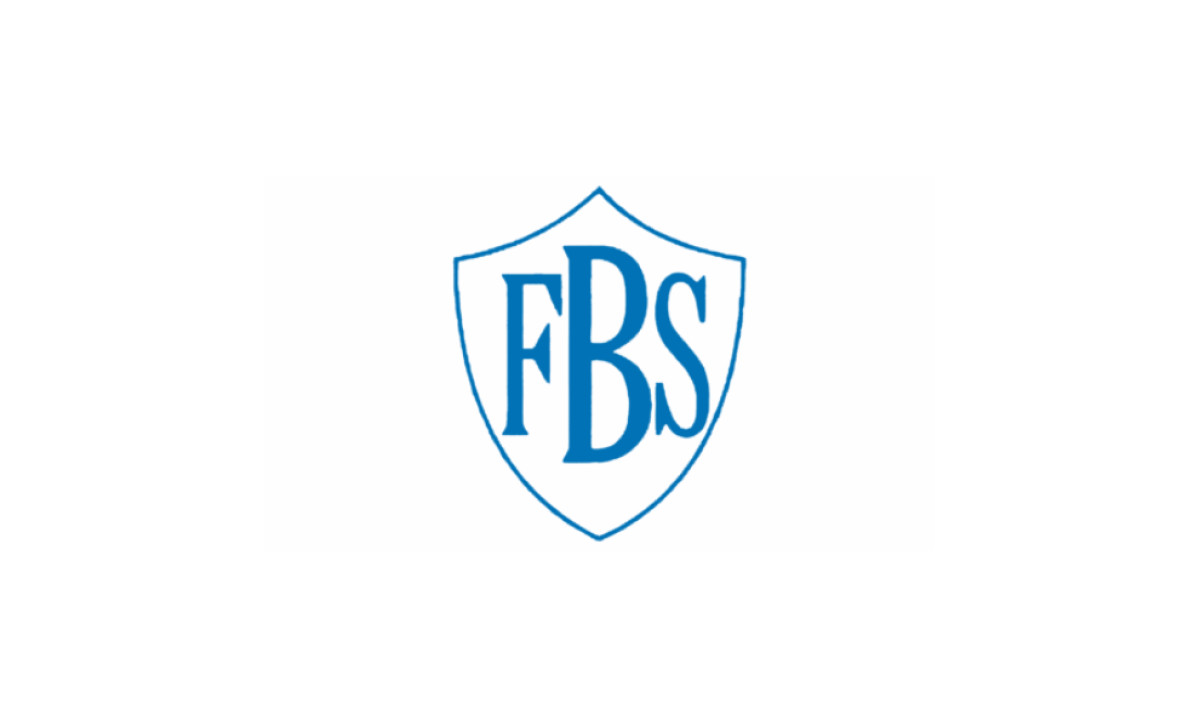
The governing body of Brazilian football began on June 8, 1914, as the Federação Brasileira de Sports, an organization that managed several sports at once. Its first badge is also its simplest: the blue serif letters "FBS" inside a white shield with a pointed base, trimmed by two inverted arcs across the top.
The letters were the whole design. No cross, no national palette, no symbolism.
Yet three things in this modest mark never left: the shield shape, the abbreviated organization name and the white-blue pairing. The pointed base survives unbroken from 1914 to 2026, the only element that has outlasted every redesign.
1916–1917: The Green and Yellow Arrive
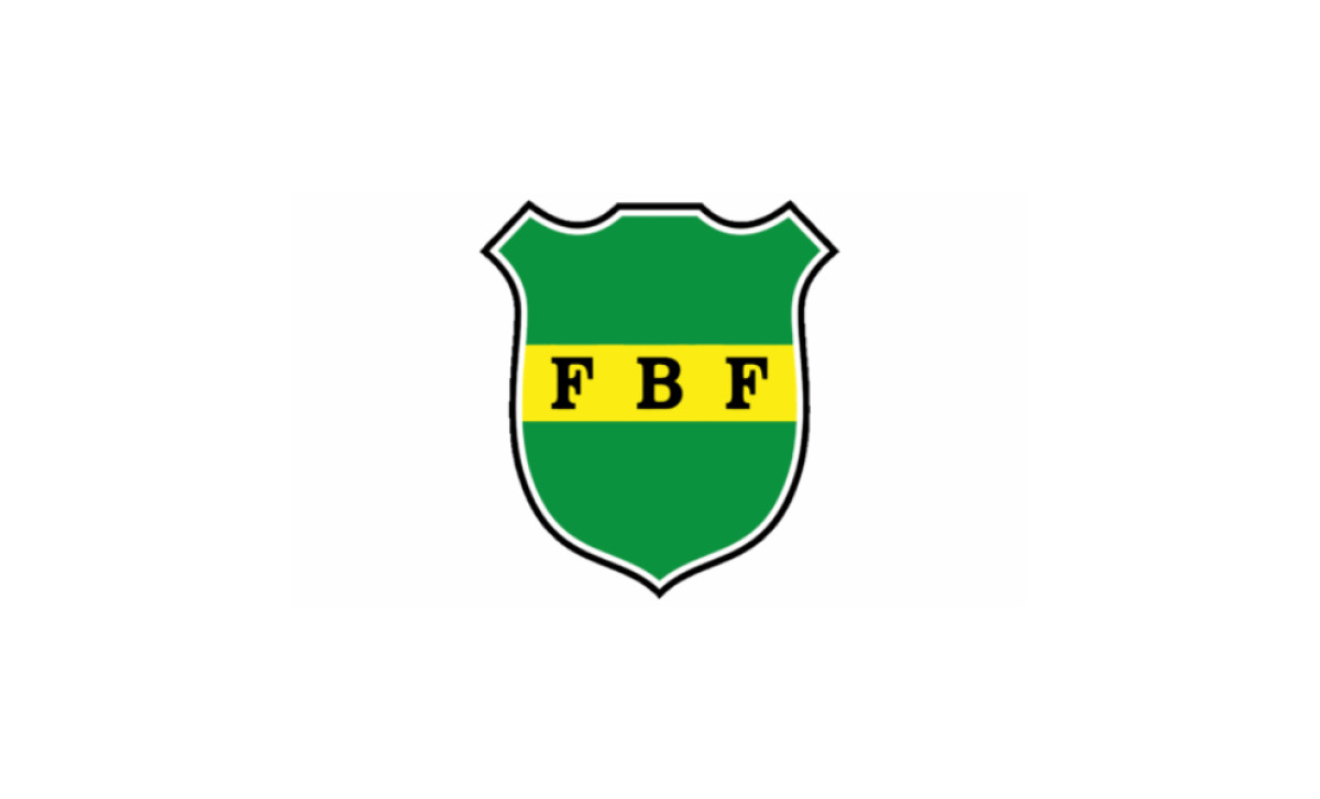
A name change to Federação Brasileira de Football brought the first real color decision. For just a couple of years, the badge was a green shield with a white and black outline, a gold stripe running through the middle and the black letters "FBF" inside it.
The palette took its cue from the Brazilian national flag, even if the shades did not match it exactly. The top edge sprouted two rectangular protrusions, a hard geometric experiment the organization abandoned almost immediately.
The shape did not stick. The green and gold did.
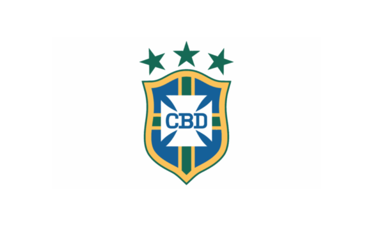
1917–1938: The Maltese Cross Lands
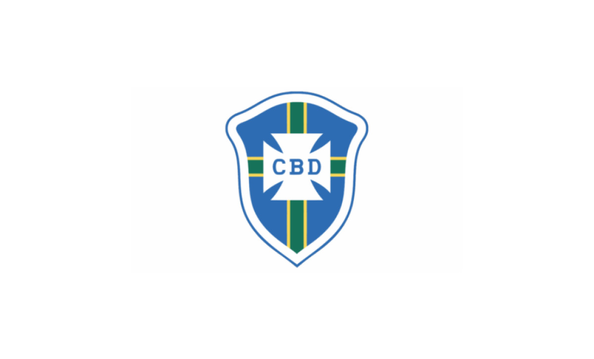
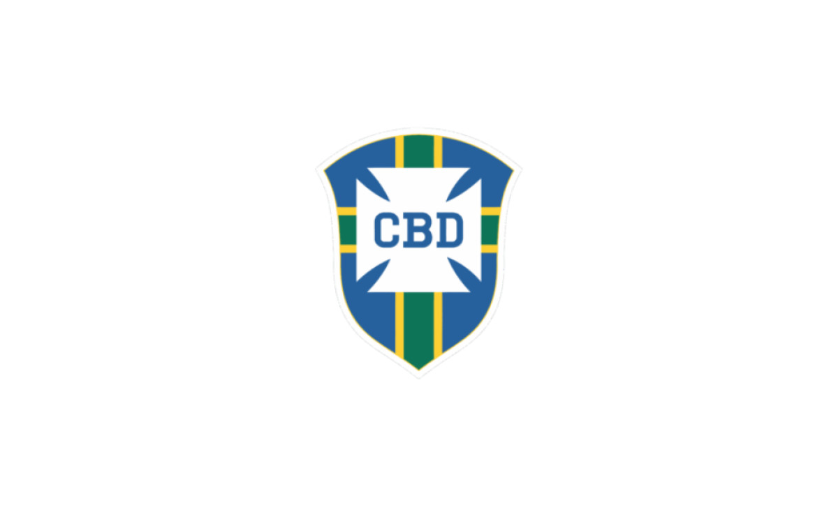
In 1917, under the new name Confederação Brasileira de Desportos, the badge gained its defining device: a white Maltese cross built from four trapezoids, carrying the letters "CBD" at its center. The design merged its two predecessors, taking the blue from the FBS shield and the gold and green from the FBF version.
The shield smoothed into rounded corners with a gentle dome at the top, the blue field split into quadrants by green stripes with yellow edges, all inside a wide white frame.
Every structural decision that matters in CBF logo evolution was made here. The next 54 years would be fidgeting.
1938–1950: A Bigger Cross
The shield lost its white and blue outer frame, and the central cross grew proportionally larger, pulling the "CBD" letters up with it. The result was cleaner and easier to read.
Brazil reached the 1938 World Cup semifinals and then hosted the 1950 tournament under this badge. The crest acknowledged neither, because there was nothing yet to acknowledge.
1950–1954: A Broader Shield
The update was almost imperceptible. The shield widened slightly and the central letters turned bolder, sharpening legibility from a distance, the one quality a sports emblem cannot do without.
This is the badge that watched the Maracanazo. It carried no scars from it.
1954–1958: The Burnt Orange Outline
The CBD tweaked the logo without touching its structure. The shield gained a burnt orange outline, and the cross compressed into a more square-like shape, narrowing the gaps between its arms and opening up more white field for even bolder lettering.
Here begins the badge's longest-running internal argument: does the centerpiece read as an open cross or a notched square? The question would flip back and forth for decades.
1958–1962: Gold Replaces Orange
The outline lightened from burnt orange to the same gold as the rest of the badge. The cross loosened, becoming less square-like, while the letters held their size.
Brazil won its first World Cup in Sweden under this version. According to Britannica's tournament record, it was the start of the most successful run in World Cup history. The badge said nothing about it.
1962–1966: A Lighter Silhouette
The top of the shield reverted toward the 1950 shape, and the lower half narrowed, with less pronounced curves on both sides. The effect was a lighter, more elegant design.
A second title arrived in Chile in 1962. Still no stars.
1966–1968: Rounded Corners
The shield shape returned to the 1958 version. The sharp angles of the white cross were rounded and its sides straightened, while new letter spacing put more air into the typography.
Compare this restraint to a club like Liverpool, whose crest accumulated commemorative elements decade by decade. Brazil's badge stayed silent about success until silence became impossible.
1968–1971: Back to 1954
The burnt orange outline returned, though this was no exact copy of the 1954 mark. The cross corners sharpened again, trading rounded edges for hard angles and gentle curves, and the whole composition read broader and heavier.
It was the last badge of the pre-star era. The team that wore it in Mexico in 1970 made sure of that.
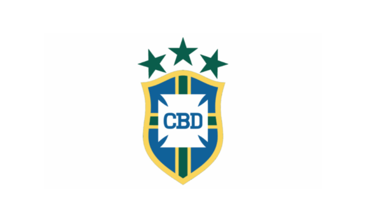
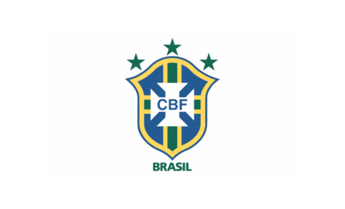
1971–1976: The Stars Arrive
Every update between 1938 and 1968 was subtle. The 1971 modification was not.
Three green five-pointed stars appeared at the top of the emblem, one each for Sweden 1958, Chile 1962 and Mexico 1970. The win in Mexico made Brazil the first three-time champion, and FIFA awarded the Jules Rimet Trophy to Brazil permanently as a result.
The stars forced everything below them to change. The shield's elements grew broader and heavier to stay visible inside the new proportions, and the gaps between the cross arms narrowed until the centerpiece resembled a square with notched corners.
From this point on, every significant redesign organizes itself around the stars: where they sit, how large they run and how they relate to the cross below. The cross identifies the institution. The stars keep score.
1976–1980: Room to Breathe
The badge widened, giving the three stars more breathing space, and a thin blue outline appeared around the existing gold one. The white cross picked up a couple of minor shape adjustments.
Small moves. The big one was coming.
1980–1985: The Jules Rimet Shield and the Coffee Grain
In 1980, following the 1979 adoption of the current name, Confederação Brasileira de Futebol, the organization threw out the entire visual system. The new centerpiece was the Jules Rimet Trophy itself, rendered in gold on a solid blue shield set inside a white and blue two-stripe frame, with "CBF" in white above and "Brasil" in green below.
The Maltese cross was gone. So were the quadrant stripes, the stars and 63 years of accumulated structure.
Then it got stranger. The badge in this era carried the mark of the team's sponsor, Café do Brasil, a small circle with coffee beans under green leaves, worn on national team shirts in 1981 and 1982. For roughly two years, the most decorated football nation on earth played with a coffee advertisement inside its crest.
The episode is funny, and it is also diagnostic. Before the sports marketing era took hold in the 1980s, nobody treated the badge as a protected brand asset. It was embroidery the federation could rent out. The same decade taught federations and clubs everywhere, from Arsenal to Barcelona, that a crest was commercial infrastructure worth governing carefully.
1985–1991: The Coffee Comes Off
In 1985 the Café do Brasil mark was removed from the shield, likely because FIFA prohibited sponsorship emblems on national team jerseys. Fan backlash played its part too, with FIFA president João Havelange reportedly forcing the removal.
The shield's structure and palette were otherwise untouched. The trophy stayed at the center even after thieves stole the actual Jules Rimet Trophy from CBF headquarters in Rio de Janeiro in 1983, never to be recovered. For its final years, the badge displayed an object the federation no longer possessed.
1992: The One-Star Futsal Badge
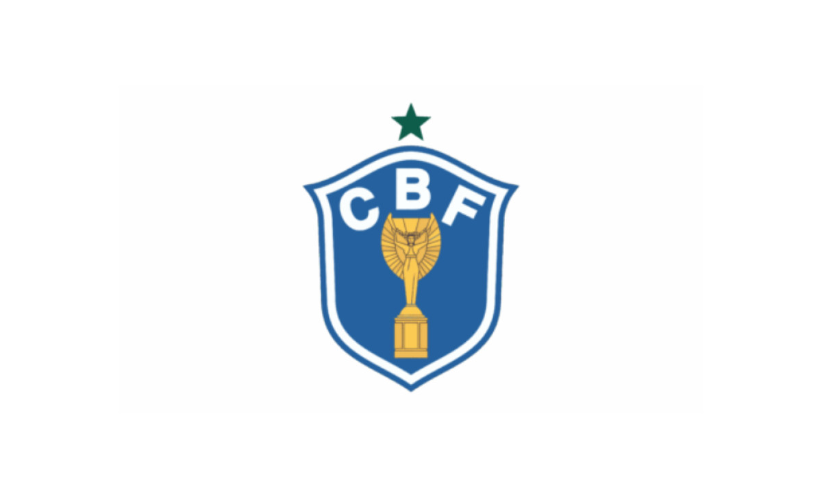
For the 1992 FIFA Futsal World Cup, the CBF modified its identity with a curious one-off: a single star instead of three. It marked Brazil's lone futsal world title, won at the only edition of that tournament held before then.
One star carrying a perfect record. For one tournament, the lone futsal star said more than the three on the main badge.
1991–1994: The Architecture Returns
The Jules Rimet shield was replaced by a design close to the pre-1980 identity: green and yellow quadrant stripes, blue field, pointed shield, three stars and the white Maltese cross, now lettered "CBF." It was not an exact copy of any earlier version, with the cross shape noticeably altered, its arms reading like two crossed spools of thread.
The trophy badge had lasted about a decade. The cross badge had history, and history won.
The return proves the central argument of the whole Brazil football badge story. The federation can change everything for ten years and the identity survives, because the identity lives in the structural rules, not in any single rendering.
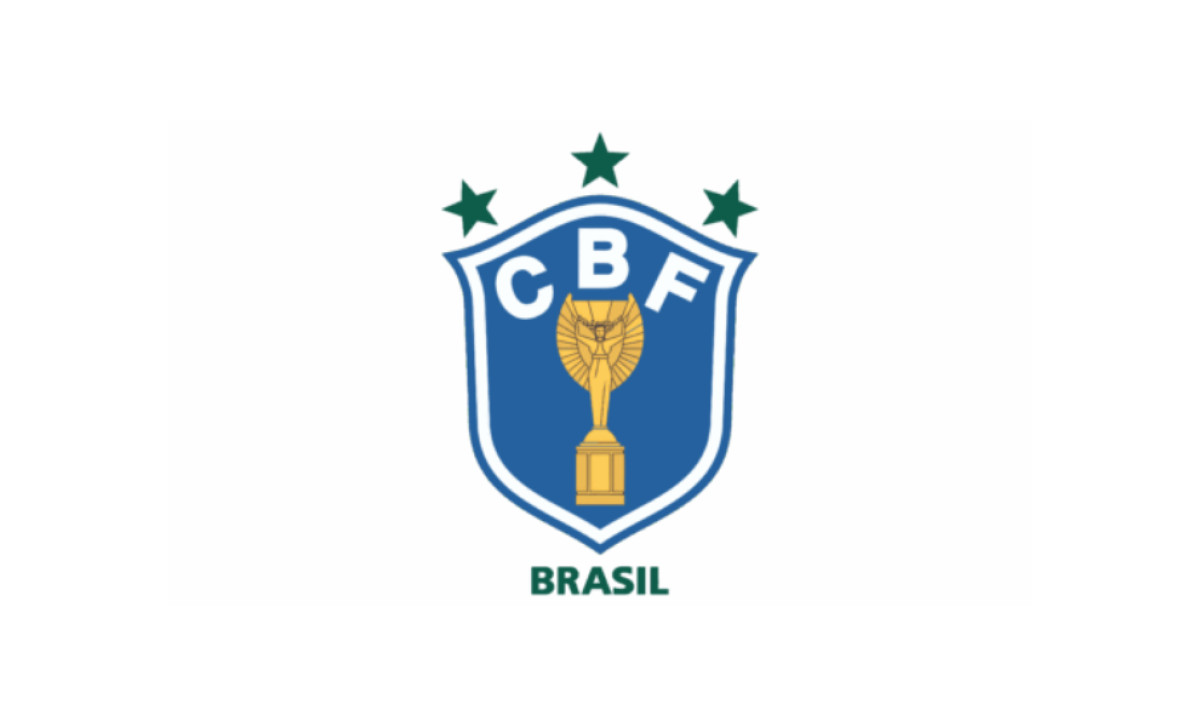
1994–1999: The Fourth Star
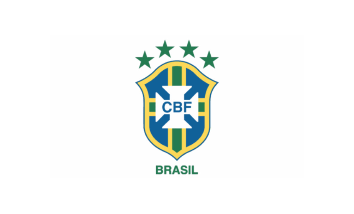
Brazil ended a 24-year title drought in the United States in 1994, and a fourth star joined the arc above the shield. The cross corners were slightly rounded and the green lightened a touch.
The scoreboard was running again.
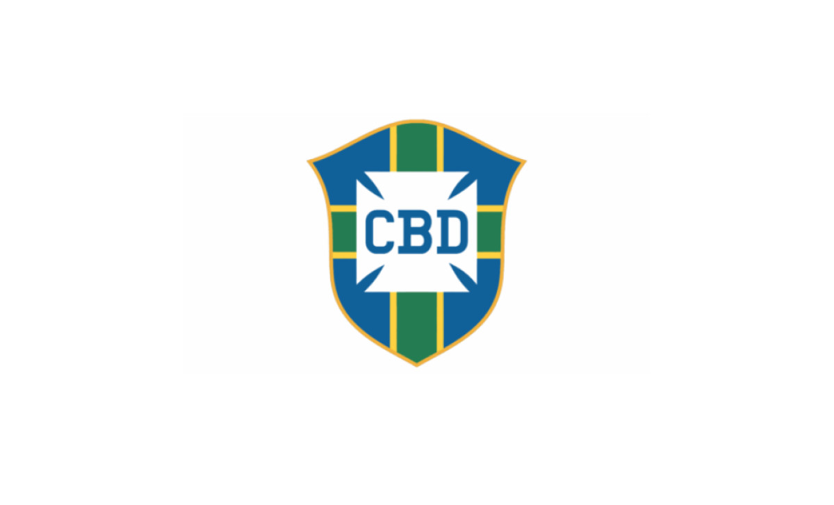
1999–2002: The Thick Blue Outline
The designers thickened the shield's blue outline considerably, a move with no obvious upside. The blue existed to make the gold outline pop, and a thin line already did that job, so the bolder version mostly stole space and crowded the letters.
Not every revision in a 110-year history is an improvement. This one reads like a draft that shipped.
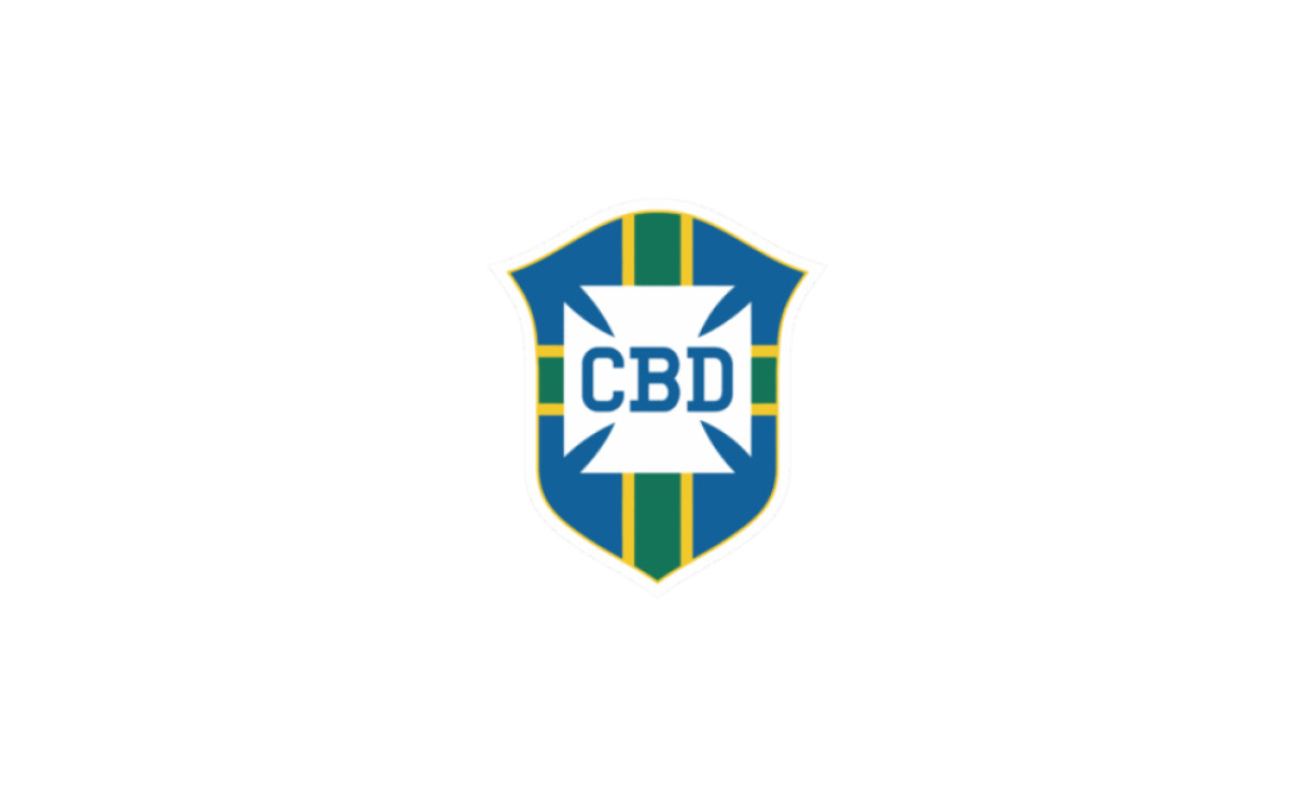
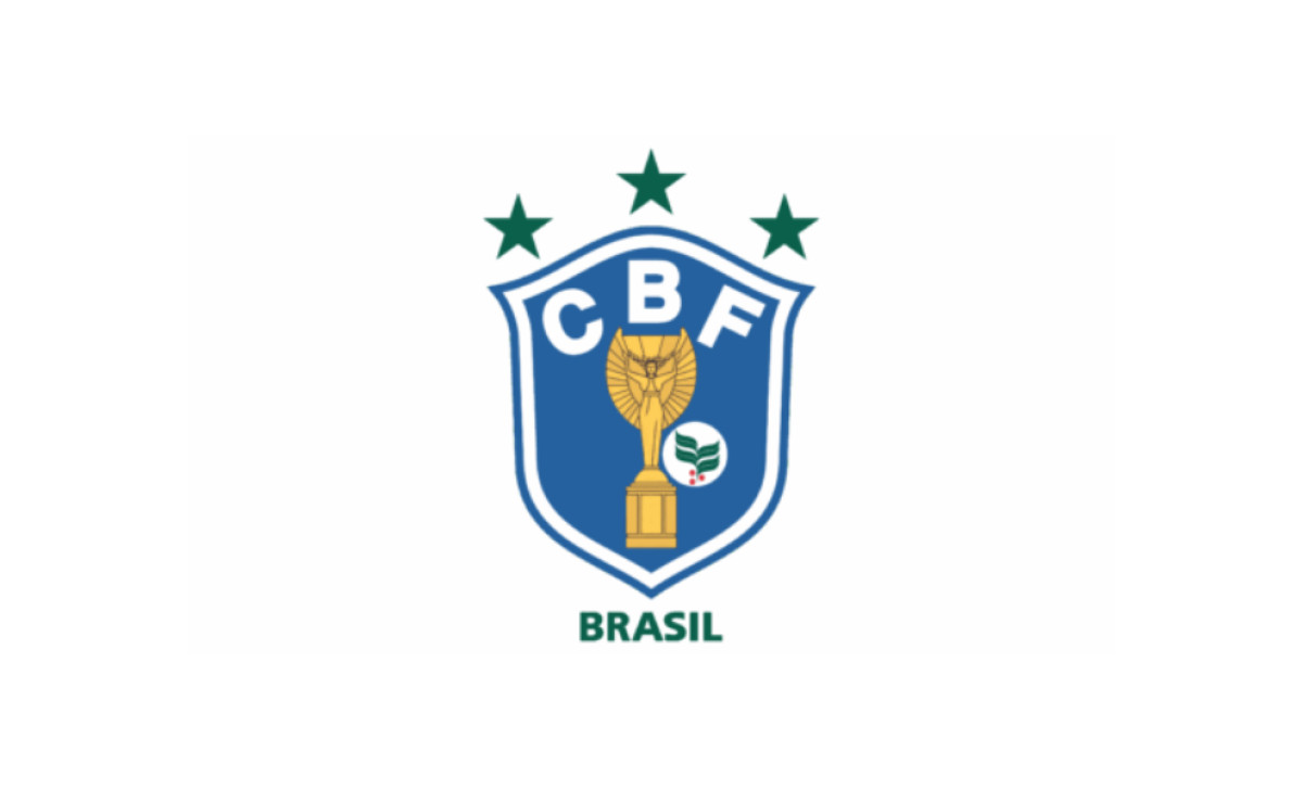
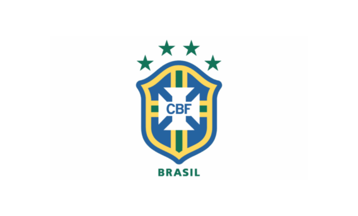
2002–2010: The Fifth Star
Brazil won its fifth title in Korea and Japan in 2002, and the fifth star completed the arc. The five championships of 1958, 1962, 1970, 1994 and 2002 remain the most by any nation.
The thick blue outline slimmed back down, brighter than the 1994 version but no longer crowding the composition. The shield also widened, echoing the 1992 proportions.
Five stars now stretch across the full crown of the badge, each roughly a tenth of its width, reading as a single curved row. The arc is the first thing the eye lands on, above the cross, above the letters. The stars do more visual work than any other element in the composition.
2010–2014: The Shadow Outline
Another outline appeared around the blue one, a reddish tone reminiscent of the old burnt orange, likely intended to add depth like a drop shadow.
The badge Brazil wore through the 7-1 home defeat to Germany in 2014 was, fittingly or not, its most overloaded in decades.
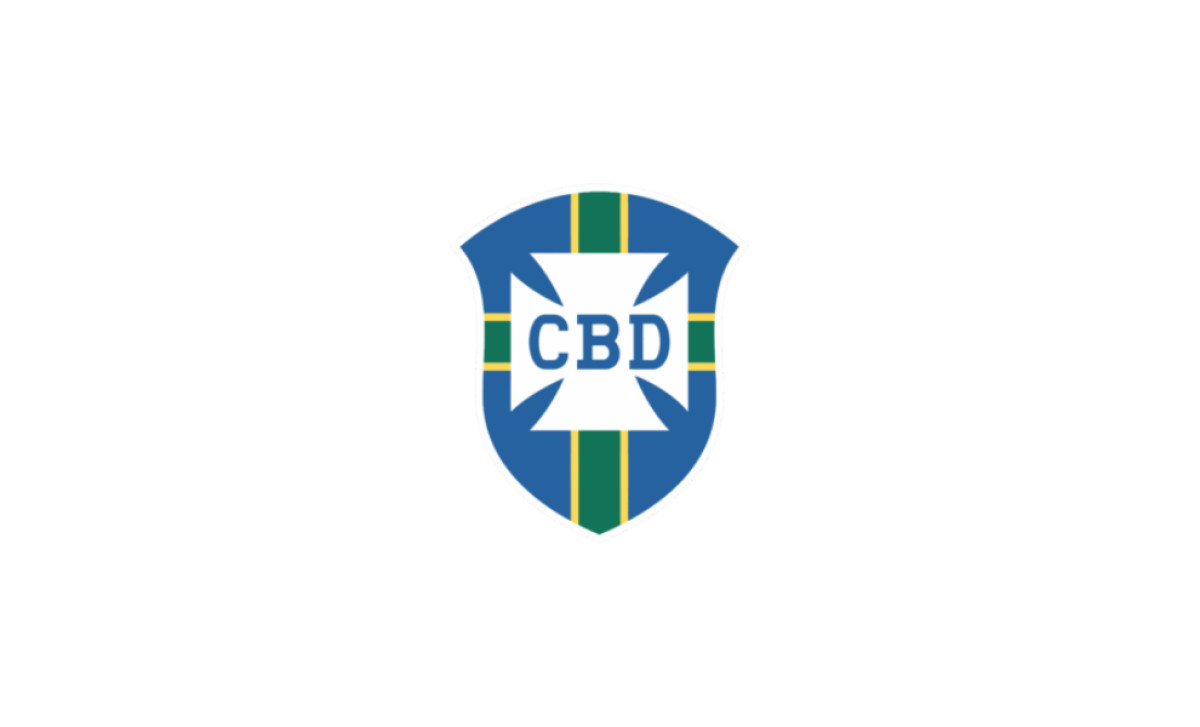
2014–2016: Darker and Cleaner
The outer outline came off, an easy improvement on a design drowning in borders. The whole palette darkened and saturated, giving the "CBF" letters more contrast.
Subtraction as strategy. It would not be the last time.
2016–2019: The Gold Lightens
The dark version did not last. The gold shed its old-school heaviness for a lighter, more straightforward shade, and the overall design brightened.
The badge was drifting toward screens. The next version would arrive built for them.
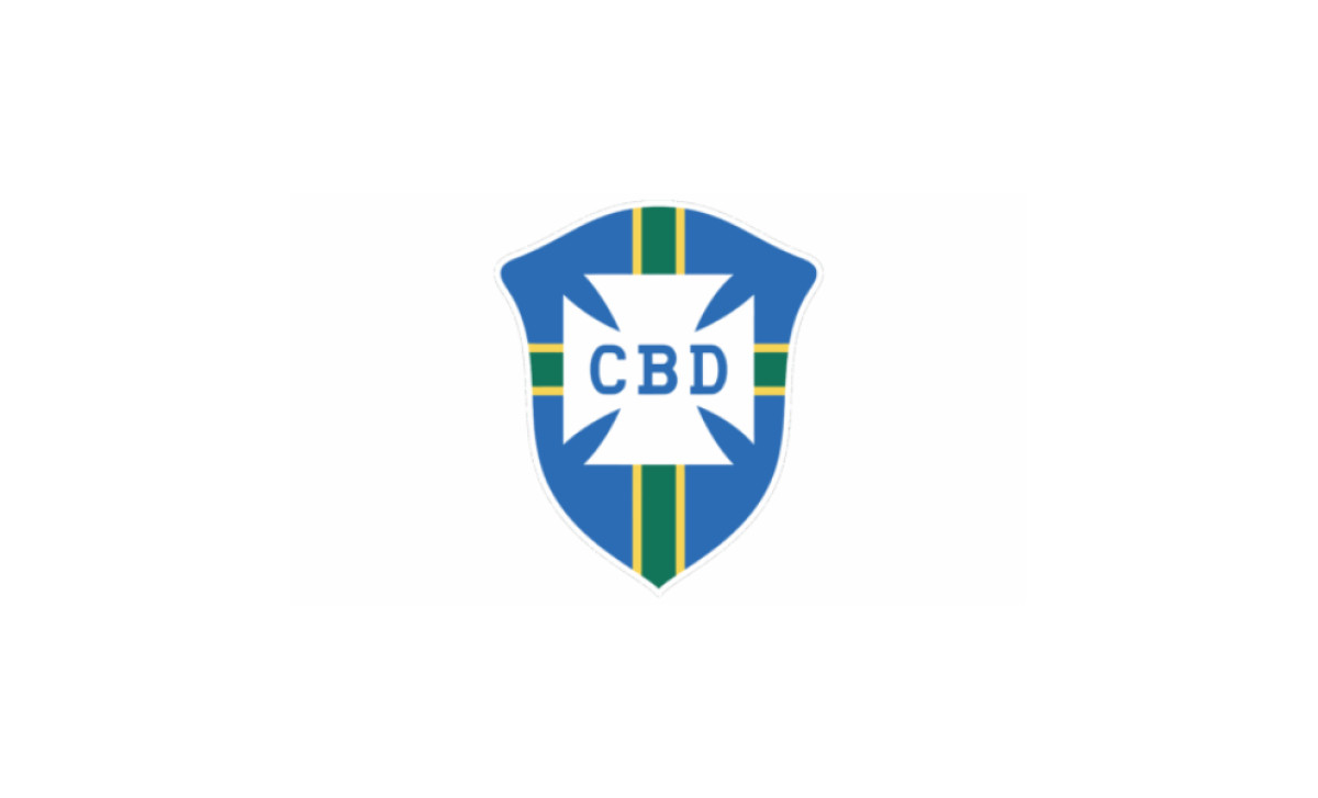
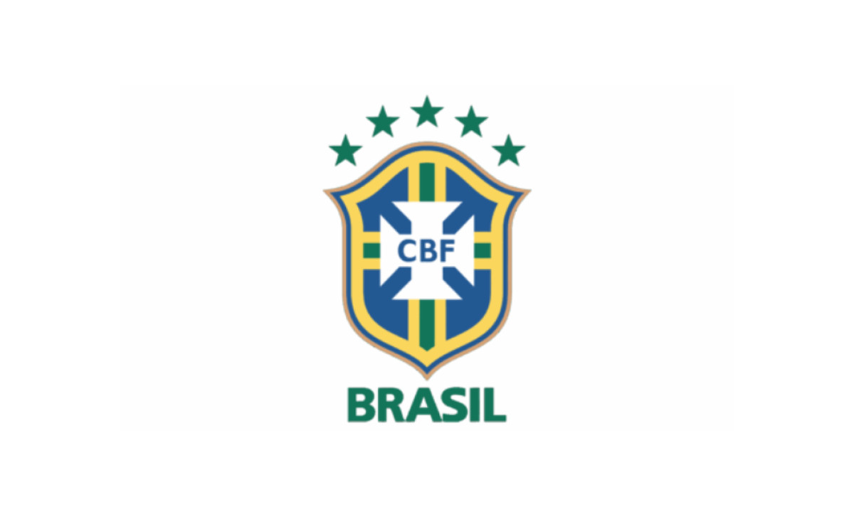
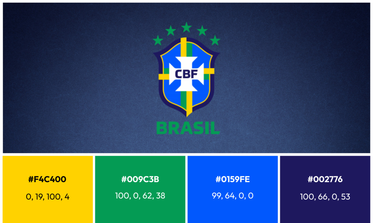
2019–Present: The Dalton Maag Redesign
In April 2019 the CBF unveiled the current badge, with a custom letterform system developed by designers at Dalton Maag, the type foundry with studios in London and São Paulo. The crest reached national team shirts in 2020.
The redesign kept every structural element and pushed the palette further than any previous version. The blue carries an almost electric quality, and the gold and green run brighter than in any earlier badge. The quadrant stripes doubled into paired yellow and green bands, with the yellow pushing past the outer contour.
After more than a century of revision, the top edge settled into a clean, gently arched dome that reads as resolved. The cross arms opened enough to read as a true cross rather than a notched square, settling the badge's oldest internal argument, at least for now.
What's in the Current Brazil Badge
Good logo design makes every element justify its existence. The current CBF badge passes that test, partly because the federation spent 110 years testing the alternatives.
Look at what made the cut:
- Five stars: the badge's primary information layer, one per World Cup title from 1958 to 2002. They arch across the full crown, each roughly a tenth of the badge's width, and no other nation can match the count.
- White Maltese cross: four trapezoids forming an eight-pointed cross, the centerpiece since 1917. The current arm gaps read as an open cross, resolving a square-versus-cross tension that ran for decades.
- "CBF" letters: an upright, geometric sans-serif drawn by Dalton Maag, sized just under the cross arm width. Deliberately neutral rather than expressive, because the badge speaks through structure, not type.
- Doubled quadrant stripes: paired yellow and green bands dividing the blue field, with the yellow overlapping the outer contour. A 2019 amplification of a pattern in place since 1917.
- Pointed shield: the only element present in every version since 1914. The gently arched top is new; the point at the bottom never moved.
- Palette: yellow #F4C400, green #009C3B, light blue #0159FE, and dark blue #002776, matched to the Brazilian national flag. The badge's color system was never independently designed. It inherits from the flag, which is why the colors never wavered across two dozen versions even as every shape around them moved. Clubs agonize over color the way Chelsea has refined its royal blue across a century. Brazil outsourced the decision to the country itself in 1917 and never had to revisit it.
What the Brazil Badge Teaches Designers
The Brazil football logo history looks chaotic on a timeline and disciplined in practice. More than 20 versions, one architecture.
The lesson for identity designers is that durability does not come from freezing a mark. It comes from defining which elements are structural and which are surface. Brazil's structure is four rules deep: pointed shield, Maltese cross, flag colors, star count. Everything else, the trim, the fonts, the cross gaps, even a coffee bean, has proven disposable.
Compare it to Manchester United, whose badge has held its current form for nearly three decades, and the contrast sharpens. United protects a rendering. Brazil protects a rulebook.
And the stars carry one final irony. The badge that ignored winning for 57 years is now organized entirely around it. As Brazil chases a sixth title at the 2026 World Cup, the most consequential design question facing the CBF is not a rebrand. It is where a sixth star would fit.

Looking to apply the same approach to your growing market? We can connect you with the right creative partners.
Browse our Agency Directory to find the most capable agency that can help elevate your brand:
And if you’re curious for more inspiration, don’t miss our other features on standout logo designs in sports.

-preview.jpg)