Standout Features:
- Animated variation
- Bold lines
- Monochrome static version
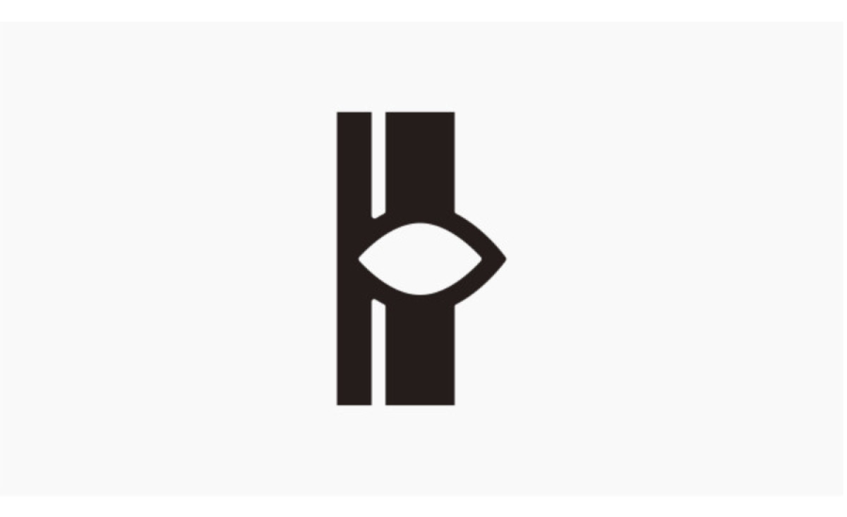
The Lineface Productions logo by Canadian designer Jan Werthwein comes alive in its animated version, where pink hues and paint splatters add a dynamic flair. The unique design, featuring two vertical lines seemingly forming an eye shape, exudes a sense of creativity and vision.
Its versatile versions ensure adaptability across different mediums, making it a strong visual identity for Lineface Productions. Meanwhile, the static version in monochrome exhibits a timeless and clean aesthetic, showcasing the logo's core design elements without the distraction of color or animation.
Get a chance to become the next Design Award winner.
SUBMIT YOUR DESIGN


