Standout Features:
- Geometric arch gridmark with spatial symmetry
- Balanced and modern typographic system
- Negative space integration with backdrops
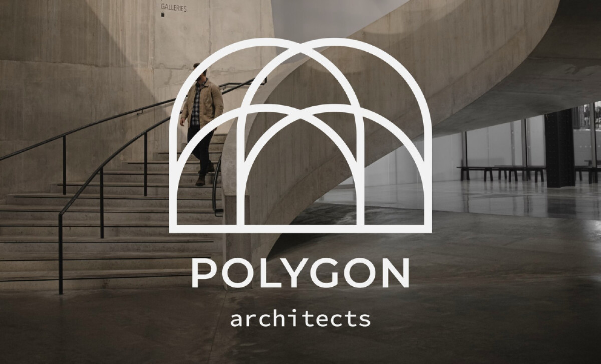
Humble Design Co created this striking identity for Polygon Architects, a firm rooted in modern architectural practice.
The logo reflects both structural elegance and a deep conceptual clarity, establishing a professional personality. It’s a mark that feels equally at home on concrete, paper, or a screen.
The central logo is composed of a white outline featuring five overlapping arches. The arches are drawn with precise, even line weights, forming an interwoven and elegant dome-like structure.
Research shows that some users generally prefer designs with low visual complexity, and this design is perfect in its simplicity.
Beneath the arch symbol, the firm's name “POLYGON” appears in a geometric sans-serif, similar to Futura.
This bold, uppercase brand name delivers a strong presence. Below it, “architects” is in lowercase with a thinner weight. This creates a beautiful contrast and a quiet, professional tone.
We also love how the logo is used against a physical space, situating it contextually. It reinforces the brand’s identity as one that is born of structure and the built environment.
In fact, it makes the logo feel like it belongs in the spaces the firm creates.
Ultimately, this professional services logo is a fantastic synthesis of form and function. Your branding should be a visual echo of your core philosophy. This design does that with a beautiful sense of clarity.
For any design-led business, the brand identity has to visually represent the quality and philosophy of your actual work.
That's why brands turn to expert partners, and our team has ranked the best agencies worldwide to make finding them simple.
Visit our Agency Directory for the Top Logo Design Companies, as well as:
Our design experts also recognize the most innovative design projects across the globe. Visit our Awards section to see the best & latest in logo design.