Standout Features:
- Nature-yoga fusion monogram in a rounded square
- Whimsical serif typography with customized character details
- Earth-toned color palette with contemporary contrast
Local Vibes Yoga aims to be a cultural and mindful movement, emphasizing connection, compassion, and community beyond physical yoga. CRENEO designed its logo to reflect these deeper values.
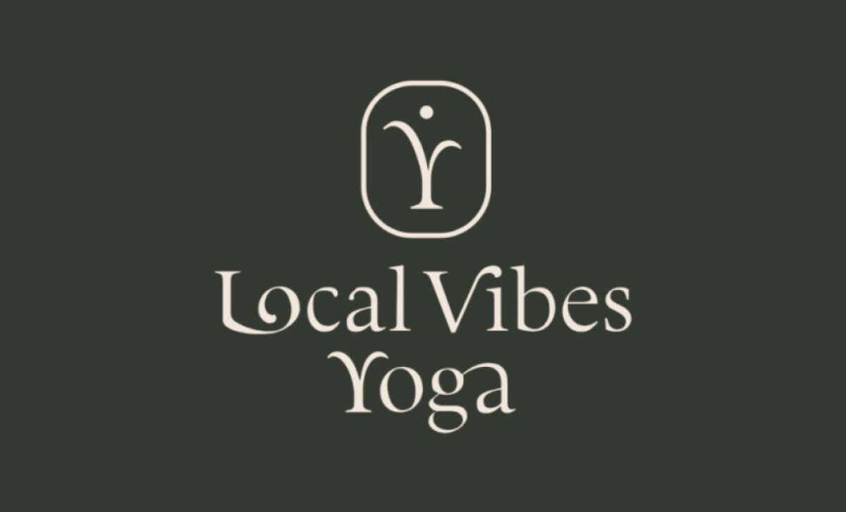
A key element is the minimalist monoline icon in a rounded square. It depicts a sprout growing from the ground to form a subtle "Y" for yoga. This masterfully restrained mark, with its upward flow, communicates balance and expansion, while the enclosure suggests a protective, sacred environment.
The logotype is set in a high-contrast serif typeface with unique character details. The “L” in “Local” has a soft, spiral-like terminal to combine with the “o,” and the “V” in “Vibes” boasts an extended tail. This typographic treatment adds an organic, crafted feel.
The logo uses a deep forest green for backgrounds, complemented by soft sand for the typographic and iconic elements. This earth-toned pairing creates a sense of calm and clarity. The green signifies renewal, aligning with yoga principles, while the soft off-white provides a gentle, inviting contrast.
The design for Local Vibes Yoga underscores how even minimalist marks can carry maximal meaning. The human-asana symbol and bespoke letterforms create a harmonious and memorable health and wellness logo.
This careful articulation of brand identity is vital, as Forbes Business Council experts note that when design reflects a wellness brand's authentic identity, “customers are more likely to feel a connection ... and see it as trustworthy and reliable.”