The ClassPass Logo Design Is Striking In Its Fluid Shape
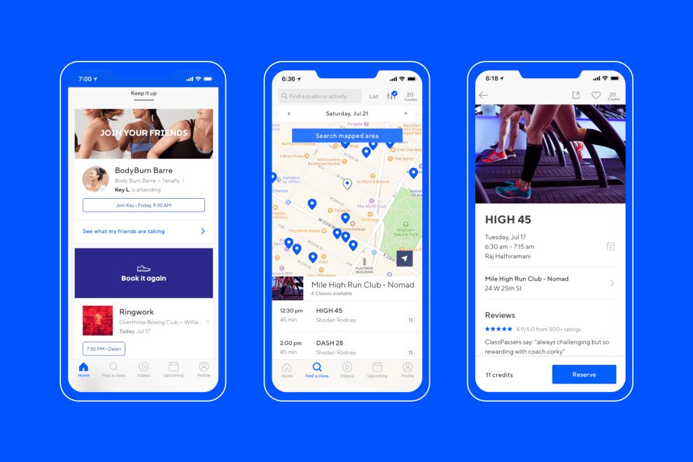
ClassPass is a subscription-based workout brand an app that connects users with hundreds of studios across their given studios. Classes include yoga, cycling, boxing, pilates and more. For a flat monthly fee, users can participate in a certain amount of classes based on a point program.
After five years, the brand was booming. But in recent days, the brand has unveiled its new rebranding initiative — complete with a new logo, app and more to appeal to more users and give them a more exciting experience.
The new logo looks extremely different than its last, but it comes with more of a heart, soul and purpose than its previous version.
The previous logo was made up of a C in a blue and green color gradient. Now, the new logo takes on the shape of an oval that curves in the middle like it’s rippling in the water, moving with the times.
This new logo has a vivaciousness and a dynamic nature to it that inspires action and motion. And that’s exactly what the brand does. It’s an app for people to get motivated and to workout, and this logo certainly embodies that.
It’s also created in a crisp, clean white. Foregoing the calming, tranquil nature of the previous color gradients in favor of something striking, bold and noticeable.
There’s depth here too — in its app form, the design is cut a bit diagonally, matching the fluid point in the design. This makes it look like there are multiple layers to this design and multiple different ideas and motives to unpack.
This is much different than its last logo — but it instantly stands out and puts you in the mood to start exercising. It’s sleek, modern and fun — full of energy, life and motivating qualities that will have you signing up for your next class in no time.

ClassPass’s Energetic Logo Typeface Promotes Movement
Not only did the new ClassPass logo get a shiny and cool symbol to live on its app, social media sites and ads, but it also got a new typeface to give the wordmark aspect of this design an energizing and invigorating boost.
The ClassPass wordmark sits like a powerful, poignant message underneath the creative and cool symbol. In other versions, it was sleek and sophisticated. It had a modern edge and an apparent authority that demanded attention.
It was written out in a sans-serif, capitalized font. It was regal and full of prestige. But now, the entire word is written out in lowercase letters. And it’s got a more modern font to give it a moving and vivacious edge.
The new typeface is called Circuit and has a sporty quality to it. It’s dynamic and fresh and instantly inspires those who look at it to jump to action. And that’s what the brand wants you to do.
This streamlines the design overall and gives it a breath of freshness that’s sleek, empowering and clean. The previous wordmark was compelling, but this one really steals the show and embodies the brand’s main initiatives with ease, creating an overall identity that sells more effectively to a wider audience.
This logo now looks like it belongs to a workout brand, not just a cool, modern entity that cares about its image.
And the beauty of the new typeface is that it can now be used across all branded material. Text inside the app and out can utilize this workout-inspiring font to grab attention and get noticed. It’s a customized font that adds depth and authority to the brand in its entirety, aligning it as a leader in the industry.
Customized design elements are instantly recognizable and come with a purpose — of differentiating a brand from its competition. And this typeface does so splendidly.
ClassPass Keeps Branding Clean And Cohesive With A Signature Blue
ClassPass has always kept colors consistent in its branding. It utilized a color gradient scheme made up of blues, greens and whites that were clean, modern and soothing. They were a bit pastel in nature. And while they were dynamic, they really just put you in a state of relaxation that made you happy — not actually motivated to jump into a cycling class, for example.
But now, with a fresh and invigorating new rebrand, the fitness gurus unveiled a whole new color to get your heart pounding and your blood flowing.
This electric blue color now sits in the app and on marketing materials, capturing attention with its bright and enthusiastic tone. It’s an electric blue that is immediately striking and allows for the crisp white outline of the logo and its wordmark to stand at immediate attention.
Blue is a color that shows authority, compelling consumers to trust the brand using it. It brings an energy and a confidence and an authenticity. It soothes and pacifies, of course. But it is also a color that inspires happiness, engagement and connectivity.
And this vibrant tone certainly packs a punch, marking its infusion integral to the ClassPass brand message
Color is cool and creative, and it brings a brand's main goals to the surface, highlighting its personality and allowing it to reach a wider range of audiences.
And for this ClassPass rebrand, it was definitely the right choice.
ClassPass’s Exciting Rebranding Turns Heads
ClassPass is five years old, but their in-house team has been hard at work trying to craft a new identity and brand presence across channels.
This wasn’t just a new logo they unveiled. It wasn’t just a new typeface. It wasn’t just a new color scheme or in-app experience. The entire look and feel of the ClassPass brand was given a facelift — one that better matched its dynamic energy and created and urgency within users to get active and work out
According to the brand:
Rebrands are a lot of work. They’re passion projects, for sure. And they require an incredible amount of coordination. Once all is said and done, we release our efforts into the world, hoping nothing breaks, people notice, and :fingers-crossed: they like it. Well, here it goes! Today we’re excited to launch a refreshed ClassPass brand. After five years and millions of workouts, it’s good to take stock of what we’ve done and where we’re headed. ClassPass originally launched to give people an easy way to book studio fitness classes. Over time, we’ve evolved what fitness means. Now, fitness can be fun. Fitness can go anywhere. Fitness can create new friendships. Fitness can deliver results rooted in a reliable routine, and results rooted in experimentation.And experiment they did — the new identity is sleek, modern and fun. It still holds the integrity and the authenticity the brand is known for. But it added a bit more energy that better matched the services the brand offered its users.
It’s only been a few days, but we already think it’s gonna be a quick hit.
What Is ClassPass?
ClassPass is a New York City-based workout group that offers a subscription service to its users, giving them access to a wide variety of workout classes and studios. Users can go to a yoga or pilates class, jump into an exciting trampoline class or try their hand at boxing. The opportunities are endless.
The brand was founded in 2013, and has grown exponentially with services in studios in tens of cities across the United States.
Here’s the ClassPass story:
ClassPass was born in 2013 after Payal Kadakia struggled to find a dance class to take after work in NYC. After countless Google searches, schedule cross-checking and frustrating log-in attempts, Payal never made it to class. Rather than chalk up that evening as a failure, Payal created an idea. Working out shouldn’t be hard - what if there was a way to make it easy? What started as an app and website that made finding and booking classes effortless is now changing how people live their lives. Whether we’re bringing together a community of enthusiasts, helping people find the activities that make their true selves come alive or supporting small businesses and studios across the entire globe, we believe that being active is the key to living a happy and healthy life.The NYC-based brand has humble, wholesome roots. And while it is still in its early years, that's no excuse not to shake things up and further impress upon users their power and prestige.
If you are looking for designers in this region, check out our list of the best New York logo design companies.
Why This New Logo And Branding Sells
The new ClassPass identity and logo design, in general, makes a tangible impact on users. It’s equal parts simple but sophisticated and stunning. The brand didn't lose any of the aspects that made it so impactful in the first place and gained a whole new persona that personified the brand’s services in a few, simple elements.
The new, in-depth and almost textured, fluid shaping inspires an active lifestyle and movement.
Similarly, the sporty new typeface embodies exercise and a workout culture that’s invigorating and passionate.
This, plus the striking electric blue turns heads and gets people’s heads in the game.
Overall, this rebranding initiative was a smart, well-planned and well-executed initiative that gave the brand an edge it was missing a bit before. It’s still in its initial steps, but we’ve no doubt it will sell.