Logo Designed by
EM bru_net EM bru_net

Lotus Medical

Lotus Medical logo design by Emilie Brunet.
Lotus Medical’s refreshed identity balances professionalism with warmth. Designed by Emilie Brunet, the logo pairs a geometric lotus symbol within a hexagonal frame with calming teal and neutral tones, signaling modern clinical precision while maintaining a compassionate, human-centered presence.
Lotus Medical logo design by Emilie Brunet.
Hexagonal mark balances structure with approachability
Lotus Medical logo design by Emilie Brunet.
Soft lotus emblem reinforces care and well-being
This website uses a colour palette of 4 colours
  • #E0DAD6
  • #BA8E73
  • #709193
  • #003046
Technologies & Tools
Description
Team Behind the Design
  • Agency: Emilie Brunet
  • Client: Lotus Medical
  • Category: Logo Design — Health and Wellness
  • Location: Montreal, Canada
  • Project Brief: Develop a renewed brand identity and website design for Lotus Medical, a Montreal-based clinic operator, to reflect its modern, patient-centered approach to healthcare.

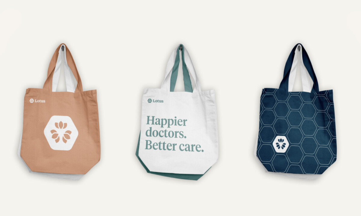
Strong health and wellness logo design must communicate trust, clarity, and care without appearing cold or institutional. Lotus Medical achieves this by combining a structured hexagonal mark with a soft lotus emblem and refined typography, creating a visual system that feels contemporary and empathetic.

Ready to elevate your designs?