Few crests in the world carry the weight of the Manchester United badge. The trident-wielding devil, the ship in full sail, gold cutting against deep red.
You can spot it on a shirt in Lagos, a scarf in Old Trafford, or a billboard in Jakarta, and the meaning lands the same way. Trophies, late winners, European nights, the Class of '92, Sir Matt, Sir Alex, and over a century of football stitched into a shield.
The badge has been redesigned, redrawn, argued over, and (in 1998) controversially stripped of two words. Every iteration has carried something forward from the last.
Here's how the Manchester United logo got from a steam locomotive in 1878 to one of the most valuable trademarks in sport today.
Manchester United Logo Design Details
The current Manchester United badge, also called the Man Utd crest, is a bold and instantly recognizable emblem featuring:
- The Red Devil: The fiery mascot at the heart of the logo, gripping a trident, channels the club's competitive bite and its identity as the "Red Devils."
- The Ship in Full Sail: Pulled directly from the Manchester City Council coat of arms, the ship nods to the city's history of trade and enterprise.
- The Golden Bends: The three diagonal gold stripes on red come from the arms of the de Grelley family, the medieval Lords of the Manor of Manchester who ruled the city before 1301.
- Two Footballs: Flanking the shield, they anchor the crest in the sport itself.
- Color Scheme: Red and gold, reinforcing passion, tradition, and noise.
These elements have stayed locked in across recent iterations, which is why the badge still feels rooted even after refinements.
Manchester United Logo Colors
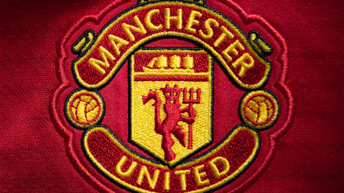
The club uses a tightly defined palette across kits, broadcast bugs, signage, and merchandise. Three colors do all the work: a deep red, a warm gold, and a soft black that grounds the lettering.
A quick note for designers: the red on the crest is intentionally deeper than the red on matchday shirts. The badge tone is saturated to stay sharp against the lighter shirt red at distance and on TV.
Manchester United Logo Typography
The current crest uses a custom sans-serif typeface proprietary to Manchester United FC, applied to "MANCHESTER UNITED" along the upper and lower arcs of the shield. The lettering is condensed, bold, and uppercase. It was built for legibility at small sizes (think embroidery on a shirt) and for weight against the gold field at distance.
Earlier crests (1973 to 1998) used a chunkier block letter that included "Football Club." The 1998 refinement tightened the letterforms and stripped them down, which fit the club's broader move toward a more globally scalable wordmark.
Manchester United Logo History
The evolution of the Manchester United crest is a story of a club growing up in public. Each redesign came with a reason, whether that was a takeover, a rebrand, a centenary, or a strategic pitch at global commercial growth. Below, we chronicle each iteration in detail.
Check out some of the most iconic football visuals that define the love of the game.
1878: The Newton Heath Era
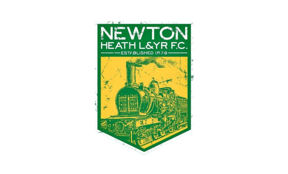
Before Manchester United, the club was Newton Heath LYR Football Club, formed by workers from the Lancashire and Yorkshire Railway. Their first badge was an industrial piece through and through. A green and gold shield carrying a detailed steam locomotive, a straight nod to where the players punched in every morning.
The shield shape gave it a traditional, trustworthy look, but the train illustration was always going to be a nightmare to embroider on a jersey at scale. Function was second to symbolism here.
1902: Manchester United's Birth and the First Crest
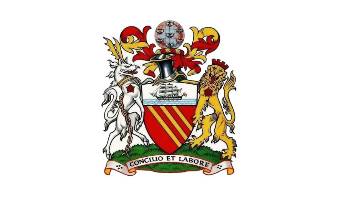
After Newton Heath nearly went under, brewery owner John Henry Davies bailed the club out and rebranded it as Manchester United in 1902. A new identity needed a new crest.
The first official Manchester United badge borrowed from the Manchester City Council coat of arms. A ship in full sail sat above a shield carrying the golden bends on red, framed by heraldic supporters and the city's motto, Concilio et Labore ("By wisdom and effort"). It was less a sports badge than a piece of civic heraldry. The intricacy meant it lived mostly on programmes and stationery rather than on shirts.
1909: The Lancashire Rose
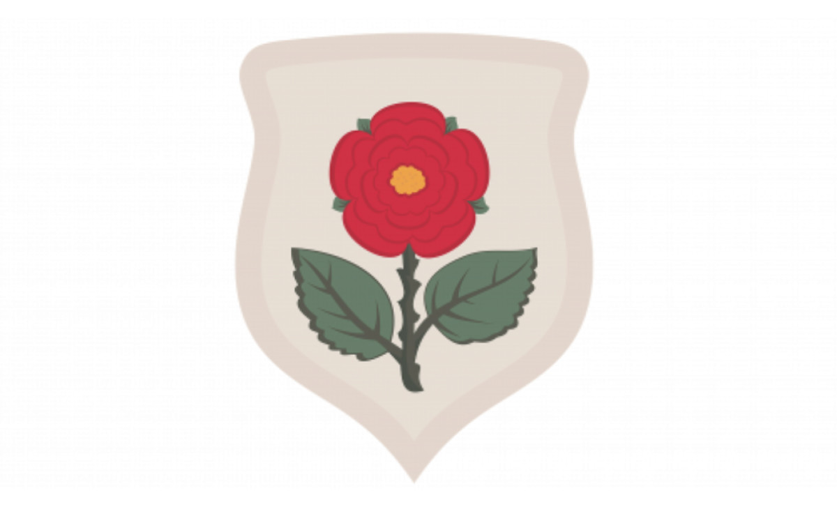
For the 1909 FA Cup Final against Bristol City, United wore a one-off white shirt with a red Lancashire rose on the chest. It was a cup-final commemorative more than a permanent crest change, but it's a documented design moment that standard timelines often skip over. The Lancashire rose stuck around in club imagery deep into the 1950s.
1940s and 1950s: The Wartime Shield
A separate devil-with-trident figure also began surfacing as early as the 1940s. This 1940s emblem combined the ship and a devil figure as a precursor to the modern badge, but it wasn't used consistently and the devil disappeared again for a period.
The heraldic supporters (the antelope and lion) from the 1902 design were dropped, leaving the cleaner shield-and-ship combination that would shape every badge that followed. United didn't wear a crest on their shirts during this era, so the badge lived primarily in print.
1960: The Streamlined Heraldic Crest
By 1960, the club had refined the shield further. The ship sat at the top, the golden bend below, and two Lancashire roses framed a curved scroll. This is the first version that visibly resembles the modern badge in shape, proportion, and palette, even with no devil in sight yet. If you squint at it, you can already see the bones of the crest worn today.
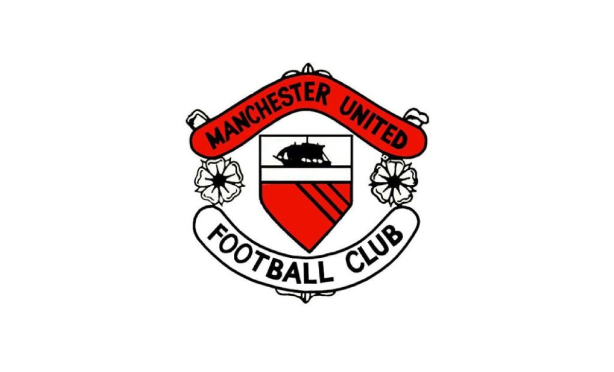
1970: The Crest Comes Together
The 1970 redesign brought the badge much closer to the version fans know today. The palette tightened to red and gold, dropping the black and white from earlier versions.
Two footballs were added flanking the central shield, replacing the Lancashire roses and turning the emblem unmistakably into a sports badge for the first time.
"Manchester United" wrapped the top banner and "Football Club" arched across the bottom. The ship still sat at the top of the shield, with the golden bends below.
What this version did not have yet was the devil. The shield still held the heraldic stripes from the Manchester coat of arms, not the trident-wielding mascot.
This was also the first iteration to appear consistently on playing shirts, debuting on kit in the 1971/72 season. It set the architectural template the 1973 redesign would build on.
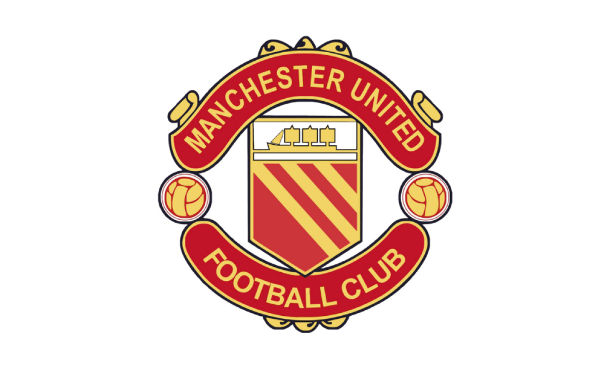
1973: The Red Devil Arrives
This was the moment the badge got its bite. The "Red Devils" nickname had been kicking around since the early 1960s, when Sir Matt Busby borrowed it from the Salford rugby league club. Salford had earned the name "Les Diables Rouges" from French journalists during a dominant tour of France in 1934, and Busby liked how it sounded compared to the softer "Busby Babes" tag.
In 1973, the trident-wielding devil was officially added to the centre of the shield, replacing the heraldic stripes. The footballs, banner, and ship all stayed put. It gave United a visual identity no other English club could touch.
Some traditionalists found the devil too aggressive after decades of dignified civic heraldry. United fans took to it immediately.
This is the version that carried the club through the rest of the 70s, the 80s, and most of the 90s, and every badge since (including the 1998 mark in use today) is a refinement of this design rather than a fresh start.
1978: The Centenary Variant
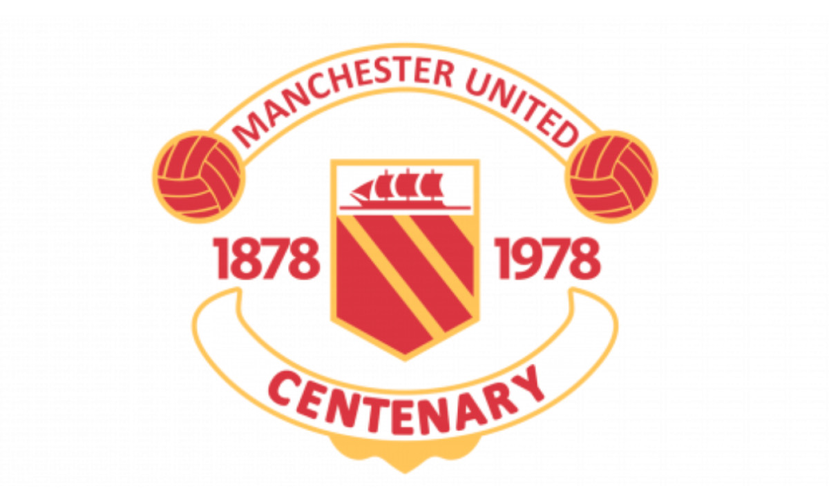
To mark 100 years since Newton Heath kicked off in 1878, United rolled out a commemorative centenary badge.
It kept the red and gold shield with the ship and diagonal stripes, but layered on celebratory typography. "MANCHESTER UNITED" arched across the top, "CENTENARY" sat on a curved banner at the bottom, and the dates 1878 and 1978 flanked the shield.
It was a one-season design, busier than the everyday badge, but fans loved it and it remains one of the more collectable versions of the crest. A nice reminder that the club takes its own history seriously.
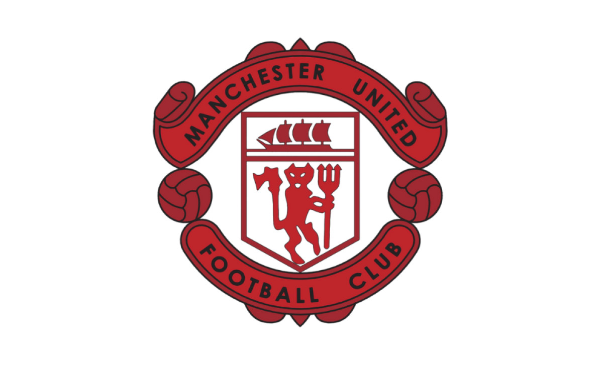
1998 to Present: "Football Club" Gets Dropped
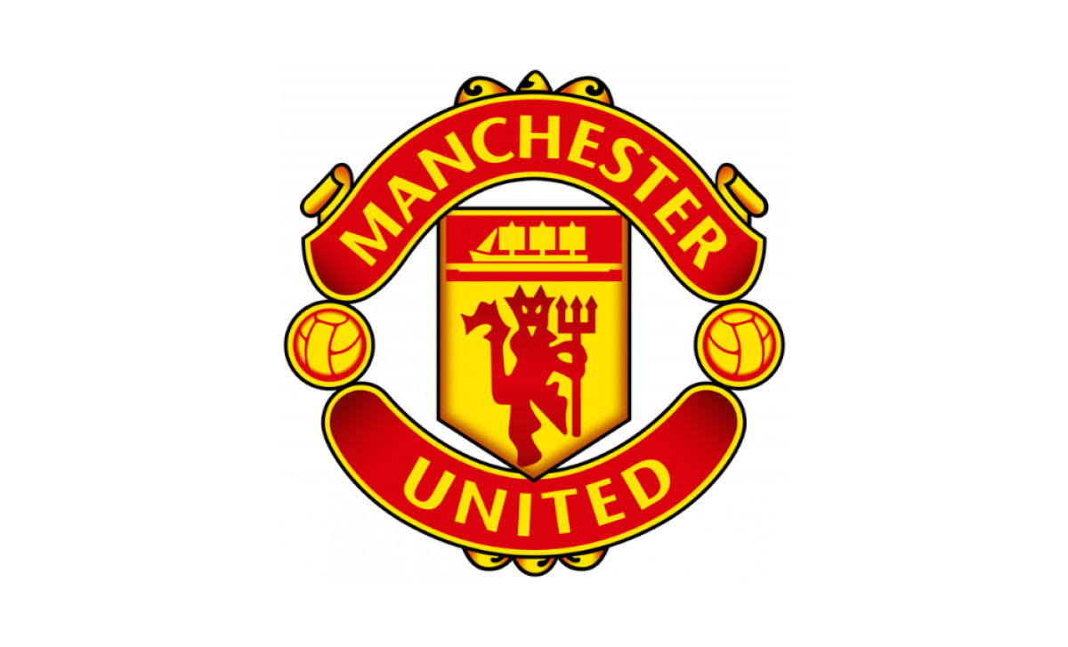
This is the most argued-over change in the history of the badge. In 1998, ahead of the 1998/99 season, Manchester United quietly removed the words "Football Club" from the crest. What was left was just "MANCHESTER UNITED."
The reason was commercial, full stop. The club was pushing hard into Asia and North America, and the rebrand was an explicit positioning of Manchester United as a global lifestyle brand rather than a regional football club.
The 1998/99 season also happened to be the Treble year, so the new badge ended up stitched into one of the most successful campaigns in English football history.
Purists hated it. Then-CEO Ed Woodward later said publicly that he and Joel Glazer disliked the change and floated bringing "Football Club" back in 2013. The reinstatement never happened. Today's Manchester United emblem is essentially the 1998 version with very minor tweaks to color contrast and line thickness for digital reproduction.
The Red Devil, the ship, the golden bends, the footballs, and the bold red and gold palette continue to make it one of the most recognizable crests in world football. Twenty-seven years and counting.
Where the Ship and the Golden Bends Actually Come From
Most writeups flatten the badge's symbolism to a vague "maritime history" line. The actual story is more specific and a lot more interesting.
The heraldic core of the crest comes straight from the Manchester City Council coat of arms, which was granted to the city in 1842. The official blazon reads: "Gules three Bendlets enhanced Or a Chief Argent thereon on Waves of the Sea a Ship under sail proper." Translated into plain English:
- Three golden bends on red: Pulled from the arms of the de Grelley family (also spelled de Gresle), the medieval Lords of the Manor of Manchester. They ruled the city before 1301, when Manchester was granted its first charter.
- The ship in full sail on a silver chief: A symbol of trade and enterprise, reflecting Manchester's rise as a global commercial city, well before the Manchester Ship Canal was built.
Manchester City FC borrows from exactly the same civic heritage, which is why the ship also shows up on their badge. Both clubs are pulling from the same historical well, even as the on-pitch rivalry has hardened into one of the fiercest in world football.
A Designer's Read: How the Crest Holds Up
Step back from the football for a second and the current badge is a textbook example of mature sports brand design. A few things stand out under closer inspection.
The Red Devil and ship sit dead center, where the eye lands first. The arched "MANCHESTER UNITED" wordmark frames the composition without fighting for attention. The two footballs aren't decorative either.
They prevent the wordmark from collapsing into the shield silhouette at small sizes and create breathing room that lets the crest read at favicon scale and stadium banner scale.
The badge is built on a vertical axis of symmetry, with the trident, the ship's mast, and the central typography all aligned. The slight off-axis posture of the devil adds movement without breaking the grid.
Strip away the color and the silhouette still reads as Manchester United, which is the test every great logo passes. That's why the 1998 refinement worked. The club cleaned up the wordmark and left the shield alone, which is exactly the playbook brand consultancies recommend for legacy marks.
How the Crest Stacks Up Against English Rivals
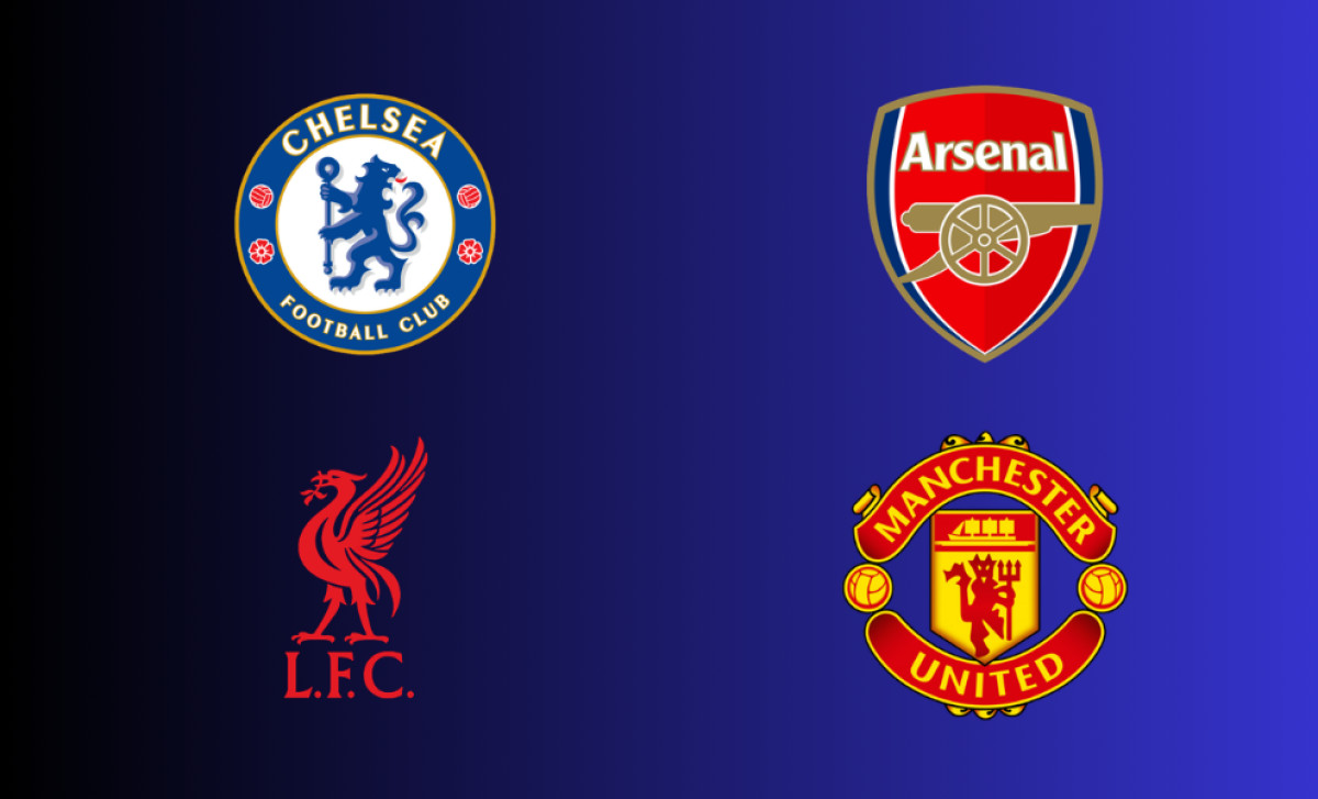
Inside the Premier League, Manchester United's badge is distinct in a few specific ways.
Liverpool wear a Liver Bird on a green shield with flames flanking the crest, commemorating the Hillsborough disaster. Their badge is civic and memorial. Arsenal have stripped their crest down to a clean, modernist cannon, the most graphic-design-forward of the major English crests.
Manchester City share the ship and golden bendlets with United (same Manchester coat of arms origin) but build them into a circular badge with a bald eagle and the founding year 1894. Chelsea use a rampant lion holding a staff, referencing Earl Cadogan, the club's president in 1905.
What makes the Manchester United badge stand apart is running full civic heraldry and a character mascot inside the same mark. Most English clubs commit to one or the other. United run both at once, which is part of why the crest reads as denser and more illustrative than its rivals.
The Crest Is Not Just History. It's a Business.
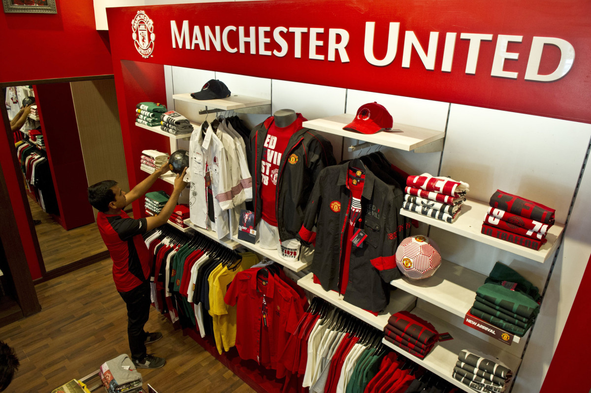
A Manchester United Shop in Delhi, India | New York Times
This badge is one of the most commercially valuable visual assets in global sport.
In fiscal 2025, Manchester United reported total revenue of £666.5 million, an increase of £4.7 million over the prior year.
Commercial revenue alone hit a record £333.3 million, up 10% year on year. Inside that, retail, merchandising, apparel, and product licensing generated £144.9 million. Every pound of that licensing revenue flows through products carrying this exact trademark.
Brand Finance has ranked Manchester United among the top three most valuable football brands globally for more than a decade. The crest sits at the center of that valuation. The trademark is what makes the licensing flywheel turn.
It's why the club has aggressively defended the mark in court for years, and it's why even the 1998 wordmark change (small as it looks) was a multi-million-pound decision rather than a design tweak.
Frequently Asked Questions
1. What does the Manchester United logo mean?
The Manchester United logo blends civic heraldry with sporting identity. The ship in full sail represents Manchester's history of trade and enterprise. The three golden bends on red come from the arms of the de Grelley family, the medieval Lords of Manchester before 1301. The Red Devil holding a trident represents the club's nickname and competitive spirit, and the two footballs flanking the shield ground it in the sport.
2. Why is Manchester United called the Red Devils?
The nickname was adopted by manager Sir Matt Busby in the early 1960s. He borrowed it from the Salford rugby league club, which French journalists had named "Les Diables Rouges" during a dominant tour of France in 1934. Busby thought it sounded more intimidating than "Busby Babes." The Red Devil was officially added to the badge in 1973.
3. When did Manchester United remove "Football Club" from the badge?
Manchester United dropped "Football Club" from the crest in 1998, ahead of the 1998/99 season. The change was driven by a global commercial strategy aimed at positioning the club as a worldwide brand rather than a regional football club. The move is still controversial. Even later executives, including Ed Woodward, criticized it publicly, but the 1998 mark is the one in use today.
4. Who designed the Manchester United logo?
The original devil motif was adopted in 1973, and the 1998 refinement was handled internally by the club. No single external agency is publicly credited with designing the modern crest.
5. What font does Manchester United use on its logo?
The current crest uses a custom sans-serif typeface proprietary to Manchester United FC. It is condensed, bold, and uppercase, and it appears consistently across the badge, kit lettering, and official branding.
6. What are the official Manchester United colors?
The primary colors are United Red (Pantone 485 C) and United Gold (Pantone 107 C), with black used for outlines and typography.
Manchester United Logo: A Legacy of Power and Prestige
The Manchester United crest is more than a graphic. It's a visual record of over a century of football, from a railway works team in Newton Heath to a club generating £666.5 million in annual revenue. The Red Devil, the ship, the golden bends, and the bold red and gold colors make it one of the most recognizable symbols in world sport.
Every iteration tells you something about where the club was at the time and where it was heading. The current badge has held the line for 27 years, which in modern brand terms is rare. With millions of fans pulling it over their heads every weekend, the Manchester United logo will keep doing what it has always done: carrying the weight of the club's story into the next match, and the next decade.