Every football club wears its story on its chest. For Chelsea, that story has always been told through a lion — bold, upright, and unmistakably blue. The Chelsea crest has changed shape through the decades, yet it’s never lost its identity.
Let's explore how this emblem grew into one of the most recognizable symbols in sport and what each detail in its design reveals about Chelsea’s character and legacy.
Chelsea FC Logo: Key Findings
Chelsea Logo History
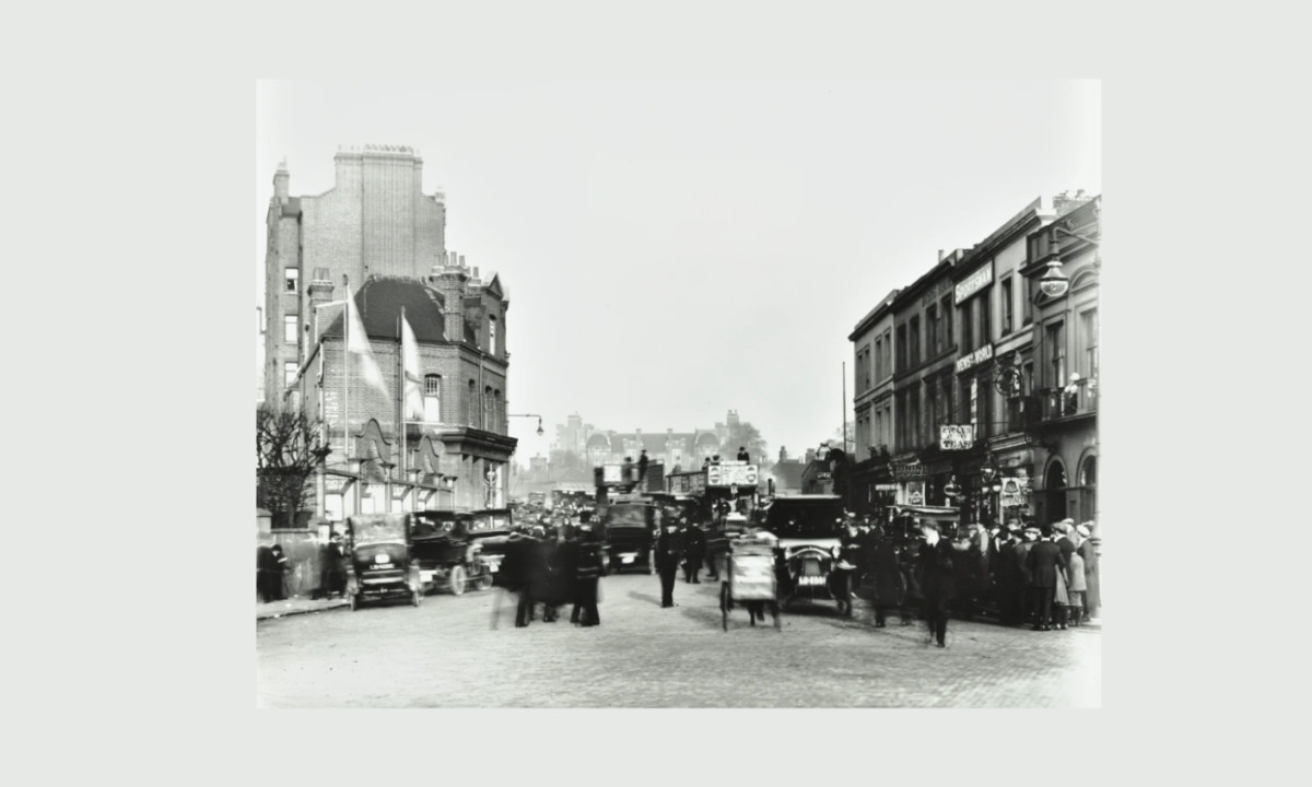
Fulham Road outside Stamford Bridge in 1912, with The Rising Sun pub visible on the far right.
(Source: Chelsea FC)
Chelsea Football Club was founded in March 1905 at The Rising Sun pub — now The Butcher’s Hook — directly across from Stamford Bridge.
Businessman Gus Mears and his brother Joseph had recently acquired the stadium and decided to create a football club to occupy it.
They wanted to establish a competitive team that would represent West London and attract the level of passionate support demanded by the city’s growing football culture.
After considering several names, including Stamford Bridge F.C. and Kensington F.C., they chose “Chelsea,” a name that captured the identity of the surrounding borough while giving the club a broader appeal across London.
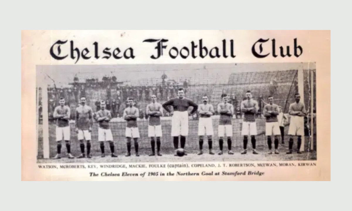
First Chelsea Football Club team. (Source: Hatchwise)
Just weeks after its formation, Chelsea was accepted into the Football League Second Division, marking the start of a long journey from local upstart to one of England’s most recognized clubs. From day one, its foundation reflected ambition, locality, and a sense of belonging that continues to define Chelsea’s character.
Evolution of the Chelsea Logo
(Source: Logos World)
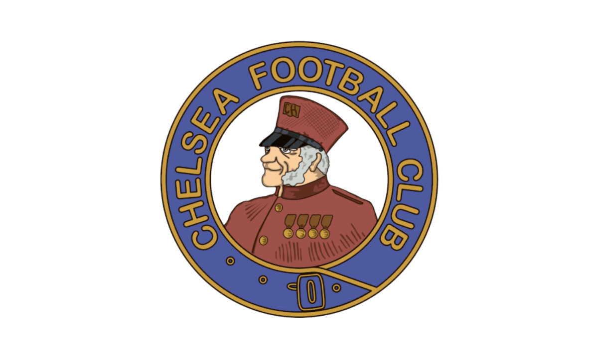
Chelsea’s first emblem depicted a British army pensioner wearing a military cap and decorated uniform. It came directly from the Royal Hospital Chelsea’s crest, a nod to the area’s military history.
The design used a blue and white palette and simple outlines. A secondary version showed the pensioner inside a blue belt ring inscribed with “Chelsea Football Club.”
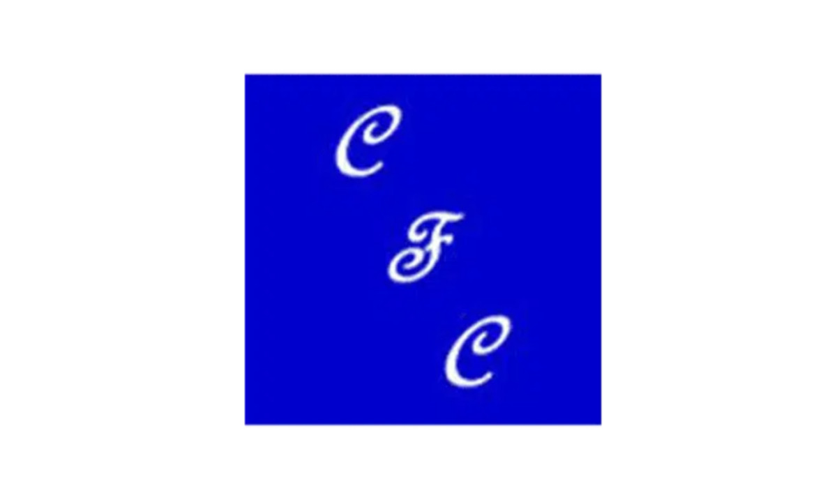
1952 – 1953: The Monogram Era
(Source: Logos World)
Under manager Ted Drake, Chelsea looked to modernize. The Pensioner crest was set aside for a brief period, replaced by a temporary badge of interlocking “C F C” initials on a blue shield outlined in white.
It was minimal, meant as a placeholder until a more permanent identity was created.
1953 – 1964: The Lion Arrives
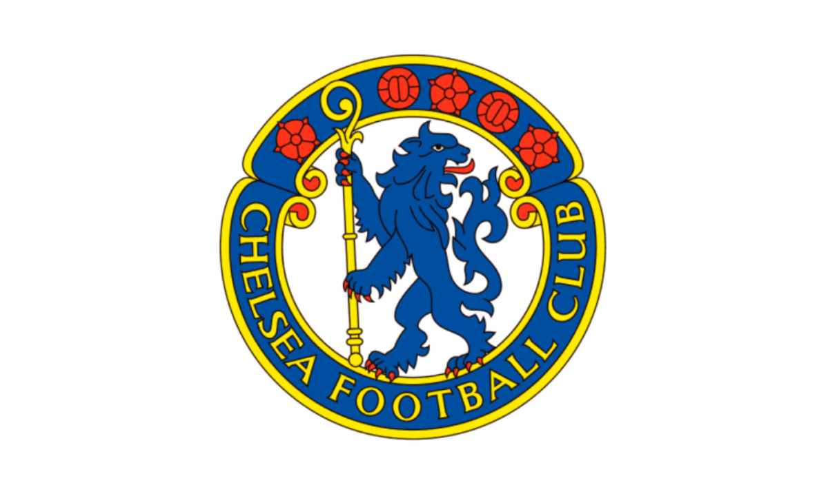
(Source: Logos World)
In 1953, the club introduced the lion rampant, standing on its hind legs and holding a staff. The symbol came from Earl Cadogan’s family crest, tying the Chelsea symbol to the borough’s aristocratic history.
The lion stood within a blue ring carrying “Chelsea Football Club,” surrounded by red Lancaster roses for England and two footballs for sport. This badge defined the club’s image for more than a decade.
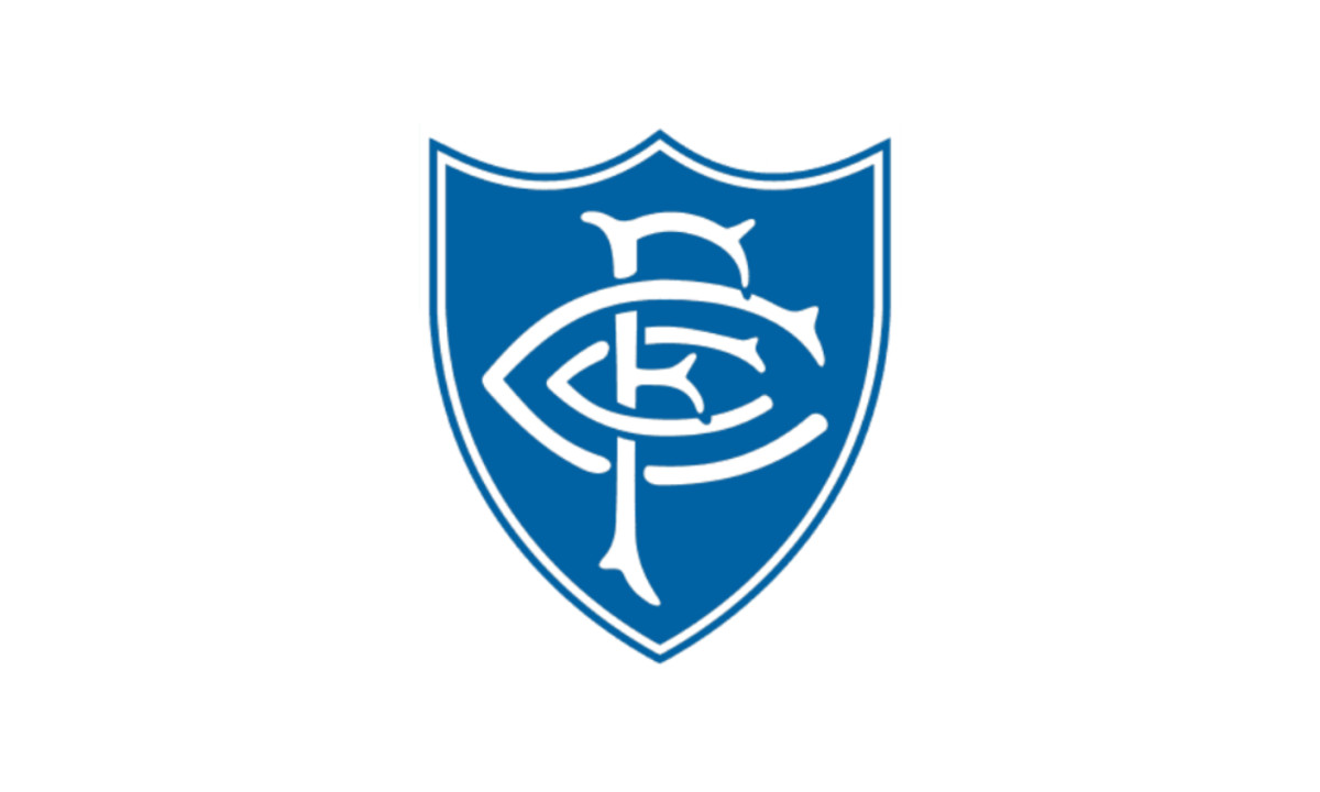
1964 – 1967: Back to Initials
(Source: Logos World)
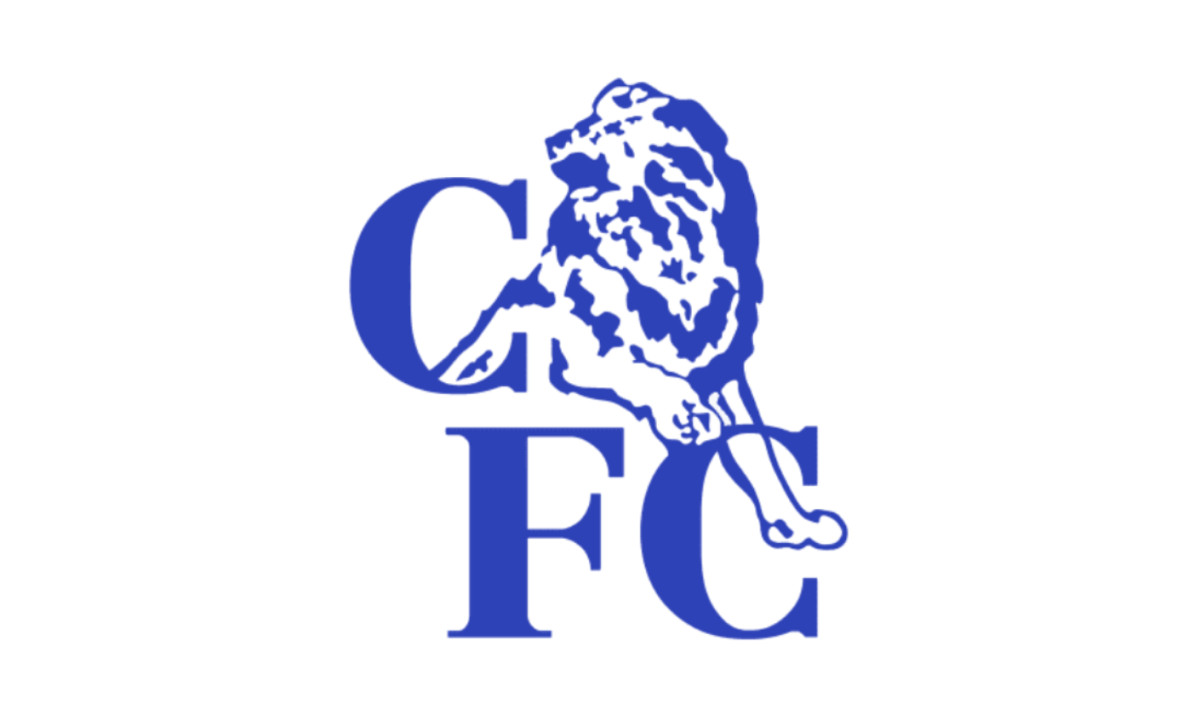
In 1964, Chelsea once again set aside the lion in favor of a more minimal approach. The club adopted a simple blue square bearing the diagonal "CFC" initials in an ornate white font — a stark contrast to the heraldic richness of the previous crest.
The design was short-lived, lasting only three years before being abandoned.
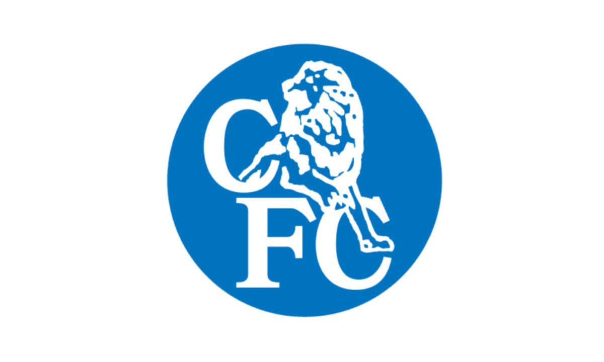
1967 – 1986: The White Lion Return
(Source: Logos World)
In 1967, Chelsea revived the lion emblem, returning to the historic symbol that had defined the club’s identity since the 1950s.
The new version featured a standing blue lion holding a staff above the initials “CFC.” The design simplified the earlier heraldic crest while preserving the club’s most recognizable symbol.
The badge was updated periodically to mark key achievements: in 1970, an FA Cup was added beside the lion's foot to commemorate the club's FA Cup victory, and in 1971, two white stars were incorporated to celebrate further honors.
This crest remained the club's primary identity for nearly two decades, through both the highs and the relegation struggles of the 1970s and early 1980s.
1986 – 1995: The Modern Circle
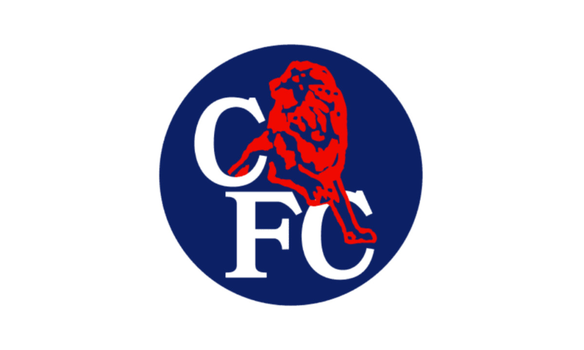
(Source: Logos World)
Owner Ken Bates simplified the design in 1986. The lion turned red and was enclosed within a plain blue circle with white “CFC” lettering. It was bold and geometric, fitting the graphic style of the late 1980s.
1995 – 1997: Experimentation with Color
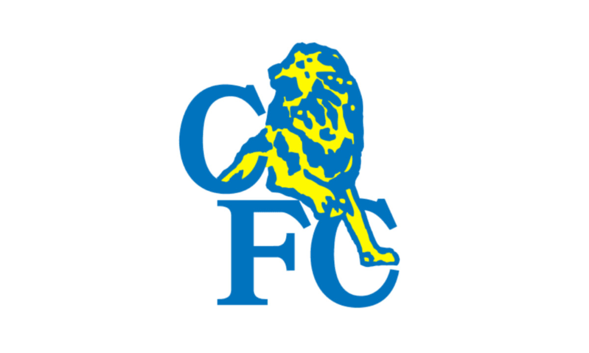
In 1995, Chelsea removed the circular frame, creating a cleaner, more modern badge.
The design retained the angular lion and “CFC” monogram, using a brighter blue and yellow palette on a white background. This version emphasized simplicity and bold contrast.
1997 – 1999: The Circle Revival
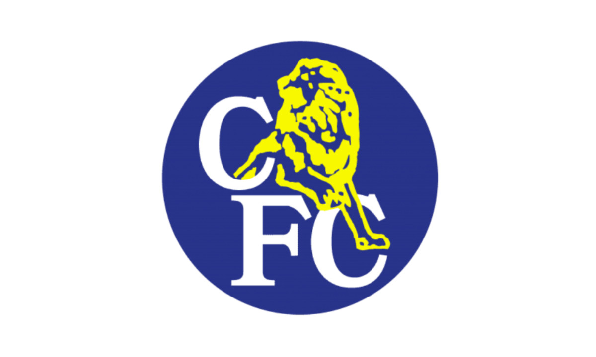
(Source: Logos World)
A return to the roundel marked this update, reconnecting the badge with its earlier visual roots.
The refined color scheme — deep blue, yellow, and white — gave the emblem a bolder and more confident presence, making it both recognizable and visually striking.
1999 – 2003: The Digitalization of the Chelsea Symbol
As digital design became standard, Chelsea adopted a simplified, two-tone lion. The shapes were sharper, and the badge worked more cleanly on television and merchandise.
2003 – 2005: The Transitional Crest
(Source: Logos World)
When Roman Abramovich acquired the club, Chelsea revived the circular logo from the 1980s. The lion returned in white, and the deeper blue background created a polished, corporate look for a growing global brand.
2005 – 2006: Centenary Redesign
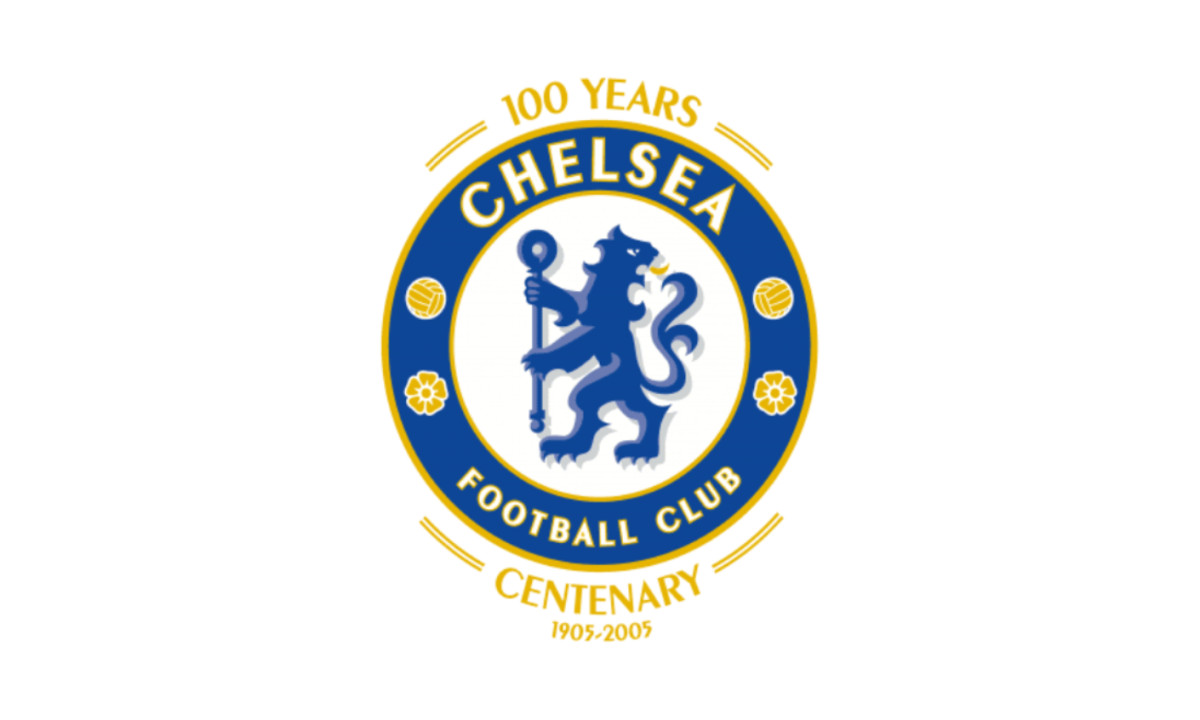
(Source: Logos World)
According to Chelsea FC's official records, the new crest was adopted for the 2005–06 season — a deliberate return to the lion design used from 1953 to 1986, recognized by Abramovich and the board as the emblem most rooted in the club's identity.
The brief was clear: restore heraldic heritage while delivering a polished mark fit for a club newly elevated to global prominence.
Supporters widely praised the return of the "proper" badge, having long felt the 1986–2005 crests lacked soul. The restoration of the circular lion validated what many already believed — that the rampant lion was Chelsea's identity, not a throwback, but a correction.
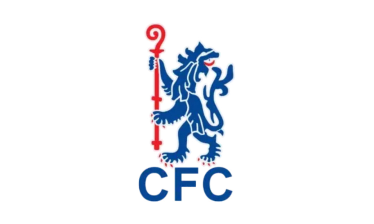
2006 – Present
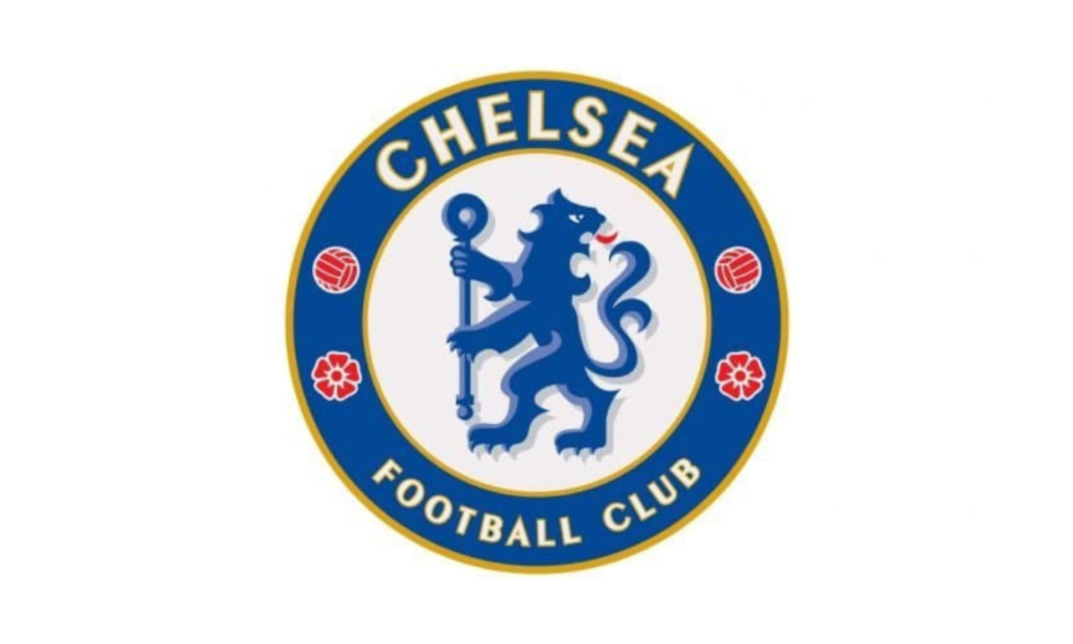
(Source: Logos World)
The current logo builds on the centenary design. The lion is blue with a red tongue, the roses and footballs now red, and the gold border slightly darker.
The Peignot Bold–style lettering remains, giving the badge a clean, balanced finish. Its layered shades of blue add subtle depth, and the composition holds a quiet 3D effect.
The crest preserves every major symbol of the club’s history while fitting modern design standards.
Chelsea Logo Meaning
Over the years, the Chelsea crest has changed many times, yet the same symbols have remained at its core, keeping the club’s identity consistent and recognizable.
- Lion and Staff: Since 1953, the badge has featured a lion standing upright and holding a staff. The design draws from the coat of arms of the Metropolitan Borough of Chelsea and the heraldic arms of the Earl of Cadogan, a former club president, as well as the Abbots of Westminster. The lion represents courage, strength, and royalty — qualities that mirror the club’s ambitions.
- Colors: Royal blue dominates the crest, often accented with yellow or gold. The shade ties directly to the team’s kit and has become inseparable from Chelsea’s visual identity. Even the earliest “Pensioner” emblem used blue and yellow, linking the modern design to the club’s beginnings.
- Roses and Footballs: Red roses appear in several versions of the logo, symbolizing England and national pride through the Tudor rose. The footballs serve as a clear nod to the sport itself, grounding the badge in its purpose.
- Circular Emblem and Inscriptions: Most iterations of the crest sit within a circular frame bordered by the words “Chelsea Football Club” or the initials “CFC.” The circle gives the badge structure and visual balance while keeping the club’s name front and center.
Together, these elements express heritage through the lion and staff, a sense of place through local ties, a link to the sport through the footballs, and lasting brand recognition through the consistent blue and circular form.
Why Chelsea Chose This Logo
This logo endures because it blends past and present. It feels timeless, instantly recognizable, and deeply tied to what supporters see as Chelsea’s true identity.
Chelsea Logo Design Analysis
From a design perspective, the Chelsea badge stands out for several reasons, placing it in the conversation for the best sports logo design. Here are a few features that work particularly well:
- Strong central icon:The lion with the staff is visually bold and distinctive.It’s large, detailed enough to carry character, yet simplified enough to read clearly even at smaller sizes. The use of a heraldic creature gives the badge gravitas and recognizability.
- Balanced composition: The circular format is symmetrical and stable, giving the crest a sense of completeness. The lion sits at the center, framed by a clean outer ring that defines its boundaries. The roses and footballs are arranged evenly around the circle, creating balance and rhythm. This structure makes the badge versatile across every use, from kits and merchandise to digital platforms.
- Clear typography and hierarchy: The outer ring in many versions carries the words “CHELSEA FOOTBALL CLUB” in a clean, sans-serif typeface — modern, legible, and straightforward. The badge uses typography that complements the icon rather than competing with it. Consistent lettering helps strengthen brand recognition, illustrating how sports organizations use typography to build brand trust across merchandise, media, and digital platforms.
- Distinctive color palette: The use of a deep royal blue as the dominant color ensures strong brand recognition (“The Blues”). The accent colors — red roses, gold/yellow outline, white inner space — provide contrast and visual interest without overwhelming. According to design analyses, the palette also supports the values the club wants to project, including loyalty, excellence, and energy.
- Heritage cues + modern readability: One of the strengths is that the design cues (lion, staff, roses, circle) are rooted in heritage, which gives the badge authenticity. At the same time, it has been simplified over time to remain legible at smaller sizes, adapting to modern digital, merchandising, and global contexts. The 2005 redesign, for example, restored heritage while refining lines for consistency.
- Versatility across media: Because the badge uses solid shapes, clear outlines and high-contrast colors, it works well in different formats (embroidered on shirts, printed on scarves, used in digital media). The circular “badge” form is easily scalable, which is a practical design benefit.
- Emotional resonance: A good design feels meaningful. Fans recognize the badge as a true icon of the club’s identity. It carries emotional weight because the design draws on local identity in the Chelsea borough, national symbolism with the roses for England, and football itself with the lion. This combination of form, color, and meaning is a very strong part of the design.
Popularity and Recognition of the Chelsea Logo
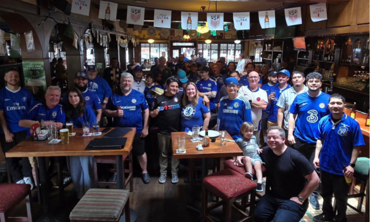
Orange County Blues in O’Malley’s (Source: Chelsea in America)
Few football crests are as recognizable as Chelsea’s blue lion. Beyond its symbolism, the badge has become one of the most commercially powerful emblems in modern football, ranking it among the most successful logo designs in the sports world.
Global Appeal and Sales
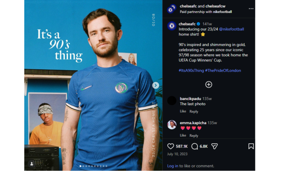
(Source: Instagram)
According to Sports Journal, Chelsea generated £91.4 million in retail, merchandise, apparel, and product-licensing revenue during the 2022–23 season, with around 1.4 million replica shirts sold worldwide.
A follow-up analysis from SportCal reported that the club’s total commercial income climbed to £225.3 million in 2023–24, with merchandise sales continuing to play a central role in that growth.
Recognition Across Platforms
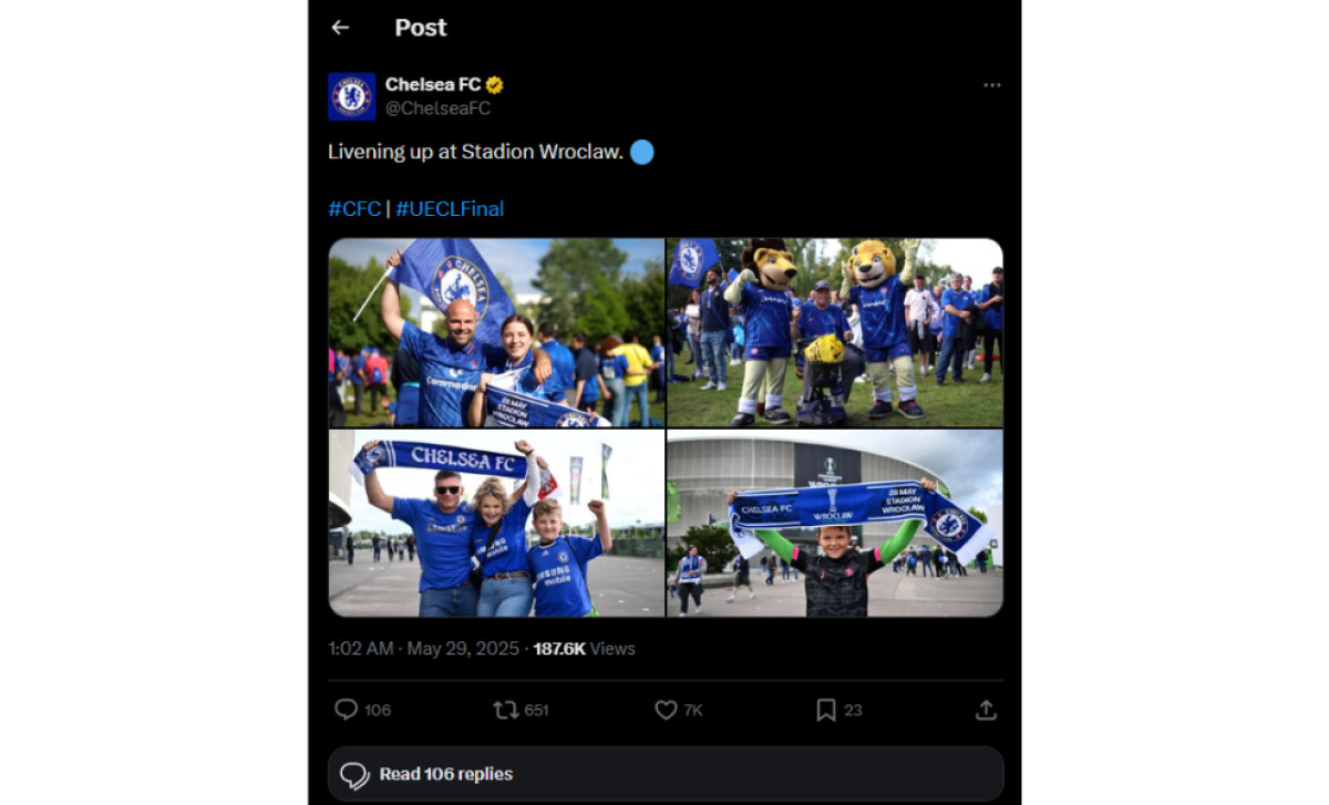
(Source: Twitter)
The crest’s bold colors and circular structure make it instantly recognizable on every surface, from stadium billboards to social media icons. According to Brand Finance, Chelsea FC ranks among the top 10 most valuable and strongest football brands in the world, reflecting the logo’s global visibility and influence.
Cultural Presence
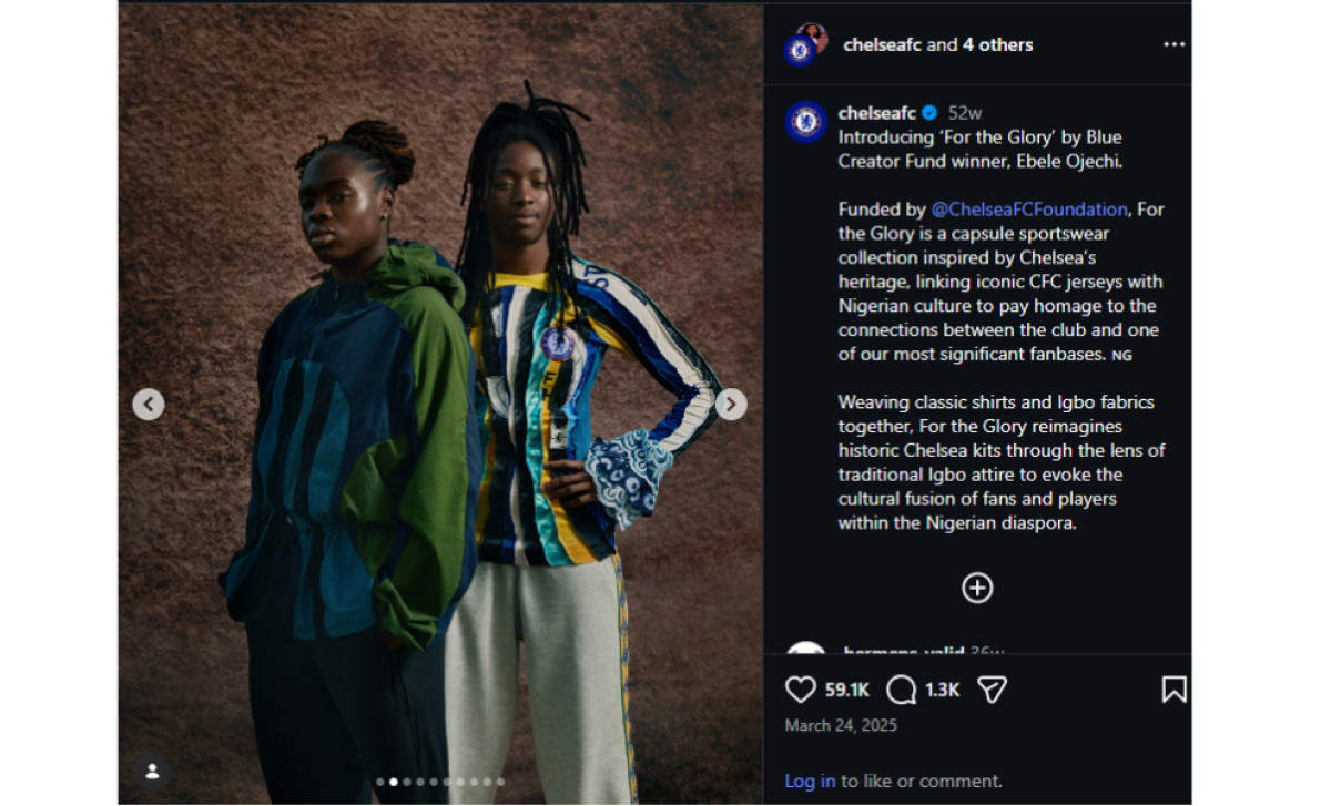
(Source: Instagram)
The blue lion appears everywhere — from match-day kits and lifestyle collections to sponsorship campaigns and pop-culture collaborations. Through its partnership with Fanatics, Chelsea distributes merchandise to fans in more than 130 countries, reinforcing its international reach and identity.
Why the Chelsea Logo Works as a Global Brand
From a branding perspective, Chelsea’s crest succeeds because it balances symbolism with practical design.
1. Merchandising Power
According to the Deloitte Football Money League, top clubs generate significant revenue from global merchandise sales. Chelsea’s crest appears on:
- replica shirts
- lifestyle apparel
- collectibles
- licensing partnerships
The badge’s simple geometry makes it easy to reproduce across thousands of products.
2. Broadcast Visibility
The bold circular structure ensures the crest remains identifiable:
- on televised score graphics
- stadium screens
- sponsor materials
High contrast colors — blue, white, red, and gold — enhance visibility during broadcasts.
3. Social Media Adaptability
Modern football branding requires logos that perform well as small digital icons.
Chelsea’s crest works effectively as:
- social media avatars
- app icons
- digital overlays
This adaptability reflects the importance of scalable emblem design in modern sports branding.
4. Kit Embroidery and Fabric Use
Football crests must function in embroidery and textile production.
The Chelsea badge works well because it uses:
- clear outlines
- balanced shapes
- strong icon hierarchy
These features ensure the logo maintains clarity even when stitched at small sizes.
Our team ranks agencies worldwide to help you find a qualified partner. Visit our Agency Directory for the Top Logo Design Companies, as well as:
- Best Logo Designs
- Best Website Designs
- Best App Designs
- Best Print Designs
- Best Packaging Designs
- Best Video Designs
Our design experts also recognize the most innovative design projects across the globe. Visit our Awards section to see the best & latest in logo design.
Chelsea Logo FAQs
- Why has the Chelsea logo changed so many times throughout history?
Each redesign reflected a shift in the club's identity or ambitions. Changes aimed to modernize the look, simplify it for commercial needs, or reconnect with heritage, like the return to the lion emblem in 2005 for the centenary. Logos evolve alongside the club itself.
- What makes the current blue lion crest so effective?
Its strength is its balance. The design successfully blends historical symbols like the lion and staff within a clean, modern circular shape. Combined with the distinct royal blue, this creates a timeless and instantly recognizable badge that works perfectly everywhere.
- How important is fan opinion when a football club designs its logo?
Fan sentiment is incredibly important in football branding. Chelsea’s 2005 return to the traditional lion crest was influenced by supporter desire for a symbol rooted in history. Clubs understand the badge represents identity, something fans connect with deeply.

