Standout Features:
- Rich, luxurious color palette
- Cultural symbolism through geometric forms
- Flexible brand applications across materials
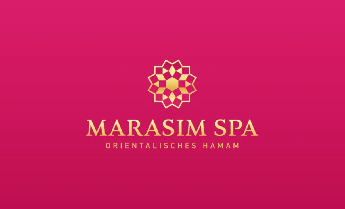
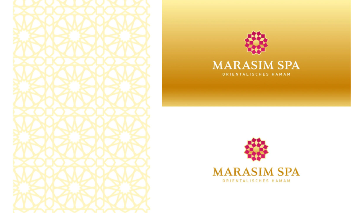
The Marasim Spa logo, designed by Arne Tympe Creative Studio, blends cultural tradition with modern sophistication. Drawing from oriental hammam heritage, it uses geometric symbolism and luxurious colors to create an identity that feels rich, welcoming, and contemporary.
A vivid fuchsia and gold palette sets a tone of energy, indulgence, and tradition. Deep pink signals vitality, while gold accents hint at luxury and self-care, giving the logo a premium feel without losing its warmth and accessibility.
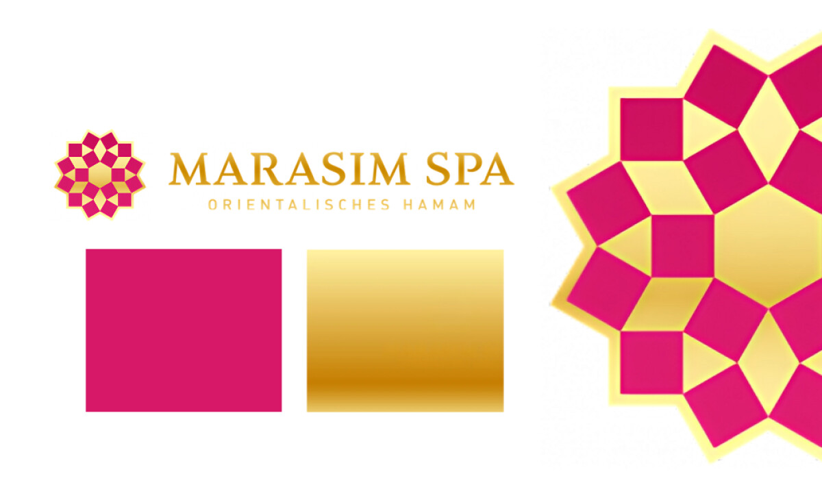
The central icon draws from Islamic geometric patterns, offering a subtle yet powerful cultural reference. Its balanced, symmetrical form feels intricate yet calming, honoring the spa’s heritage while appealing to a modern audience.
Versatility is one of the logo’s greatest strengths. Whether on pink, white, or gold backgrounds, the symbol and typography remain clear and unified. Across signage, packaging, and digital use, the brand stays instantly recognizable.
With rich color choices, symbolic design, and flexible execution, Marasim Spa’s identity invites clients into a world where tradition meets comfort. It’s a prime example of how the best logo design creates connection while telling a meaningful story.

-preview.jpg)