- Designer: Junyoup Bong
- Client: Mewame
- Category: Logo Design — Food & Beverage
- Location: Seoul, South Korea
- Project Brief: Create a food and beverage logo that introduces Korean shaved ice culture through a distinctive M-W-M symbol inspired by the brand name’s meaning.
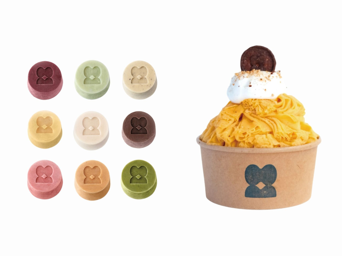
A food and beverage logo earns its place by staying legible squished onto a napkin or pressed into the food itself. mewame, a Korean shaved-ice brand out of Los Angeles, gets there with a rounded mark that folds M, W, and M into one soft symbol.
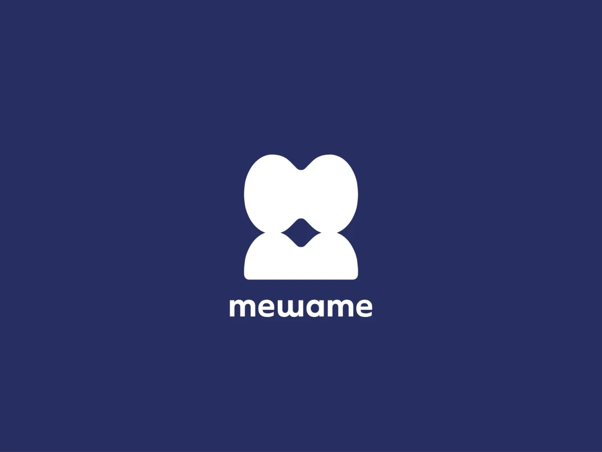
The glyph reads as two heads leaning together over a small diamond gap, warm and approachable at a glance. It also carries the name's meaning, standing in for Mi, Wa, and Mi, or beauty and taste, without spelling any of it out.
The rounded language extends into a lowercase wordmark, matching the mark's soft curves in a friendly geometric sans. Consistent radii tie the symbol and letters together, so the whole thing feels built from one shape.
The system stretches furthest as a pattern, chopped into bumps and curves that spell the name across a wall or stamp onto each ice cup. That flexibility is the real strength, though the abstraction cuts both ways, since the mark leans so soft and simple it could read as any wellness or tech brand before it says dessert.