Standout Features:
- Custom 'M' mark with arrows
- Bold typography and colors
- Tool icon pattern
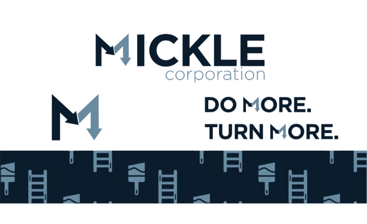
MORE creative agency developed a robust logo system for Mickle Corporation, a company specializing in comprehensive turnover services for student housing. The design needed to convey efficiency, reliability, and the capability to handle diverse maintenance tasks from cleaning to major repairs.
At the heart of this professional services logo is a custom-designed 'M' mark, used both standalone and within the main wordmark. This bold, geometric letter cleverly incorporates blocky arrows that suggest movement, efficiency, and the cyclical "turnover" process central to Mickle's business model.
Additionally, bold, geometric sans-serif typography give the design a solid and action-oriented feel. This is complemented by a professional color palette of dark and light blue greys. The direct tagline, "DO MORE. TURN MORE.," clearly articulates the company's value proposition, and is a great addition to the logo’s suite of variations.
Adding another layer to the brand identity is a supporting pattern composed of simple, flat icons. Featuring tools like paint brushes, rollers, and ladders, this pattern subtly visualizes the hands-on services Mickle Corporation offers, providing a versatile graphic element that could be used on any branding collateral while staying true to its services.
All in all, the directness inherent in the custom mark, the straightforward tagline, and the recognizable supporting icons help define Mickle's specific service niche unequivocally. For specialized B2B service providers, such clear visual communication is absolutely key to establishing immediate credibility.