- Article by
- Jermaine Dela Cruz

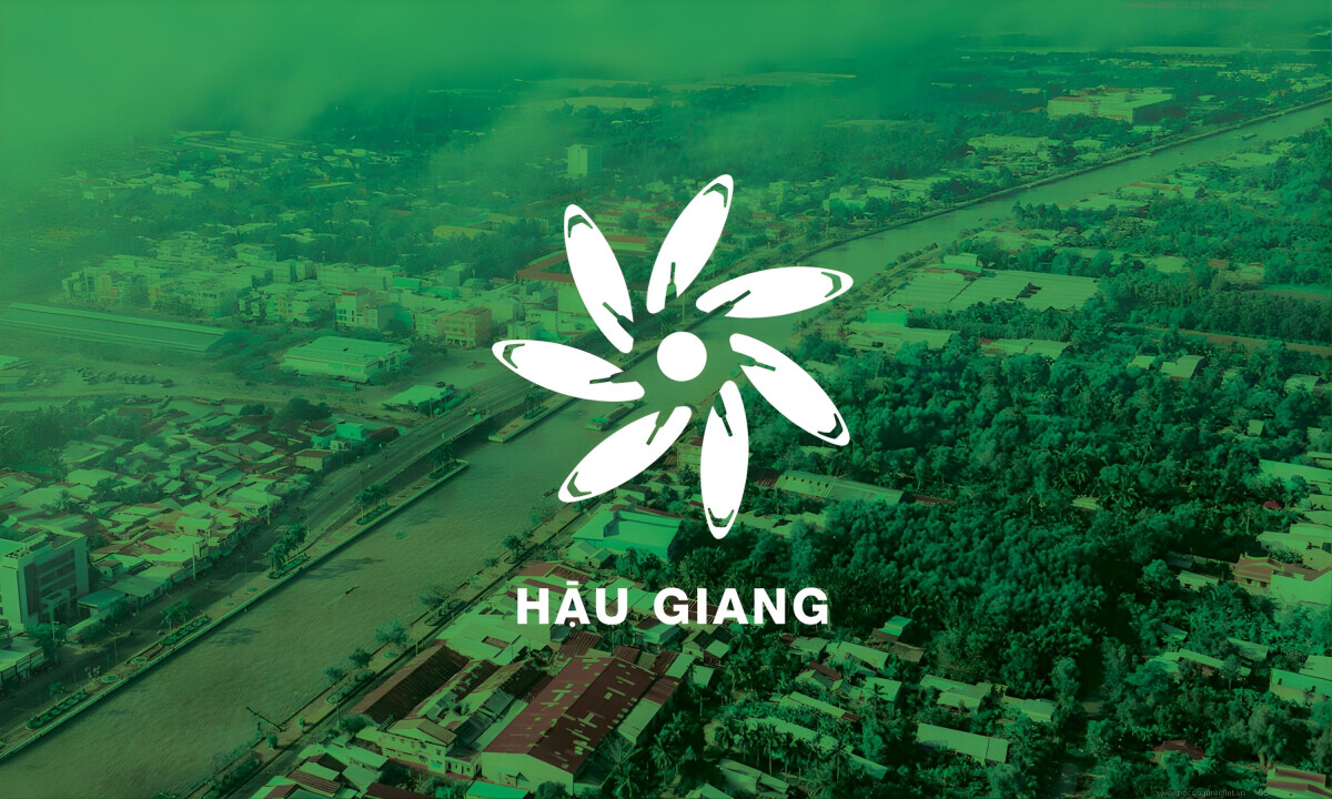
This website uses a colour palette of 4 colours
#A1D66A #188F46 #F0B300 #FFFFFF
Technologies & Tools
Description
Team Behind the Design
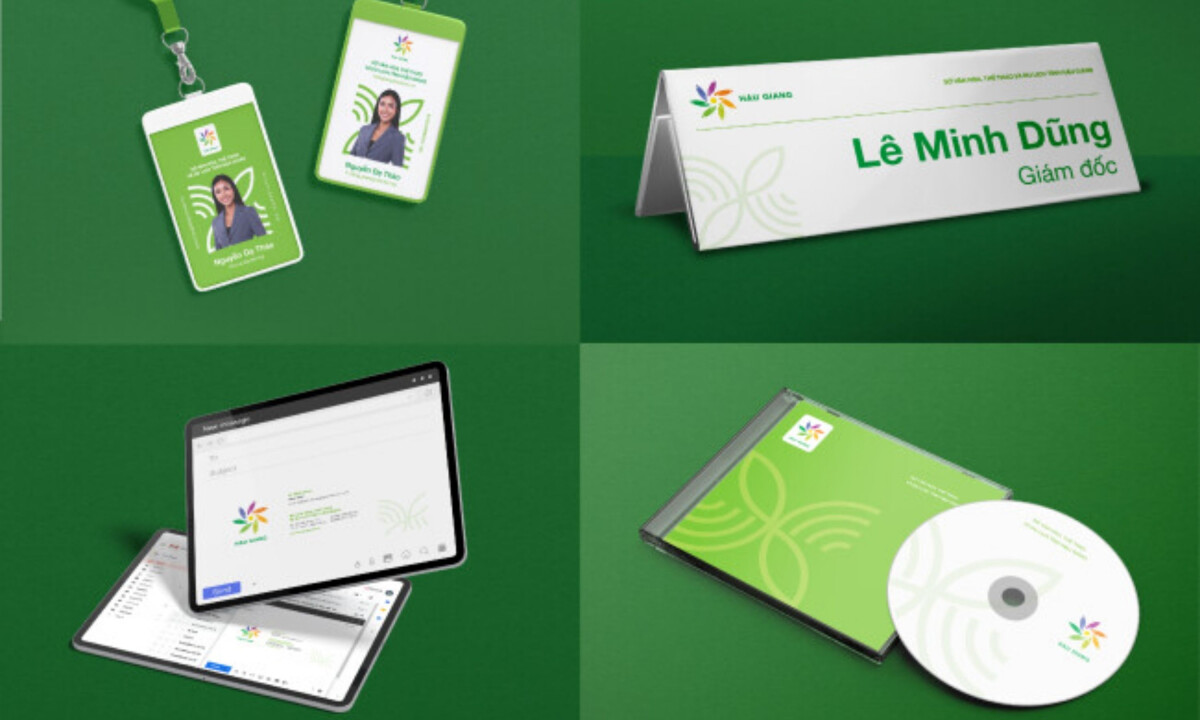
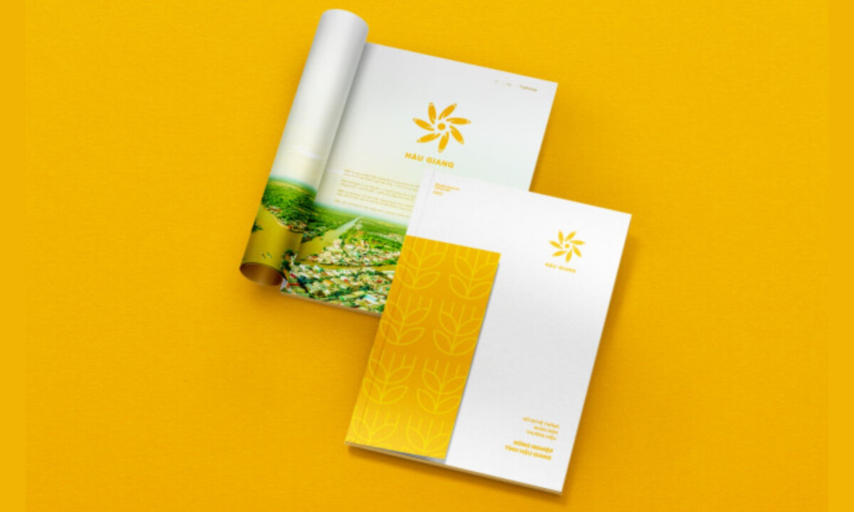
Bo Cong Anh Creative is a boutique agency situated in Ho Chi Minh City, Vietnam, dedicated to strategic design and digital product innovation. Their process emphasizes individual creativity and collective growth, aiming to produce distinct visual stories that resonate with specific community values.

Discord's Logo Is a Face. That's Not Cute. That's Strategic.
Redheads
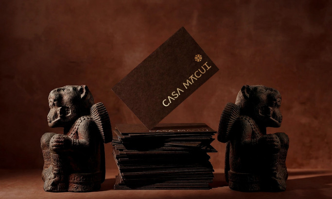
Casa Macui
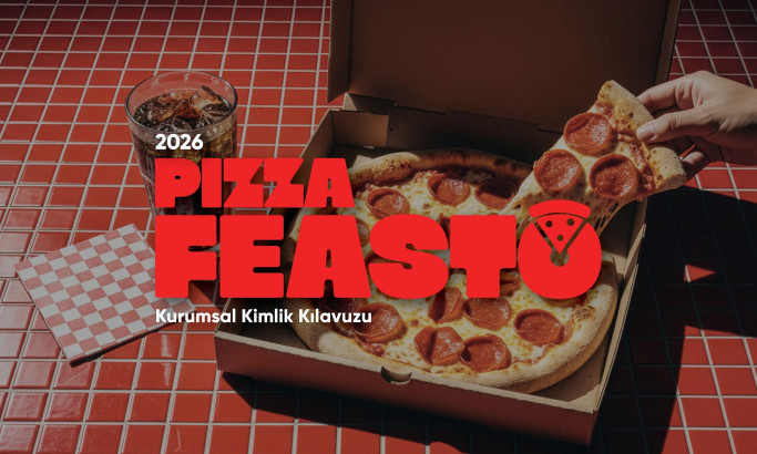
Pizza Feasto
View All BestLogo Designs