Standout Features:
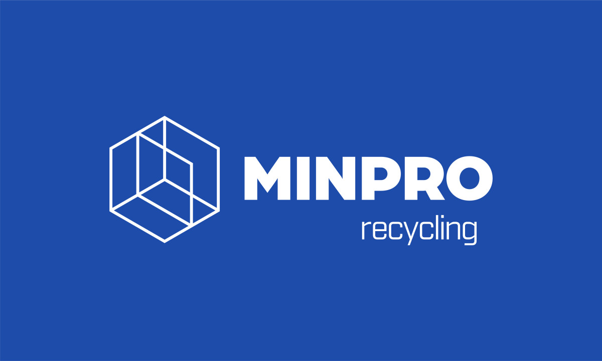
- Geometric hex-cube symbol
- Monochromatic blue palette
- Compact, bold typography
This new brand identity for Minpro Recycling AB, a Swedish leader in industrial waste solutions, was created by Nestell Design. The design challenge was to reflect the company's deep engineering roots while highlighting its modern sustainability mission. The logo system serves as a strong visual testament to these dual strengths.
A distinctive cube, constructed from hexagonal elements, defines the professional service logo’s icon. This multifaceted form can be interpreted as blueprint structures or modular building blocks, alluding to recycling processes. The symbol’s ability to shift between outlined and solid 3D renderings makes it a flexible and potent visual tool for the brand.

The brand’s color identity is built on a range of blues, from dark and authoritative to light and energetic. This monochromatic approach effectively communicates professionalism, leveraging the fact that blue is rated the most trusted brand color by 54% of consumers (Adobe, 2025). Plus, the palette ensures excellent readability across different materials.
Typography follows the same rational, grid-based logic as the icon. "MINPRO" is set in a strong, thick geometric sans-serif with close kerning, conveying authority. The secondary "recycling" text uses a lighter, more rounded and condensed sans-serif, making everything more readable and balanced.

Nestell Design’s identity for Minpro Recycling AB powerfully showcases how industrial branding can effectively communicate environmental responsibility. This approach demonstrates that even complex technical services can be represented with clarity and compelling visual logic.


