Standout Features:
- Monogram “NB”
- Elegant typeface
- Sophisticated color system
Biquara Digital Creative designed the logo for Natália Barsô, a residential architecture brand rooted in elegance and personal detail.
The visual identity is sleek, minimal, and deeply considered. It’s a perfect manifestation of the brand’s mission of turning dreams into structured, livable design.
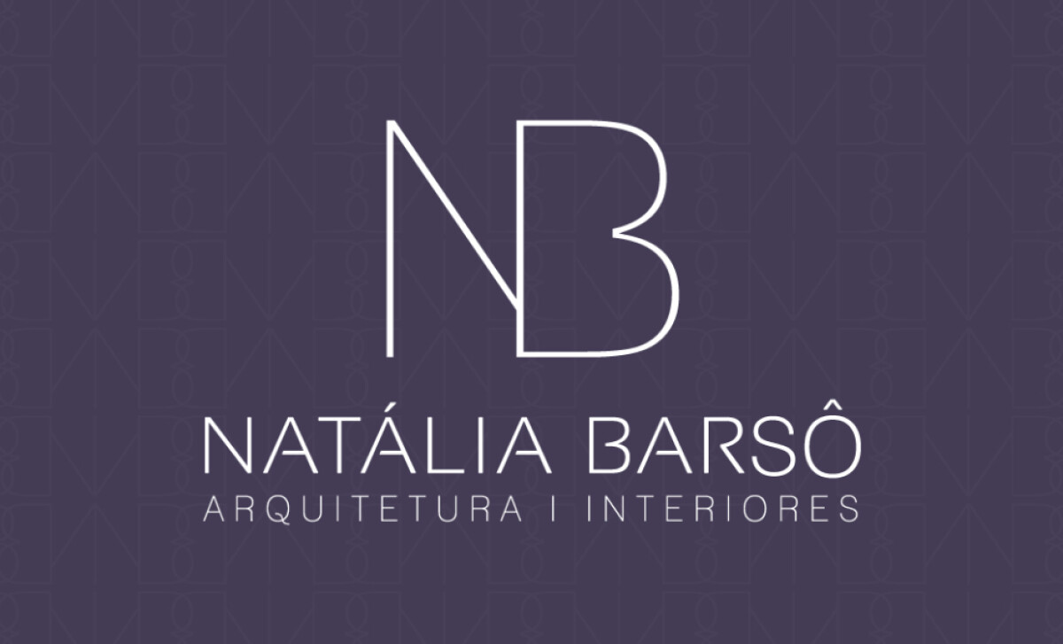
A key feature of the design is the monogram made from the initials “N” and “B.”
The delicate linework is a key part of the logo's success. The way the sharp “N” flows into the curved “B” is a beautiful and elegant detail.
The impact of this choice is a refined and recognizable visual signature. The monogram is adaptable across all branding materials without losing its elegance.
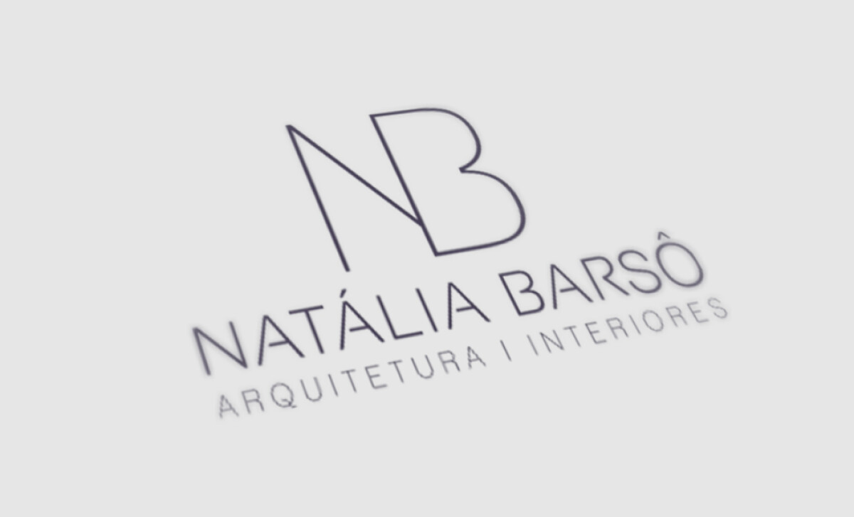
Beneath the monogram sits the full brand name in a clean, all-caps sans-serif typeface.
“NATÁLIA BARSÔ” appears in a slightly heavier weight. The supporting line, “ARQUITETURA | INTERIORES,” is presented in a lighter, more spaced-out variation.
This typography delivers a sense of clarity and professionalism, which are hallmarks of architectural communication.
Not to mention the unique bars of the letters, which are customized to barely touch the adjacent sides of the letter, giving it a unique, modern feel.
A 2024 study from the International Journal of Eurasia Social Sciences notes that, from a brand identity perspective, this unique typographic treatment is a powerful tool for building brand recognition.
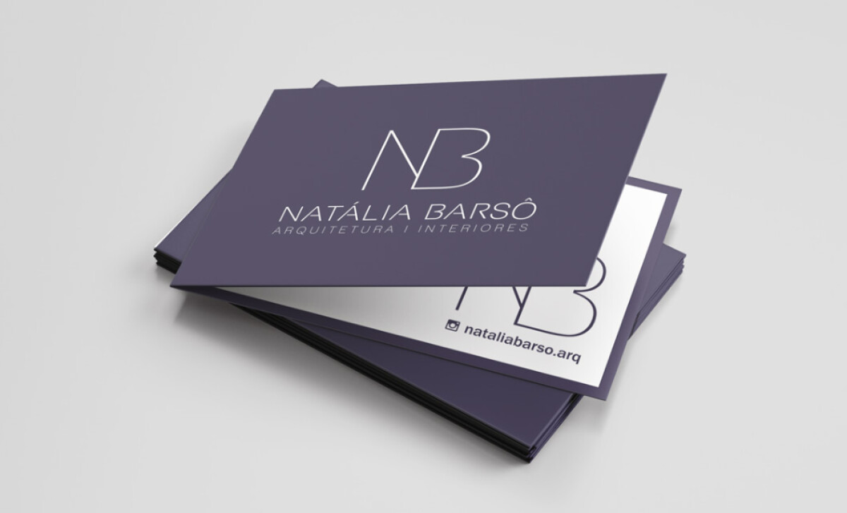
The dominant color palette features a deep, muted eggplant purple with a crisp white typography.
This color choice is both unexpected and elegant. It’s a deviation from the standard grayscale palettes often used in architecture. The color communicates a sense of creativity, luxury, and a strong sense of individuality.
The logo for Natália Barsô is a perfect example of how to brand an individual practitioner as a high-end studio.
The architecture logo design's minimalism elevates the personal brand, giving it a sense of scale and authority that is crucial for attracting premium residential clients.
A great brand for an architect or designer needs to feel both personal and highly professional at the same time.
That's why brands turn to expert partners, and our team has ranked the best agencies worldwide to make finding them simple.
Visit our Agency Directory for the Top Logo Design Companies, as well as:
Our design experts also recognize the most innovative design projects across the globe. Visit our Awards section to see the best & latest in logo design.