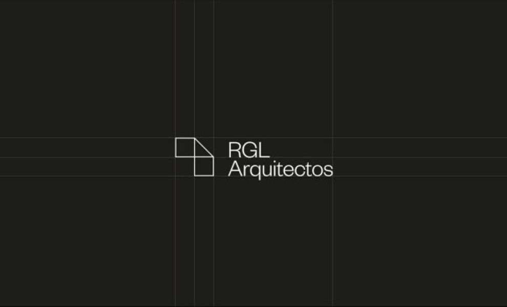
Standout Features:
- Interconnecting shapes
- Classic logo concept
- Serious feel
One thing familiar with company logos with geometric shapes is that they always mean business. They want to create something other than something that looks fun and fancy.
Senza Estudio gave our next entry, the RGL ARQUITECTOS logo, a classic yet serious feel by adding interconnecting shapes.
This gives off the impression that they are well-connected and dependable in what they do. This is a superb impression to leave on your target audience to present yourself as a put-together group.
They used white and black as their primary colors, with an additional grey highlighting their connection and message.
Get a chance to become the next Design Award winner.
SUBMIT YOUR DESIGN