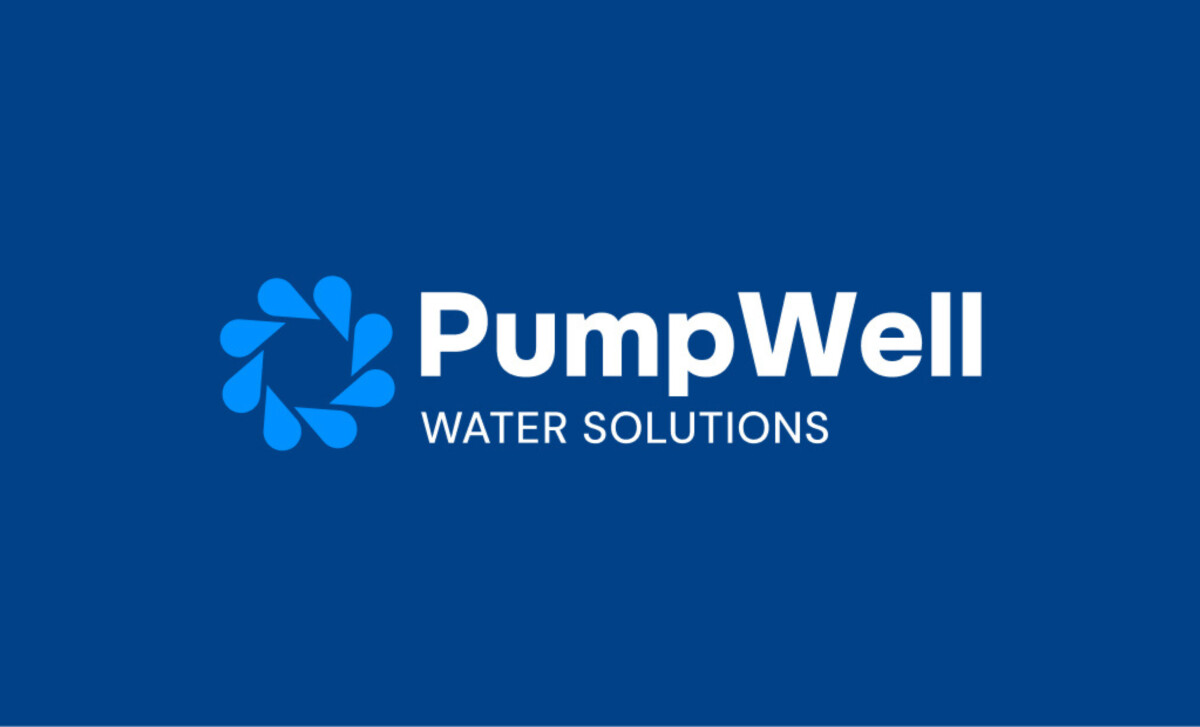
The PumpWell Water Solutions rebrand demonstrates how great logo design can signal trust, innovation, and approachability in a traditionally overlooked space. Created by Longhouse Branding & Marketing, this identity system reframes water services with a fresh and functional brand mark. It introduces a striking visual built on clarity and metaphor, engineered with refined form, color, and empathetic layout.
Key Insights for Brands:
- Combine symbolic elements to create logos with layered meaning
- Use bold and clean typography to balance approachability and authority
- Develop a visual system that adapts fluidly across media and platforms
Unified Shapes and Typography Build a Clean, Trustworthy Identity
The PumpWell Water Solutions logo is built around a circular motif of stylized water droplets, arranged precisely to create a gear-like shape.
This harmony between nature (water) and utility (mechanical form) visually conveys what PumpWell does: bring dependable infrastructure to life-sustaining resources.
Next to this mark sits a logotype that’s also well-considered. Given that heavy fonts often signal authority, the bold geometric typeface is an excellent choice. It’s approachable without losing strength and credibility.
The capital “P” and “W” also create rhythm and structure, while the word “PumpWell” feels conversational, like a company you already know and trust.
Together, the typography and icon serve as a seamless unit that balances modernity and tradition. It’s the kind of work that professional logo designers like Longhouse strive to create, one that holds its own at both small scale and large format without losing clarity or meaning.
Symbolism Adds Layers of Meaning to a Simple Mark
The logo may look effortless, but it’s backed by smart symbolism. It blends three core visual ideas: a well, water drops, and a gear.
The result? A visual shorthand for what PumpWell stands for: access, flow, and engineered reliability.
Learn the best practices of brand symbolism.
Each droplet is evenly spaced to create a sense of movement, suggesting both rotation and flow. This gives the logo energy, direction, and purpose. More than just a badge, it becomes a storytelling device, a tool that builds immediate understanding with new audiences.
This technique of metaphor-based logo construction sets apart the best logo designs. It helps the audience intuitively grasp the company’s value before they read a word of copy.
The PumpWell Logo’s Refreshing Palette Signals Reliability and Approachability
Color is critical in creating an equally confident and welcoming company identity.
The brand’s deep blue base anchors it in stability, seriousness, and professionalism. These are essential qualities in an industry where trust is paramount.
To offset this depth, bright blue accents introduce freshness and clarity, while orange tones in some applications act as a humanizing element. It’s a combination that feels both engineered and warm, capable and friendly.
The Longhouse Branding Process
Prior to designing any brand, it's important to conduct an industry and peer analysis to see where there is the most opportunity.
If the industry favors a certain style, color, or voice, it may make the most sense to align your brand similarly. However, there could also be an opportunity to stand out through brand differentiation. Longhouse’s process begins with a comprehensive onboarding session, which is then followed by extensive research.
With research completed, the team then presents the findings and a direction for the project.
The final stages are the delivery of brand concepts and finalization revisions to the chosen package.
Sample of a branding industry analysis map with Longhouse
Sample of a branding industry analysis side-by-side comparison with Longhouse Sample of a branding data aggregation with LonghouseAccording to Straits Research, blue is the most preferred color by top brands globally. PumpWell Water Solutions’ palette supports this reality by creating a first impression that feels secure and solutions-focused, which is exactly what a customer in need of water help is looking for.
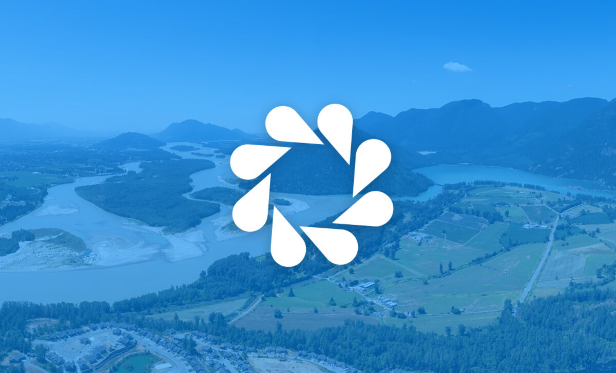
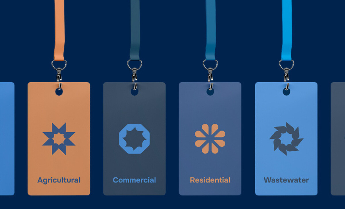
An Icon System Enhances Brand Recognition Across Media
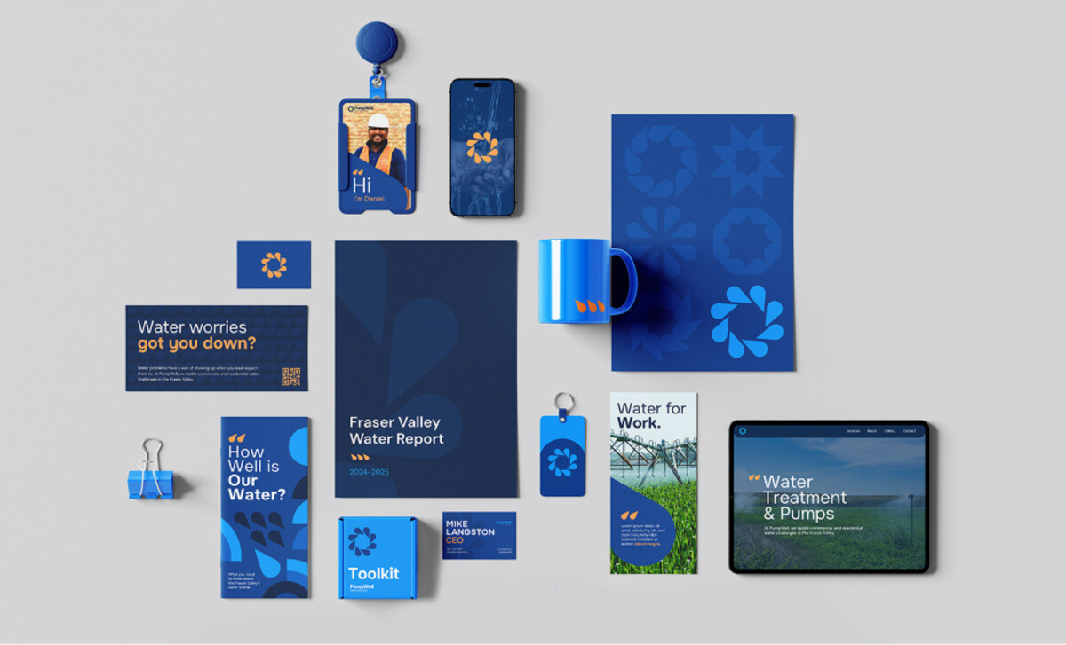
The water droplet becomes a visual system used throughout PumpWell’s brand materials. From web design to mugs, flyers, and keychains, the logo’s circular icon appears in varied applications, both as a pattern and a brand anchor.
Whether used in a full-color lockup, an embossed graphic, or as a subtle watermark, the symbol adapts fluidly across platforms. Its simplicity makes it scalable. And its shape, rooted in repetition and rhythm, feels instantly recognizable.
This consistency is what makes a logo truly outstanding.
It gives the identity a sense of coherence and presence across touchpoints. It’s a smart, future-facing brand system designed not just for one logo file, but for how modern audiences experience brands today.
Overall, the company logo and complete branding package created by Longhouse Branding & Marketing is a refined, symbol-rich piece that reflects the values and utility of the brand it represents.
Through meaningful shapes, confident typography, and a flexible visual system, this logo elevates what a water service brand can look and feel like. It’s a noteworthy example of strategic branding, and one fully deserving of winning the Design Awards.
To read more about Longhouse or their founder Keenan Beavis, check out their website.