Standout Features:
- An imaginative take on building blocks
- Protection at the core
- Oscillating between traditional and modern
NETT FRONT is a family business that produces top-notch, personalized, and distinctive furniture doors. Creathink Advertising’s rebranding solution was made to address the two different types of the brand’s audience: personal buyers that value unique aesthetics and technicians looking for long-term partners.
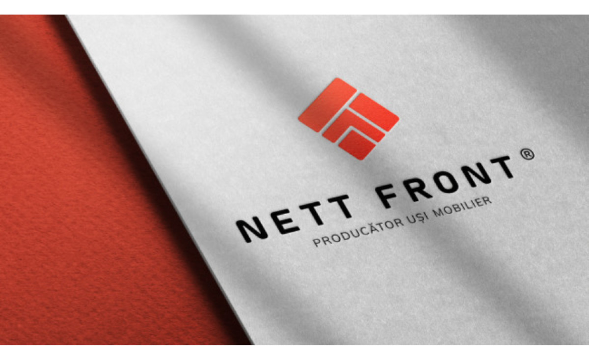
The new logo design does an incredible job of communicating with both target audiences. Inspired by the distinctive millings the brand makes on its furniture doors, the logo resembles a furniture-based tribute to Legos and Rubik’s Cube – it symbolizes building blocks into meaningful and beautiful shapes.
The emblem displays a rhomboid of four closely aligned red building blocks, encouraging playfulness, logic, and the simplicity of the brand’s operations.
The NETT FRONT red, which stands for the essential components of constructing a warm home: stability, vitality, and protectiveness, pulses with possibilities while radiating a welcoming warmth.
-preview.jpg)


