Standout Features:
- Colorful connective squares
- Creative letter encapsulation
- Vibrant aesthetic
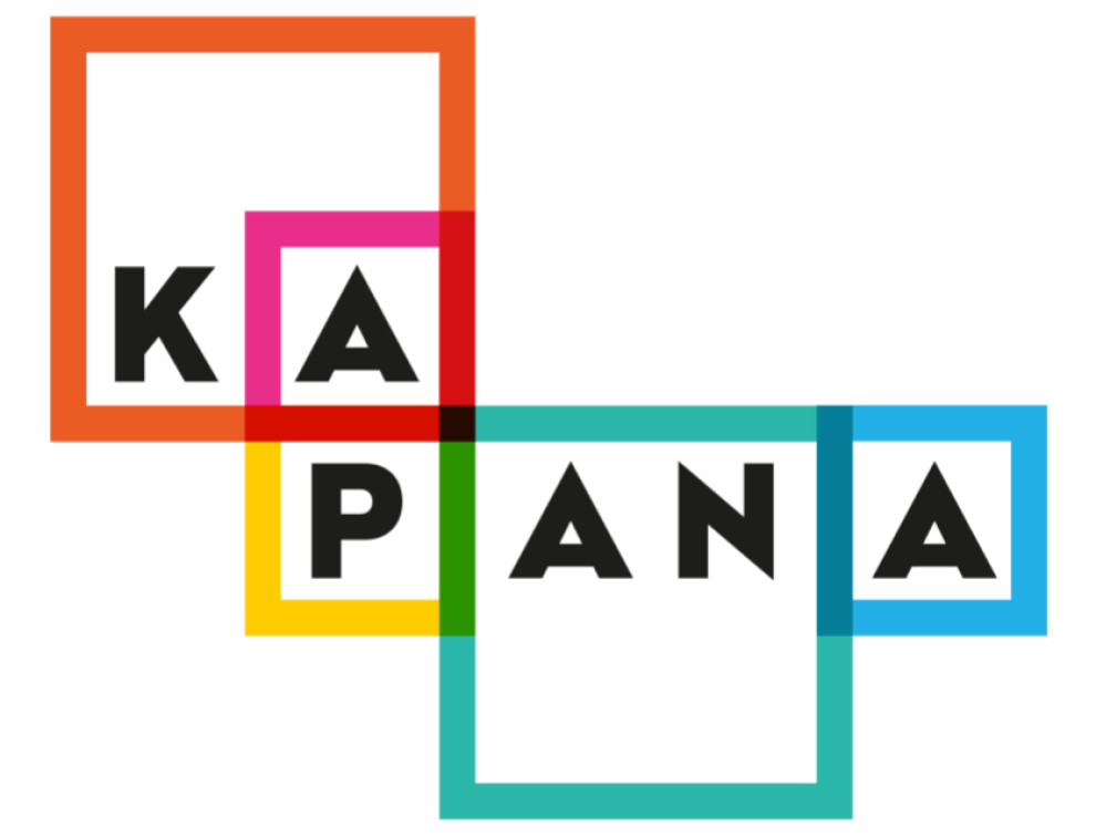
Neogrey Creative’s logo design for ABSOLUT Kapana is a vibrant homage to the district's rich, artistic vibrancy and cultural dynamism.
The design utilizes a palette of varied colors within squares and rectangles, mirroring the eclectic art scene and cultural richness of Kapana’s workshops and galleries. Each letter is thoughtfully placed within these geometric shapes. This style symbolizes the distinctiveness of the local artists and their creations.
The logo's lively and radiant design does more than catch the eye. It embodies the spirited creativity and vitality that flow through Kapana. The simplicity of the shapes invites continuous reinterpretation, reflecting the district's artistic evolution and adaptability.
The best part? Presenting the logo in both English and Bulgarian honors Kapana’s cultural heritage and ensures the design resonates deeply within the community.