Standout Features:
- Highly symbolic logomark
- Futuristic yet readable typeface
- Bold color combination
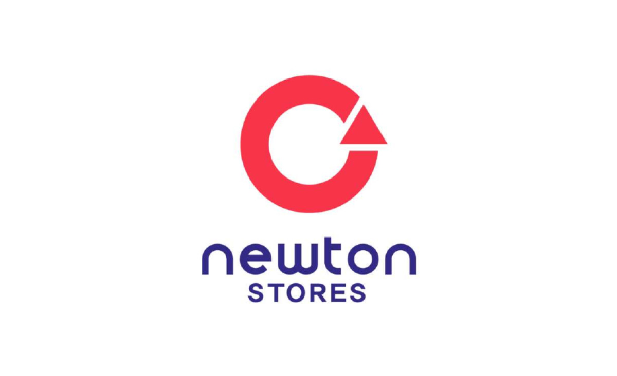
Marking its 50th year in the industry, Newton Stores wanted to galvanize its place in the hardware retail and wholesale market. The solution? A complete branding facelift, and yes, that includes this amazing logo redesign by UBlac Agency.
The new ensemble features a looping logomark composed of three aspects that symbolize Newton's name: a telescope for innovation, a prism for colorful reflection, and a replay icon for continuity.
With such an abstract illustration, having the logotype written so clearly and legibly is a smart design choice. It doesn’t look too plain, though – the font leans toward a more industrial yet futuristic style.
Using bright primary colors for these two visual components also makes the logo stand out in a sea of monochrome pieces. Blue and red are a striking color combination that immediately catches attention.