
Sometime in late June, thousands of Norwegian fans sat down in rows inside American stadiums and started to row. Nobody choreographed it. Supporters arranged themselves bench by bench and pulled invisible strokes in unison while chanting a two-letter word: ro.
In Norwegian, å ro means to row, the way you would inside the hull of a Viking longship. The fans improvised the whole thing. The Norwegian Football Federation never planned it, and no historical evidence suggests Viking rowers ever chanted anything like it.
So why did it land so perfectly? Because the shirt on the pitch and the crowd in the stands said the same thing: we came from somewhere old, and we are not pretending otherwise. Norway's run ended July 11, when England won their quarterfinal 2-1 after extra time in Miami. The kit story it leaves behind is the best design story of the tournament.
The Kit: What You See
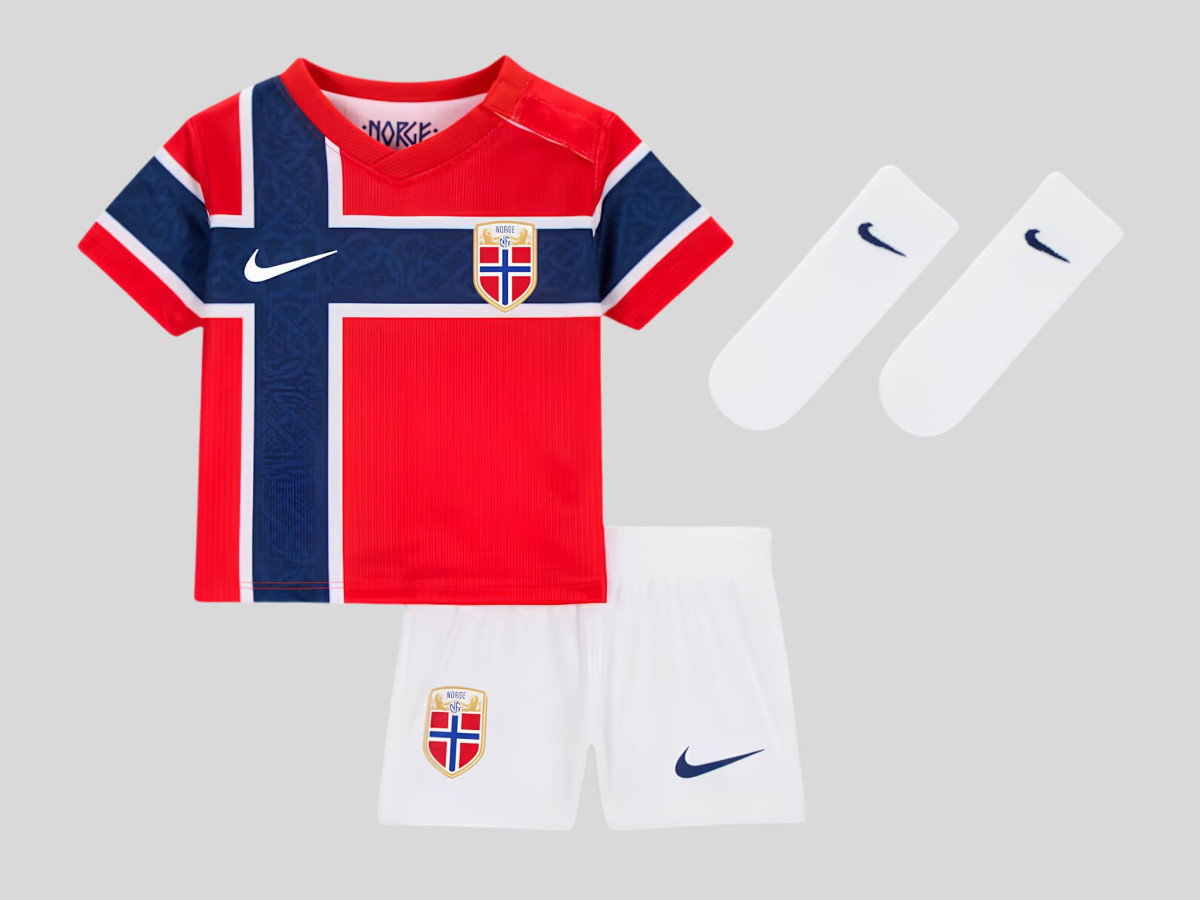
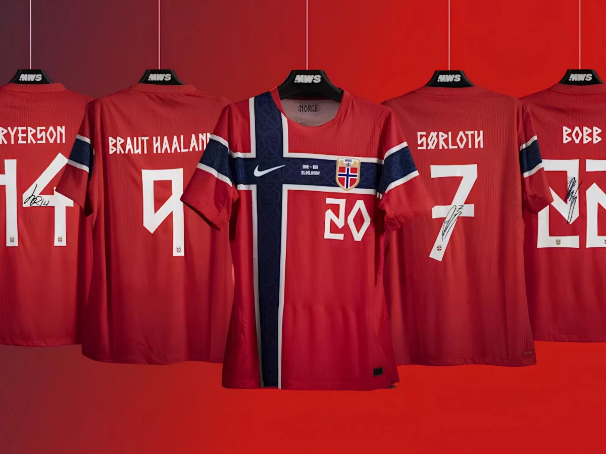
The Norway football kit 2026 starts with the flag and refuses to apologize for it. The home shirt is red, crossed front and sleeves by a navy Scandinavian cross outlined in white. The NFF crest sits inside the cross itself.
Look closer and the navy panels carry a tonal carving pattern from Urnes Stave Church, the 12th-century wooden church whose interlaced woodwork marks the handover from Norse paganism to Christianity. White shorts and blue socks complete the combination, and the whole look echoes the Umbro shirt Norway wore while qualifying for the 1998 World Cup, the last one the country reached before this summer.
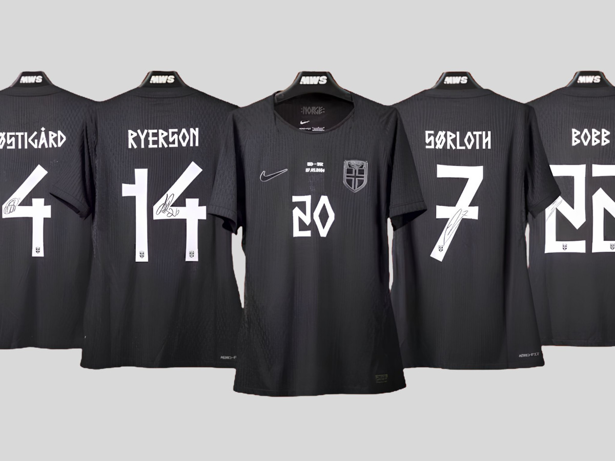
The away kit goes the other direction entirely. It is the first all-black strip in the national team's history: black base, blacked-out crest, silver Swoosh, and a ribbed vertical texture across the torso. The federation built it around the Viking mentality, and the metallic lettering against black reads like engraving on a blade.
The tension that makes both shirts work sits between crest and type. The NFF badge is a heraldic lion, formal and medieval. The names and numbers above it are something much older.
The Font: Why It Got Banned
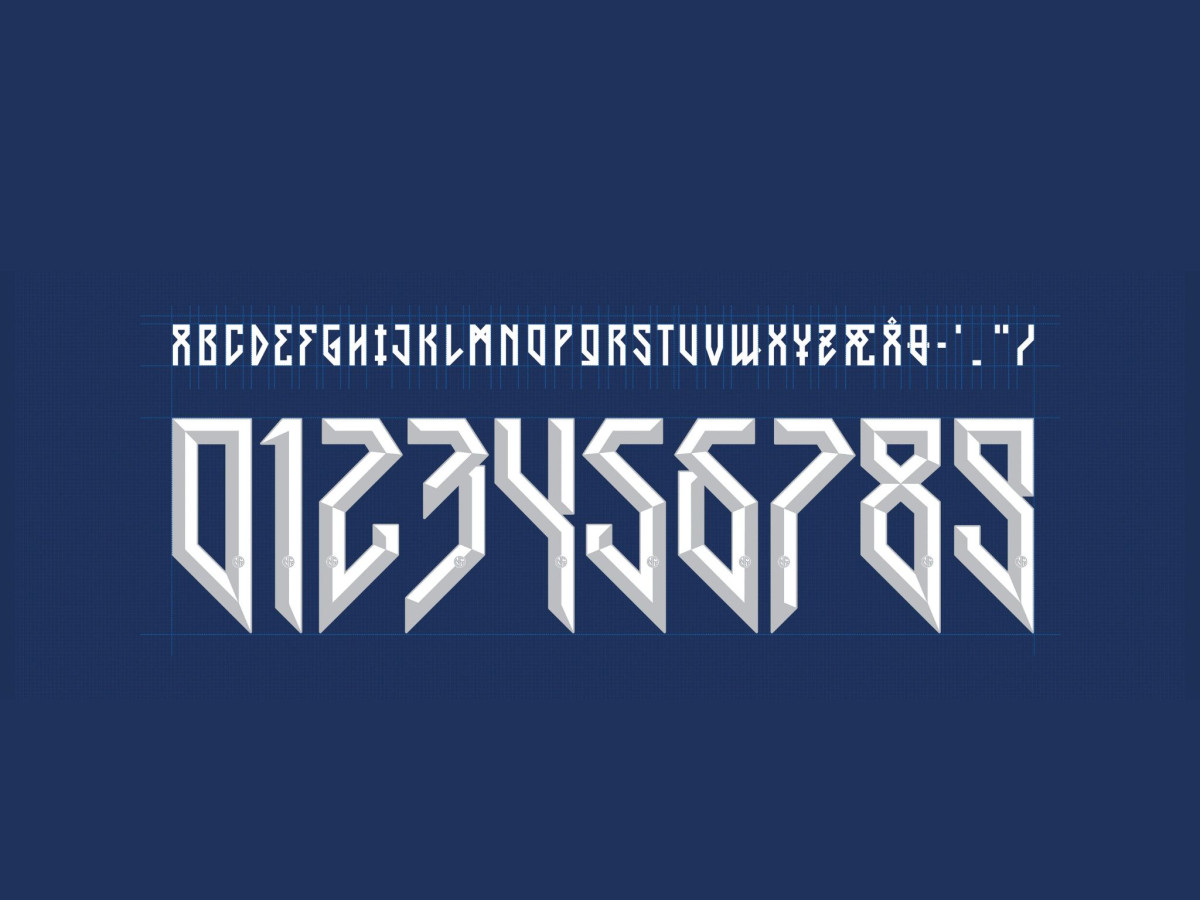
The typography experiment began in 2024, when Nike designer Luis Callegari created a nameset for Norway called the Harald Typeface. Callegari described it as a reflection of "the spirit of Harald." He drew the letterforms from the straight lines of sword metal and the angular geometry of runes.
The numbers were two-tone and bevelled, the strokes sharp and vertical. The whole set looked spectacular in a product render. On a moving player, it was close to unreadable.
The Harald Typeface debuted at the 2025 Women's Euro and the U20 World Cup, and FIFA banned it soon after. The design broke equipment regulations on two counts. FIFA disallows two-tone numbers outright, and it requires names and numbers that read clearly from distance and derive from the Latin alphabet. Norway's players spent the interim wearing Nike's standard global font.
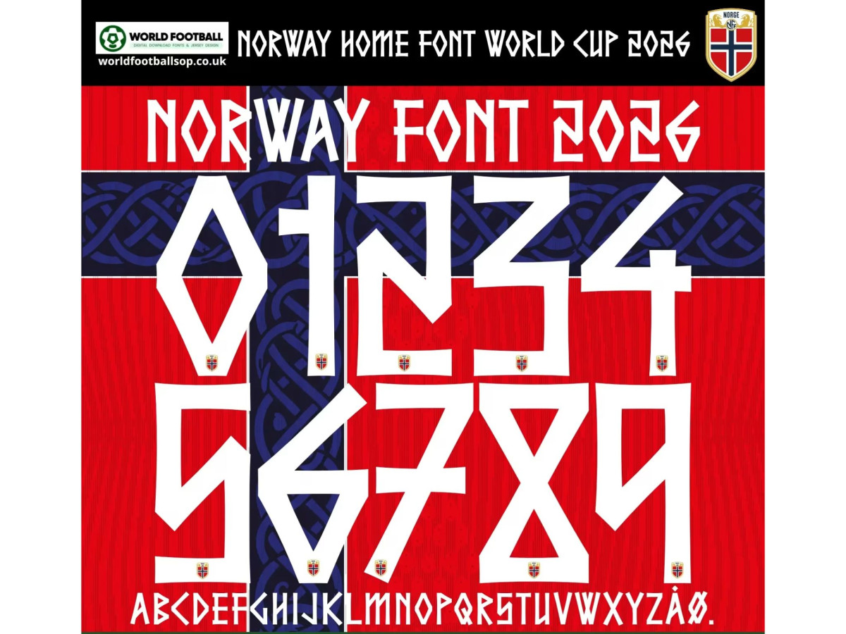
The 2026 revision fixed the problem without abandoning the idea. The tournament typeface is Taakeferd Condensed, Norwegian for journey through the fog, a nod to the 28 years Norway spent outside the World Cup. Bergen-based designers Justin "Justinho" Tallian and Dan Gerhardstein created the font, and Nike adapted it for match legibility.
The letterforms follow strict logic. Strokes stay horizontal or vertical wherever possible, with diagonals reserved for moments inside individual characters. In the surname Haaland, the foot of the L now sits flat on the baseline where the 2024 version kicked it upward at an angle. The crossbar of the double A tilts as a controlled exception. The number nine keeps its geometry free of curves without closing into a figure eight, as the banned version nearly did. Wider strokes carry the shapes across a stadium and a television screen, which is the entire point.
Runes, Bluetooth, and a 10th-Century King
One paragraph of history, because the source material earned it. The letterforms trace back to the Elder Futhark, the runic alphabet Germanic and Scandinavian peoples used between roughly the second and eighth centuries. It ranks among the oldest writing systems with surviving evidence in the Nordic world, and the word rune itself comes from Proto-Germanic roots tied to secrecy. Each rune worked double duty as a sound and a concept, a letter and an idea at once.
This is also where the strangest thread in the story comes in. The most famous modern use of runes sits in your pocket. In the 1990s, engineers at Intel and Ericsson code-named their wireless standard after Harald Bluetooth, the 10th-century Danish king who unified Scandinavia. They built its logo by binding the runes for his initials, and the temporary code name stuck.
The name Harald runs through the entire royal line the kit gestures at, from Harald Fairhair, Norway's first king, to Harald Bluetooth, to Harald V on the throne today. The same symbol system that became a global data standard now spells out squad numbers on a football shirt. That is a long afterlife for an alphabet built for carving into stone and steel.
The Haaland Thread
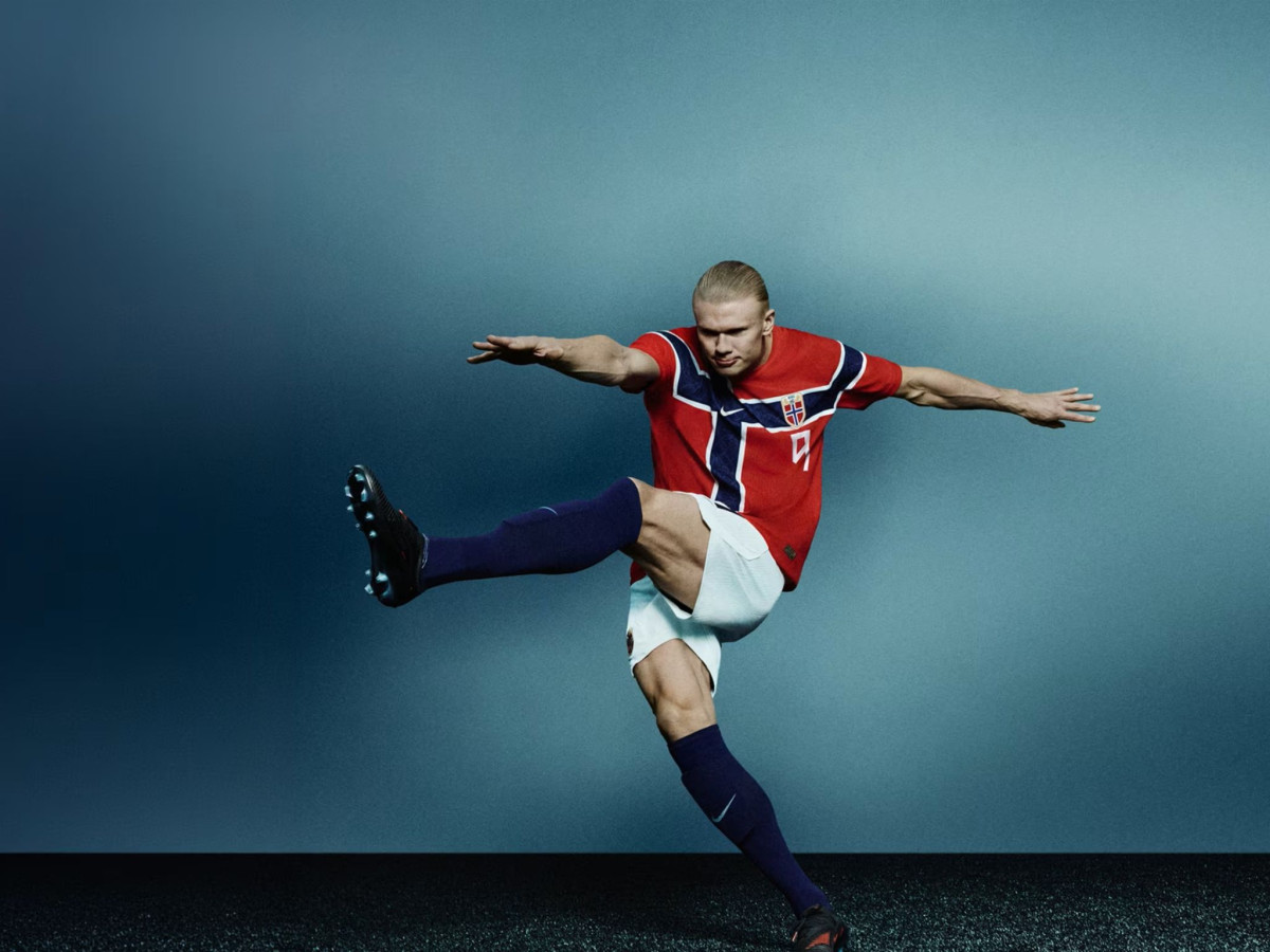
Erling Haaland spent the tournament wearing a name he does not use at Manchester City. His Norway shirt reads Braut Haaland, restoring his mother's surname. Gry Marita Braut won the Norwegian national heptathlon title in the 1990s, and her son reserves the full name for international duty. Teammate Kristoffer Ajer does the same, playing as Vassbakk Ajer for Norway in memory of his grandfather.
The commitment goes past the nameset. In March, months before the tournament, Haaland and his father donated the only surviving copy of the 1594 edition of Heimskringla, Snorri Sturluson's sagas of the Norse kings, to the public library in Bryne, the town where he grew up. The pair paid 1.3 million kroner, about $134,000, the highest price ever paid for a Norwegian book.
Haaland attached one condition to the gift: the book stays open and on display, so anyone can read about the kings whose world the kit borrows from. A reading competition for local schoolchildren follows in the 2026-27 school year, with a national team match at Ullevaal Stadium as the prize.
The Fans: Why the Kit Works Beyond the Pitch
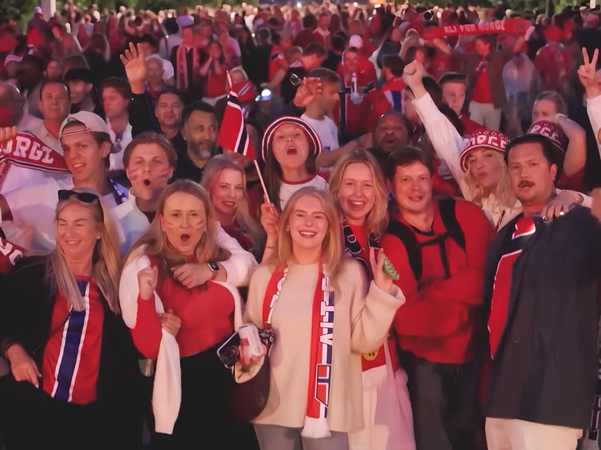
Here is the part that matters most for anyone who designs wearable brand objects for a living. Nike and the NFF never taught anyone to row. They built a coherent visual world instead: a runic viking font on a flag-red shirt, backed by an all-black away strip pitched at berserkers and fronted by a star who put his mother's name over his number.
The fans extended it on their own. Supporters filled the New York City subway and Times Square, then sat down in rows and turned entire stands into a longship. After Norway beat Senegal 3-2, the players walked to the fans and rowed back.
The rowing echoes Iceland's Viking Clap from Euro 2016, but the difference is instructive. Iceland adopted its clap from a Scottish club. Norway's ro grew directly out of the identity the kit had already made legible.
When a design gives 50,000 people a cultural reference point clear enough to improvise around, without a single instruction, the design is doing its best possible work. Norway went home in the quarterfinals, the deepest World Cup run in the country's history. The shirt, and the thinking behind it, will outlast the result.
Our team ranks agencies worldwide to help you find a qualified partner. Visit our Agency Directory for the Top Logo Design Companies as well as: