NVIDIA’s logo evolution tracks the brand’s rise from a challenger in graphics processing to a global force in AI, gaming, and autonomous tech. What started as a stylized, serif wordmark has sharpened into a bold, instantly recognizable emblem — a symbol of innovation, vision, and industry dominance.
NVIDIA Logo Design Details
NVIDIA’s streamlined logo moves in lockstep with the brand’s push into groundbreaking innovation, staying sharp for a tech-savvy global audience.
At the center of every iteration stands the iconic "Eye" — a symbol of vision, progress, and graphical mastery. It’s more than a design choice; it’s a direct link to NVIDIA’s leadership in AI, gaming, and graphics technology.
By preserving the Eye and bold wordmark through decades of change, NVIDIA built instant brand recognition and deep consumer loyalty; a rare advantage in industries where staying visible means staying ahead.
Logo Design Evolution
1993: The Birth of the Eye — NVIDIA’s Original Logo
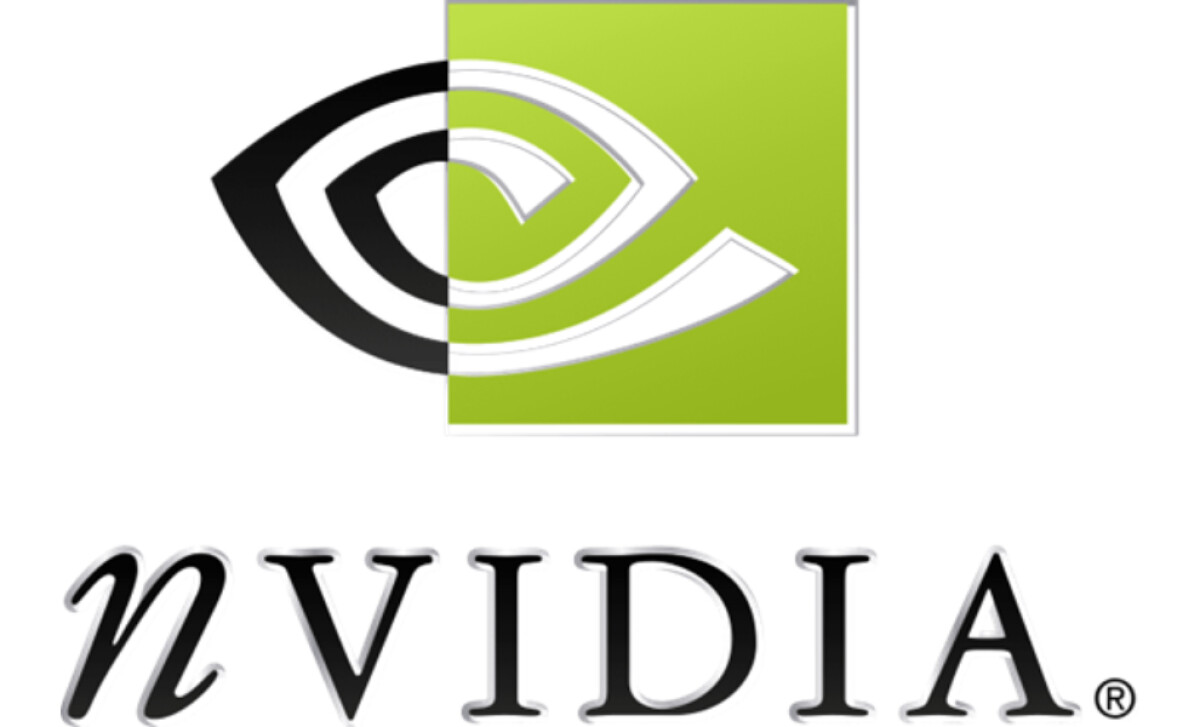
The first NVIDIA logo introduced in 1993 featured a split-eye design with a classical serif typeface spelling out "nVIDIA." The use of a lowercase "n" alongside formal lettering conveyed a mix of innovation and tradition. The lime green background hinted at energy and growth, while the "Eye" motif symbolized vision, focus, and a futuristic outlook — fitting for a tech company aiming to change the landscape of computer graphics.
Explore 8 different logo styles that work best for your brand.
2006: The Modern Transformation — A Bolder, Cleaner Identity
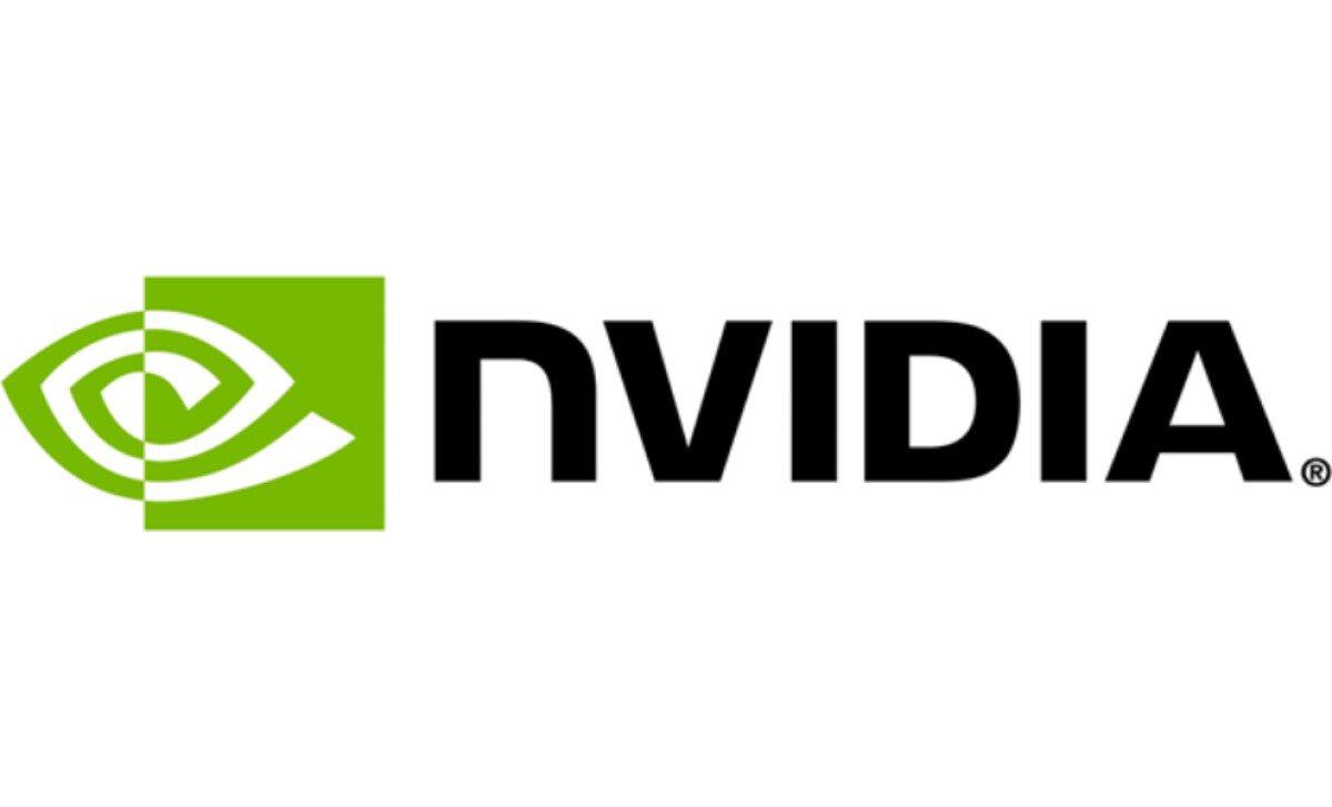
In 2006, NVIDIA underwent a significant brand refresh. The serif font was replaced by a bold, sans-serif wordmark in uppercase — "NVIDIA" — signaling strength, modernity, and confidence. The eye icon remained but was subtly refined, featuring cleaner lines and a fresher green hue, allowing the brand to better align with the sleek aesthetics of the digital age.
Take a closer look at 35 legendary logos and their influence on brand identity.
2015: Subtle Refinements for the Digital Era

Though the 2006 tech logo largely remained, NVIDIA polished its look by flattening gradients and adopting a slightly brighter green. The flat design adaptation allowed for better scalability and visibility across digital platforms, critical for a brand operating in gaming, AI, and mobile devices. This iteration emphasized versatility without losing the brand’s identity.
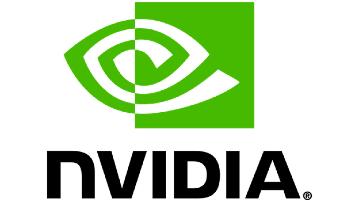
2024: Vibrancy and Dominance — The Latest Evolution
The most recent iteration (2024) stays faithful to its core — the iconic split-eye and strong typography — but amplifies vibrancy.
The green is now more saturated, and the black wordmark stands even bolder, asserting NVIDIA’s market dominance. This evolution ensures perfect clarity on screens of all sizes, from smartphones to massive LED displays, essential for an ever-expanding digital presence.


