Standout Features:
- Initial-based icon with integrated bar graph
- Balanced primary color palette
- Elegant dual-typeface wordmark
We are looking at a logo that had to represent a personal brand focused on quality over quantity. MB Design achieves this with a thoughtful emblem.
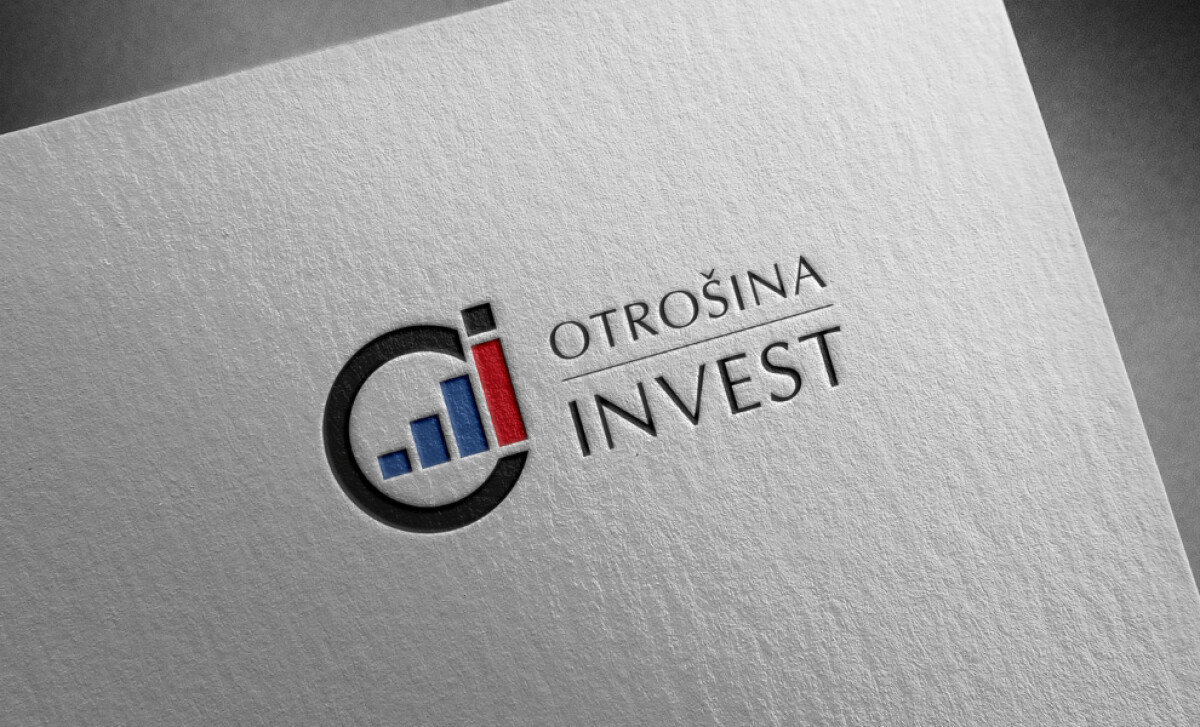
The emblem logo design fuses the lowercase "C" and "i" initials into a single, cohesive mark. Inside the circle, three ascending blue bars represent an upward-trending graph. This is a smart way to visually communicate the core service of investment and growth.
The colors here are chosen for their meaning. The blue bars evoke a sense of calm, intelligent growth. In contrast, the single red bar draws your immediate attention, highlighting the most prominent value point with a touch of confidence.
The typography here appeals to clients who value both a personal relationship and proven results. The serif font feels bespoke and classic, which aligns with research showing serif fonts lead to a higher perception of a brand as being refined and authoritative.
In contrast, the sans-serif feels precise and transactional. Together, they create a perfectly balanced message.
The Otrošina Invest logo succeeds because of its clever symbolism. It embeds a complex idea like "growth" into a simple, memorable mark. It shows that the most effective logos are often the ones that have a powerful idea at their core.
Your logo has the chance to tell a bigger story — you can use smart symbolism to communicate your brand's purpose in one clear mark.
That's why brands turn to expert partners, and our team has ranked the best agencies worldwide to make finding them simple.
Visit our Agency Directory for the Top Logo Design Companies, as well as:
Our design experts also recognize the most innovative design projects across the globe. Visit our Awards section to see the best & latest in logo design.