- Agency: Ronan Redel Design
- Client: Pastorey Pasta
- Category: Brand Identity & Logo Design — Food & Beverage
- Location: Chase, Canada
- Project Brief: Develop a complete brand identity for an independent sourdough pasta producer, including logo system, typography, illustrations, photography direction, and packaging that communicates craftsmanship, warmth, and artisanal quality.
A food and beverage logo design succeeds when it translates a founder's passion into a tangible experience.
Pastorey Pasta thrives by using organic textures and meaningful symbolism to position the brand as a leader in the artisan food space.
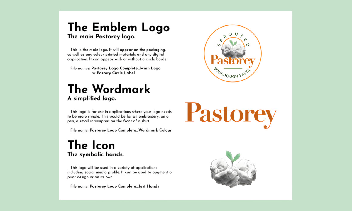
- Artisan Symbolism & Typography: I like how the emblem centers on illustrated hands holding a sprouting grain to signal human touch, while the blend of refined serifs and handwritten accents balances heritage with approachability. This combination prevents the brand from appearing overly precious, ensuring it remains inviting for everyday consumers.
- Illustration & Visual Texture: I find that the hand-drawn illustrations of grains and pasta shapes add a necessary narrative depth to the packaging. These details subtly educate the consumer on the craft story without overwhelming the core design elements.
- Packaging & Shelf Presence: I appreciate the use of earthy palettes and generous white space that allow the product to breathe on the shelf. The clear hierarchy ensures legibility, while the photography creates a sense of freshness and authenticity.
- Scalability & Consistency: I like how the brand scales across logo variations and iconography for various digital and print touchpoints. This flexibility ensures the business can grow its product range while maintaining long-term coherence.
What Brands & Designers Can Learn from Pastorey
1. Use Symbolism to Express Craft and Care
Illustrated hands and sprouting grain communicate human touch and slow production instantly. Meaningful symbols make artisan values visible at a glance.
2. Balance Heritage with Approachability Through Type
Refined serifs paired with handwritten accents keep the brand warm without feeling precious. Typographic contrast helps heritage brands feel accessible to modern consumers.
3. Design a System That Scales Naturally
Organic textures, earthy color palettes, and flexible logo variations maintain cohesion across packaging and digital use. Scalable systems allow growth without losing authenticity.