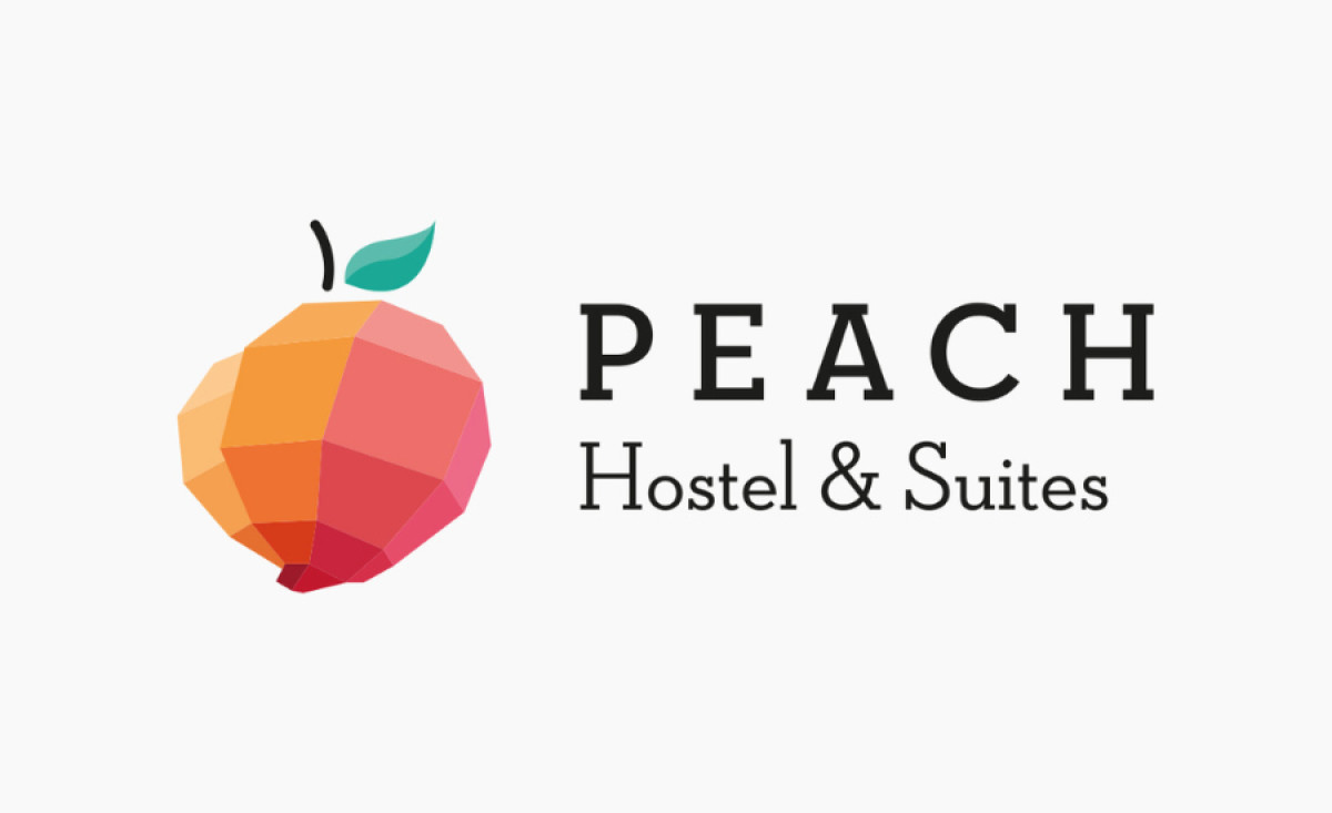
Standout Features:
- Dynamic emblem
- Serif typography
- Colorful gradient blocks
Bazooka's logo design for Peach Hostel is a delightful blend of whimsy and charm, perfectly conveying the brand's unique story and Porto’s iconic São João festival.
The owner discovered a peach tree in the garden upon acquiring the property. So, this fruit was a clear choice for the hotel’s name and symbol. However, this peach emblem can also be seen as a balloon of St. John, a beloved symbol of Porto. This duality adds charm and authenticity to the logo.
A distinctive serif typeface complements the emblem. Its refined lines and subtle details evoke nostalgia and sophistication, creating a timeless and inviting visual language.
Lastly, the colorful gradient blocks mimic the effect of light hitting the surface, adding depth and dimension to the logo. Its vibrant colors symbolize the warmth and hospitality guests can expect at Peach Hostel and reinforce its welcoming atmosphere.