Standout Features:
- Simplicity with warmth
- Use of nature-inspired elements
- Clean and friendly typography
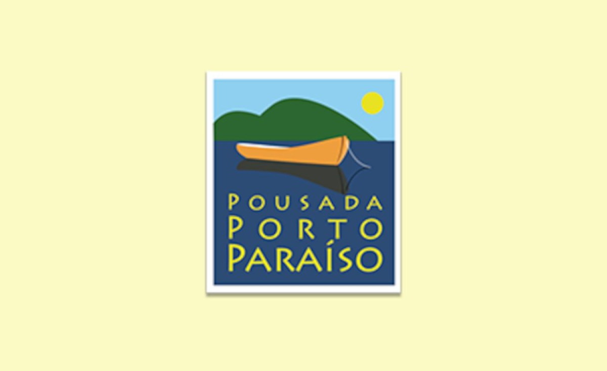
Porto Paraiso Inn, located in Guarujá, SP, offers a peaceful retreat surrounded by nature. The logo, designed by Ars Media, captures this tranquil environment through a simple yet powerful design. With its minimalist approach and nature-based imagery, the logo effectively communicates the inn’s serene and welcoming atmosphere.
The combination of a boat, mountain, and sun evokes feelings of peace and adventure. These elements suggest a relaxing getaway, with the boat symbolizing leisure and exploration. This clean design ensures the logo is instantly recognizable, aligning perfectly with the inn’s calming ambiance and its promise of a peaceful escape.
Nature-inspired elements are central to the logo, reinforcing Porto Paraiso’s connection to the outdoors. The boat, mountain, and sun immediately link the brand to natural beauty, emphasizing the tranquil, escape-like atmosphere of the inn. These symbols invite guests to experience the serenity and exploration offered by Porto Paraiso.
Typography enhances the logo’s friendly and welcoming tone. The soft, rounded typeface complements the natural imagery, adding a layer of approachability. This simple, clean font ensures that the logo is both legible and warm, inviting potential guests to experience the comfort and hospitality Porto Paraiso offers.
In conclusion, the Porto Paraiso Inn logo for the hospitality industry embodies the brand’s essence through its use of minimalist design, nature-inspired visuals, and approachable typography. These elements combine to create a memorable and inviting identity that captures the tranquil, welcoming experience the inn provides.