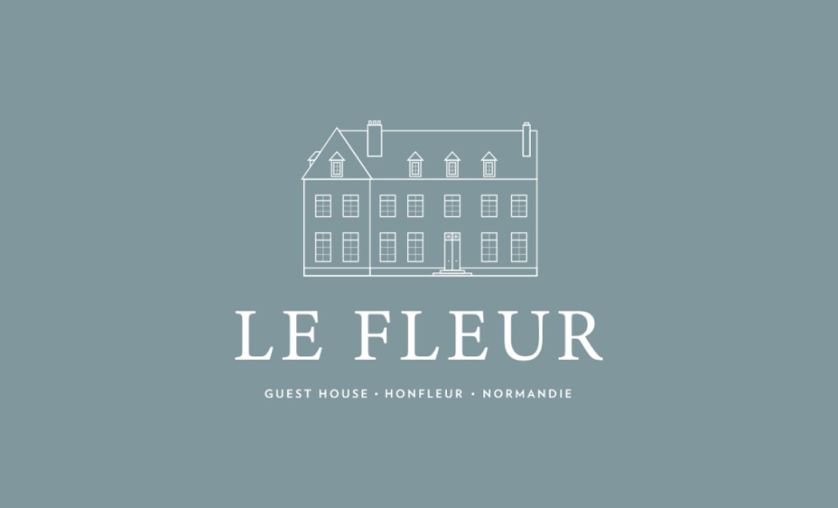
Standout Features:
- Elegant, building-derived line drawing
- Serene, muted blue-grey color palette
- Classic, all-uppercase serif typography
If you're dreaming of an authentic French château experience, Le Fleur guesthouse in Normandy aims to provide just that. Logo Studio was tasked with creating a logo to match its historic charm.
The heart of the logo is its refined line illustration, taken directly from the guesthouse building. These delicate lines capture the architectural style perfectly, creating a sense of timeless sophistication. This method directly links the visual brand to the real place, reinforcing that promise of an authentic stay you're looking for.
The color choice for the logo also adds to its peaceful feel. A soft, muted blue-grey is used in the background, creating a very calm and serene mood. This subtle color works beautifully with the line drawing. It helps give you that feeling of a quiet, luxurious escape that Le Fleur wants to offer.
The choice of a classic serif font for the brand name is quite fitting. It's an elegant style, and presenting "LE FLEUR" in all uppercase letters adds a dignified, timeless touch. This typography works in harmony with the line drawing and helps communicate that the guesthouse is rooted in tradition and quality.
The logo skillfully combines its features to reflect elegance and history. The delicate drawing, soft color, and traditional font create a feeling of genuine sophistication. If you're in the hospitality business, this logo shows how to make your brand speak of a unique, authentic experience.